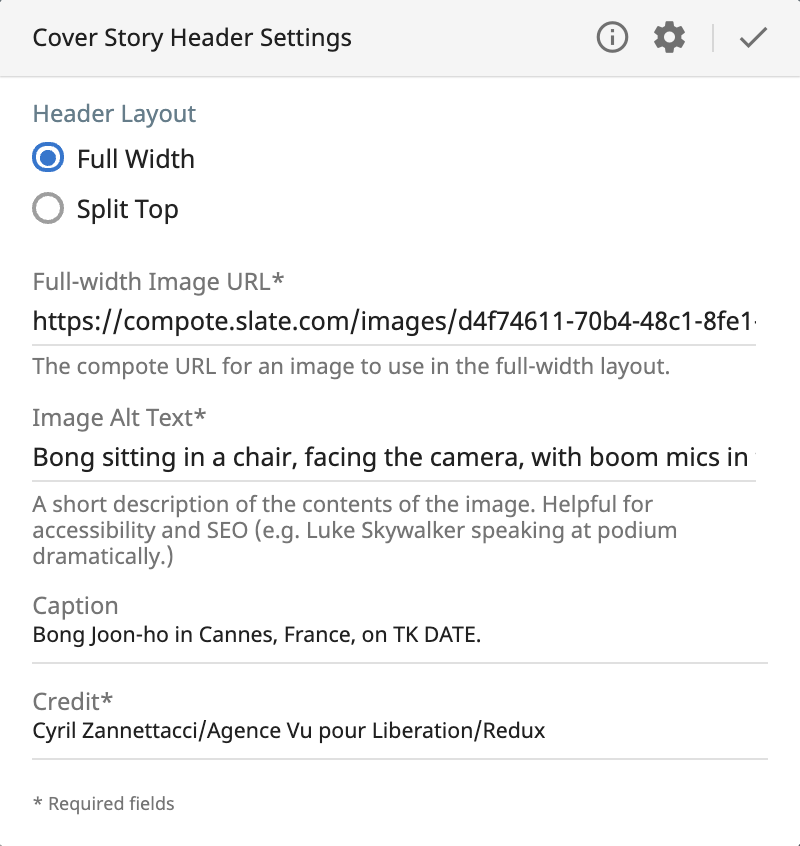
New "cover story" layout
A new split-top layout option for Slate's cover stories.
History
This project started as an idea from PIE (Slate's product, interaction and engineering teams) Hack Day because the art director, Lisa Larson-Walker, wanted to have more visual options for Slate's cover stories.
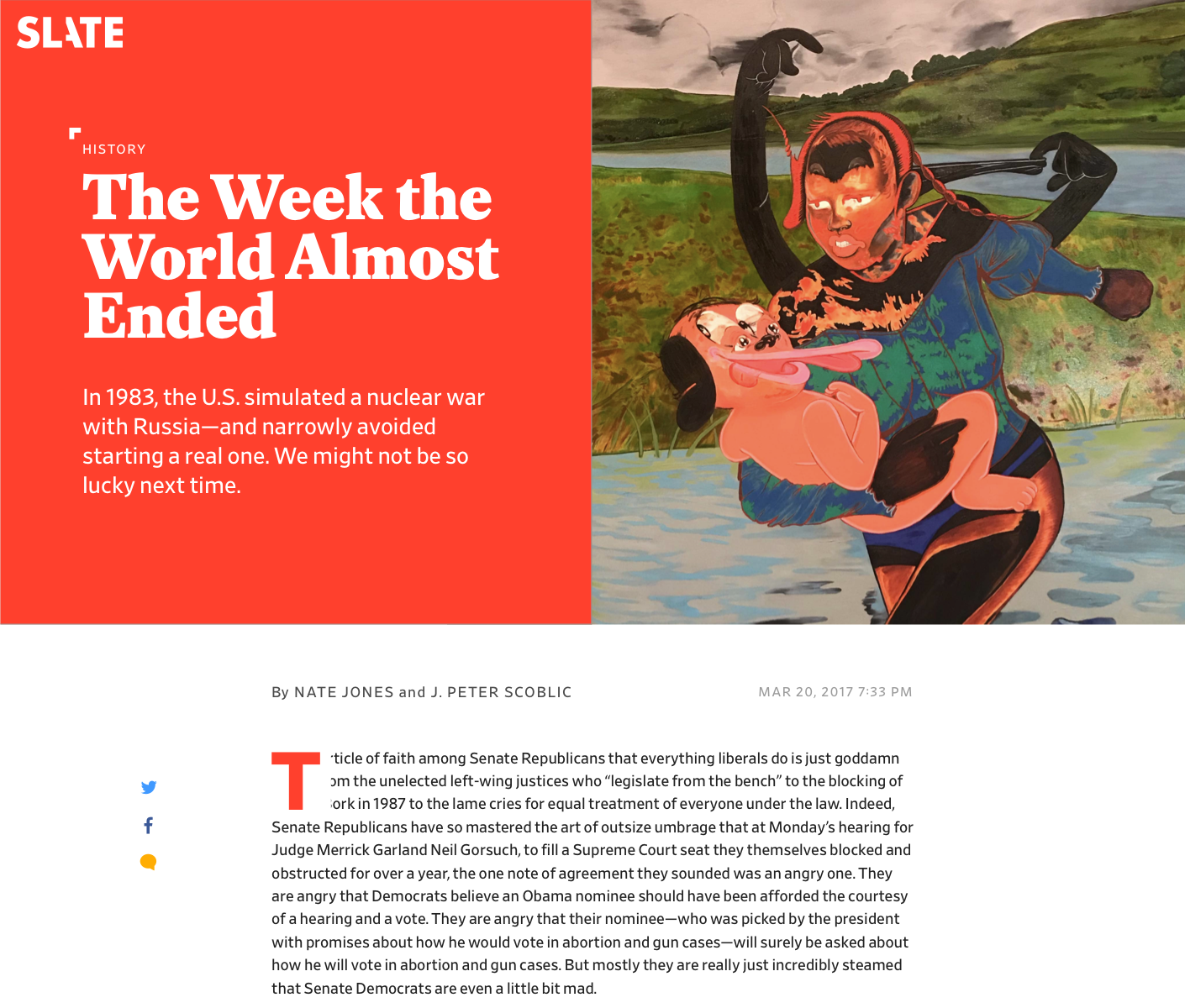
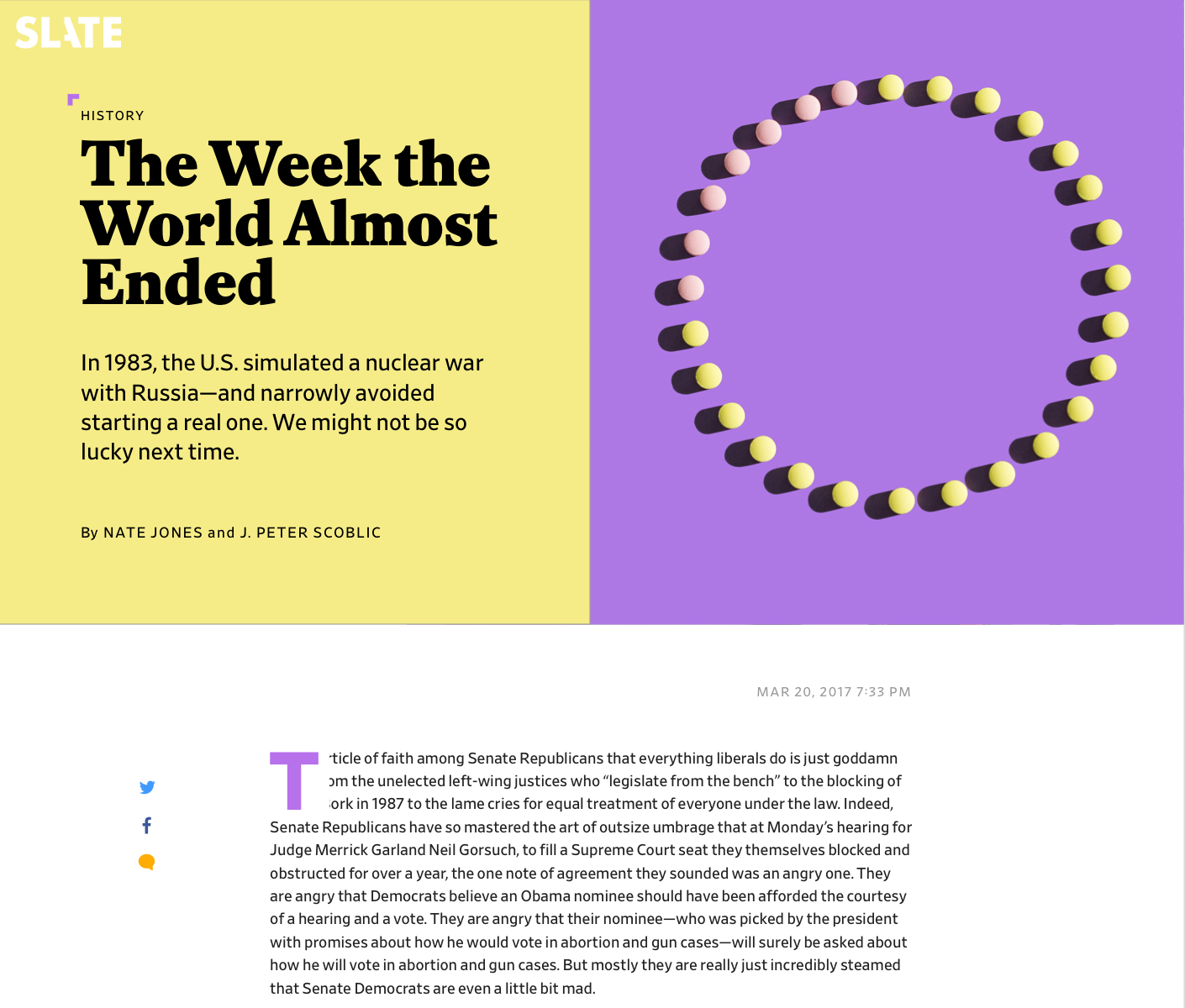
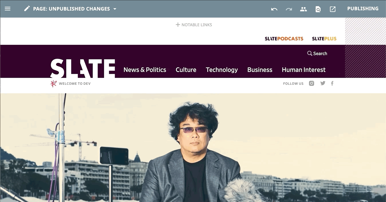
Currently, the cover story template has a full-width horizontal image followed by the headline, subhead and other article data. One of Lisa's ideas was to have a more square or vertical image at the top and have the headline and other info beside it.
The initial idea for this was just as a Hack Day project but once both the dev team and the editorial team saw the mocks, they wanted to build it.
Mocks
After it was decided everyone wanted to work on this, I started mocking up past stories where I thought the art might have looked better in this layout.
For these mocks, I used a setting that currently exists called "theme color." The "theme color" allows someone on the art team to set a color (that usually corresponds with the art) and the link underlines and other details on the page change to this color to make the template feel a bit more custom. I thought this would be a nice thing to use in this prospective new layout.
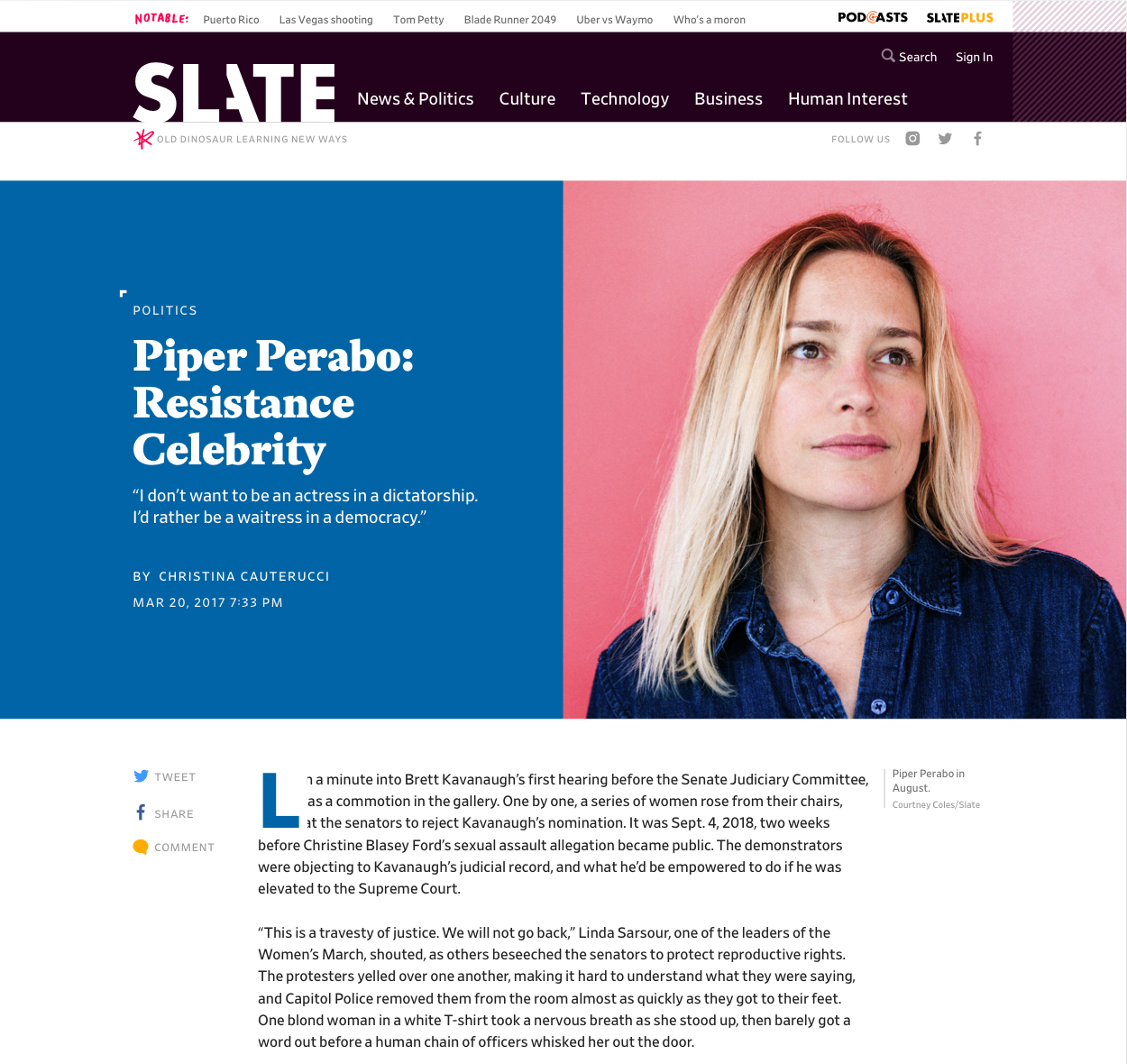 New layout for this story
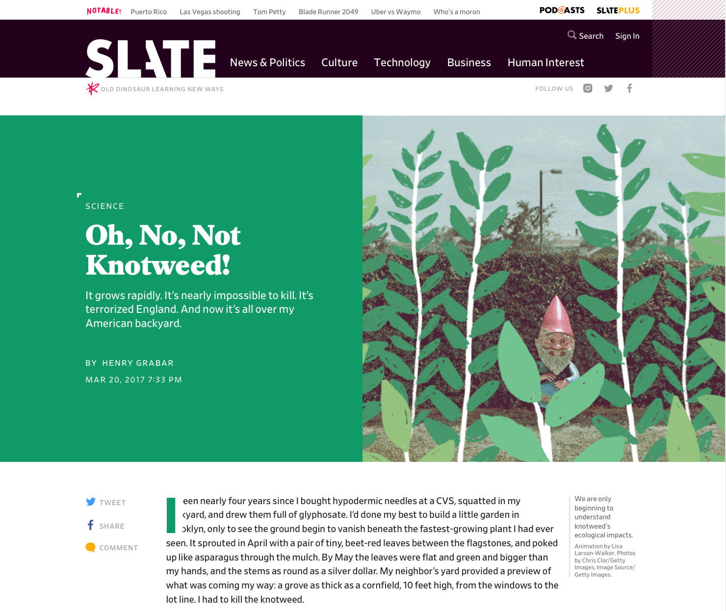 New layout for this story
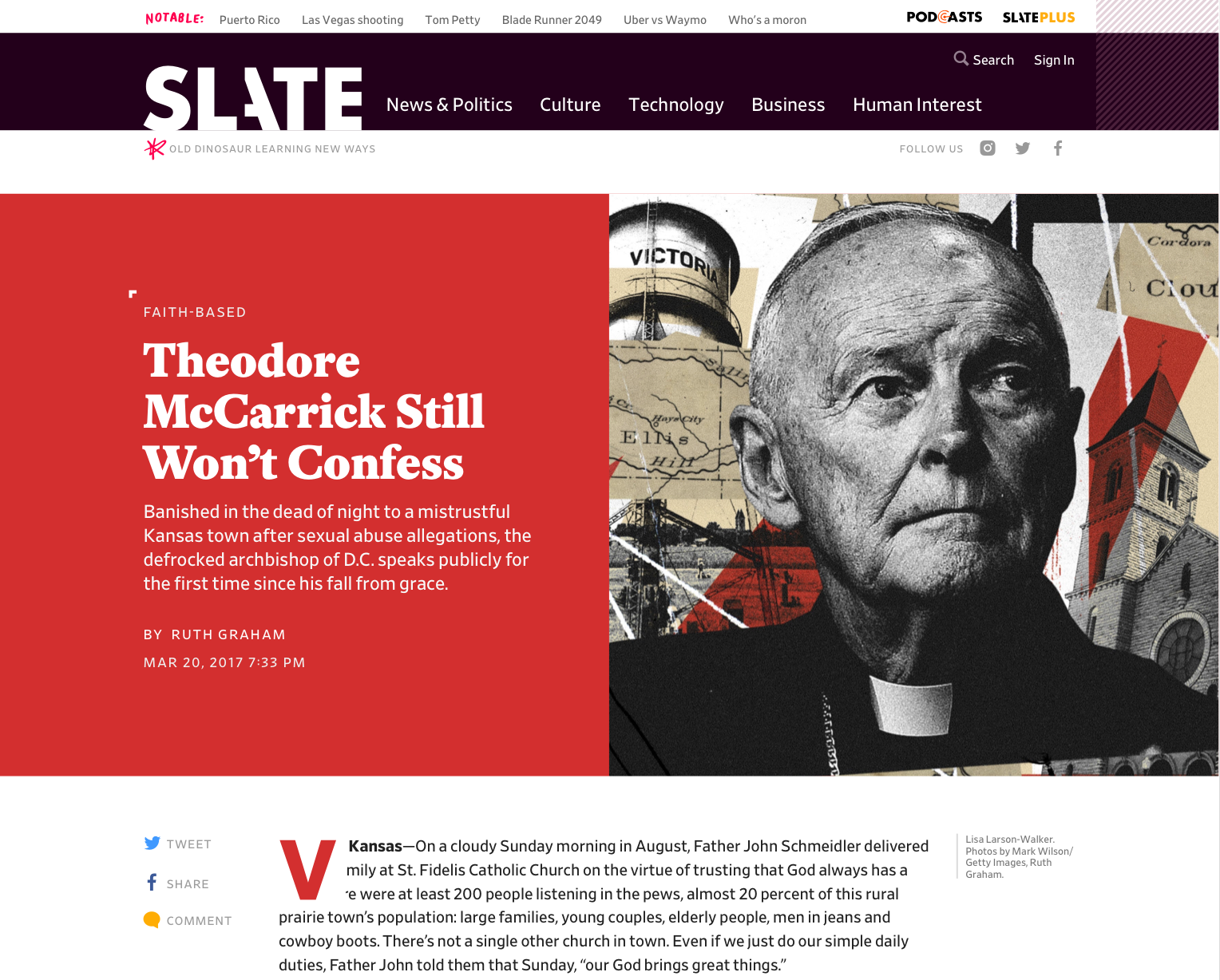
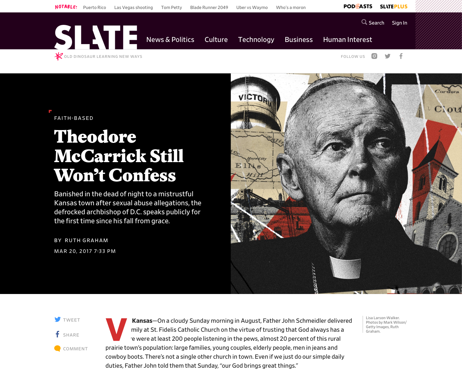
Although the theme color usually looked good, some cover stories had a more serious tone and I thought maybe they'd look better with a black or white background instead of a color.
Workflow
After I mocked up a bunch of different articles, I met with the dev team to decide how this would get built in Clay (the CMS):
- Is the photo an
imgorbackground-image? - How is the text color decided? How is the background color decide? How do we make sure this relationship is has enough color contrast?
- How does the new template work with the old template? Should the new template be an option in the main CS template or should the new template be its own template?
For the first question, we decided to make the image a background-image. The old template's image is a regular img so I thought dev might be a preference for that because the new template's image is 50% of the page width and needs to grow and shrink to fill the space, background-image made more sense.
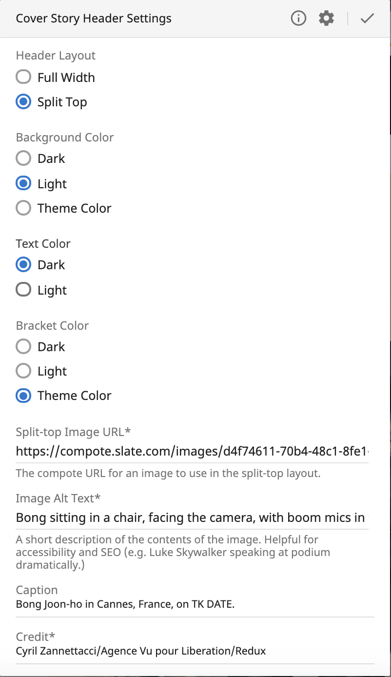
For the second question, we decided to let the art team have full control over picking the background color and text color (as well as a third option for the bracket color). We also thought it would be nice to have some sort of test running to show the color contrast between the background and text colors but that wouldn't be a blocker to this going live and I could keep an eye on the contrast until it is completed.
CMS options for new layout:
- Background color
- Black
- White
- Theme color
- Text color
- Black
- White
- Bracket color
- Black
- White
- Theme color
For the third option, dev said a new template was easier but they could make it an option if that was a better experience. I talked to the art team and they preferred the new layout be an option in the current template instead of being its own template so they could toggle between two layouts (full-width vs. split-top) to see what looked best. I also thought that this layout being incorporated into the current template would make sure it was used more often and not forgotten.
Implementation & working with dev
Based on the meeting, I ticketed this new feature and, after many sprints, dev started working on it. The biggest challenges we faced in development were image-related.
Initially, the developer, Jonathan Zuckerman (JZ), separated "layout" and "image" into separate tabs in the CMS editing experience. I thought this was a good idea but we realized that the images needed to be different based on layout (horizontal vs. square/vertical image). It was confusing having the image tab be reliant on the layout tab but the image content was hidden until you clicked on the tab.
I checked with the art team about this decision (because they are primary people making layout and image decisions) and they said it didn't really matter if layout and image were separated and it would be nice to see all the information at once. So, we put all the options in one tab.
 Switching the layout for this story
Another issue was the image cropping on desktop vs. mobile. Initially when I mocked it up, I thought the full-width and split-top layouts would have the same crop on mobile (horizontal image). But, in development, JZ said it was much easier to keep the same crop across all screen sizes. I thought this also looked good so we went with this.
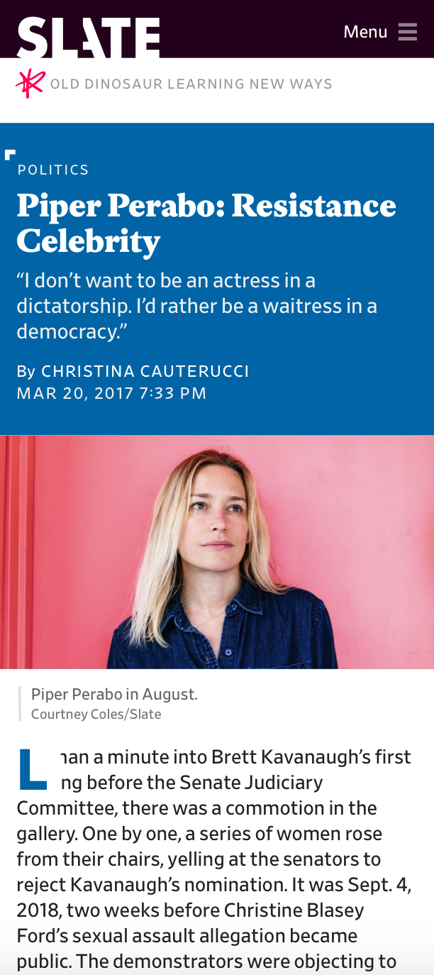 Mobile mock
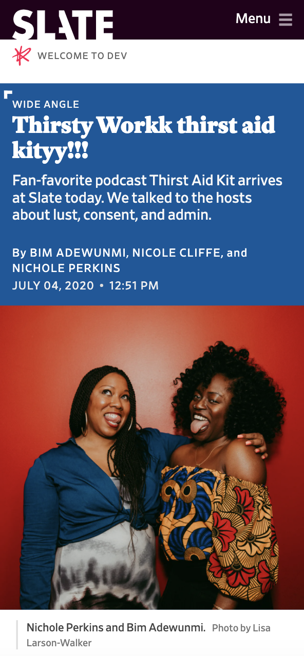 Mobile view in production
Development was lead by Jonathan Zuckerman and product management was lead by Chris Schieffer. Big thanks to Lisa Larson-Walker for the idea and reviewing the initial mocks and Abby McIntyre, Megan Wiegand, Holly Allen, Natalie Matthews-Ramo and Derreck Johnson for reviewing this many times during development.
Usage
Here are some examples of the split-top layout being used:
- COVID school reopening by Dan Kois, July 19, 2020
- Slate's Favorite Podcast Episodes of 2020 by various Slate staff, December 01, 2020
- The Most Influential 80-Plus-Year-Olds in America by Molly Olmstead & various Slate staff, December, 22, 2020