Flex grid menu
March 25, 2018
I re-coded the menu for all Industry Dive products using a flex grid. This resulted in a more accessible menu with code that scales better for growth.
 Updated menu
Goals
Going into this project, my two main goals were:
- Make the menu more accessible at a higher number of screen sizes
- Make the code more scalable for a growing number of variants in the menu
For inspiration, I looked at both Vox and GitHub's menus to see how they structured their HTML and CSS because they had similar content (logo, regular menu and sub menu). Both publications use flex grids.
Research
I started by researching all grid methods. Industry Dive currently uses a modified Foundation grid for all sites because it is responsive and well-supported. When I had brought up an alternate grid before, the main concern was support, specifically in Internet Explorer, so I needed to prove that whatever I chose would work within these constraints.
The most helpful articles were this Hacker Noon article that explains flex vs. CSS grid and Philip Walton's article on how flex grids work in general.
The Hacker Noon article mentions that "Flexbox is made for one dimensional layouts and Grid is made for two dimensional layouts." Because I was only re-coding the menu (not the whole site), I decided to go with flex. As you can see below, flexbox has great support. From my research, CSS grids seem really cool but are still pretty new and not well-supported.
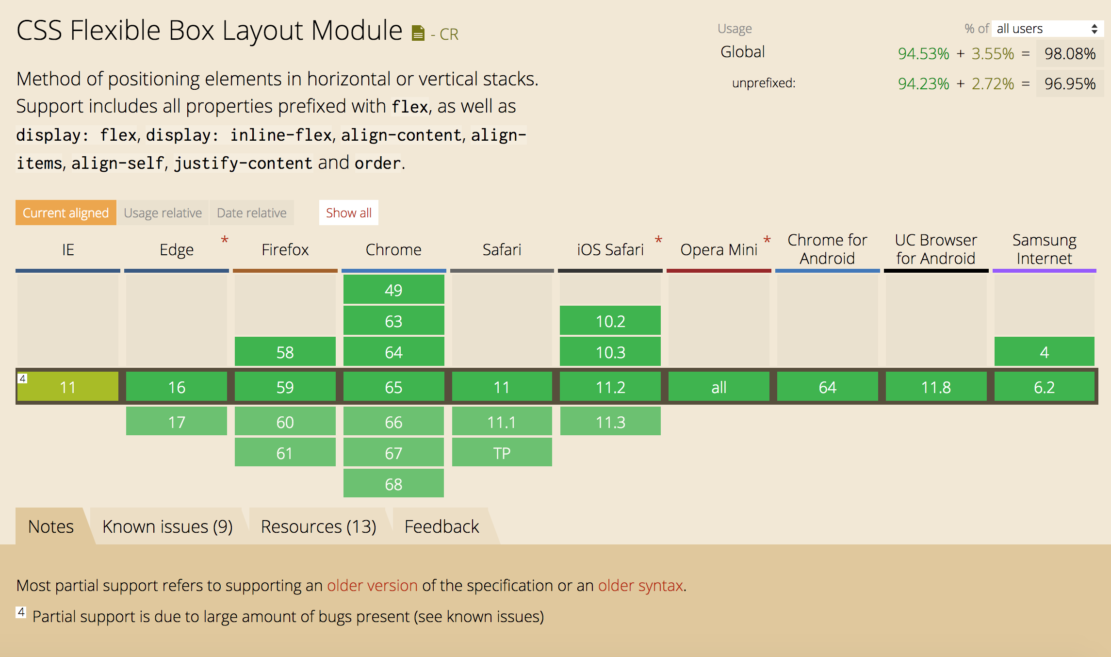 Flex grid support, screenshot from Can I Use
Reassessing the menu SCSS
First, I broke up the menu SCSS so it was easier to manage. This was pretty straightforward: the menu CSS was previously all in one SCSS partial so I broke it up into three SCSS partials:
/* _menu.scss */
@import 'base';
@import 'mobile';
@import 'desktop';
Currently, the desktop and mobile menus run off almost completely separate code and the small amount of code shared is in _base.scss. To implement the flex grid, I would mainly be editing the desktop and base menus so the split made the code more maintainable and easier to read.
Setting up flex grid
As previously mentioned, the menu was originally written using a Foundation (float) grid. Because this only controls the widths, floats and clearing for each column, all other elements needed to be manually styled. For example, each unordered list below's list items needed to be styled with display: inline-block to make the menu horizontal.
With the new flex grid structure, neither the floats nor inline styling were necessary, because the flex grid does this for you. This is easier to manage and scale.
<nav class="site-menu">
    <div class="site-menu-inner">
        <div class="menu-content-wrapper">
            <ul class="desktop-menu-main">
                <!-- desktop menu, not visible on mobile -->
            </ul>
            <button class="mobile-menu-toggle">
                <!-- mobile menu toggle icon, not visible on desktop -->
            </button>
            <ul class="desktop-menu-sub list-no-bullets">
                <!-- sub desktop menu, not visible on mobile -->
            </ul>
        </div>
    </div>
</nav>
For the SCSS, most of it made sense after reading the flex grid documentation mentioned above.
To me, the most confusing property related to flex grid is flex. The two most frequently used styles are flex: auto and flex: initial. auto grows or shrinks according to the free space in the container while initial only shrinks to fill the minimum size of the container. Both styles are used on .menu-content-wrapper, which wraps both menus. initial is used on mobile screens while auto is used on medium and large screens.
.site-menu-inner {
    align-items: center; // vertically centers all items
    display: flex;
    height: 55px;
    justify-content: space-between; // added so mobile menu stays on the right
    margin: 0 auto;
    max-width: 75rem;
}
.menu-content-wrapper {
    display: flex;
    justify-content: space-between;
    flex: initial; // initial is flex: 0 1 auto;
}
@media screen and (min-width: $menu-breakpoint) {
    .menu-content-wrapper {
        flex: auto; // auto is flex: 1 1 auto;
    }
}
.desktop-menu-main,
.desktop-menu-sub {
    display: flex;
}
Making the flex grid responsive
So far, the changes to the menu haven't changed what it actually looks like. But, as previously stated, one of the goals of this project was to make the menu more accessible on smaller screen sizes. Making it work on mobile is a different project but what about tablets and small laptops? This was going to involve some slight visual changes.
 Before (on smaller desktop screens)
 After (on smaller desktop screens)
The first thing to change was the sub menu CTAs (the menu on the right). To account for the thinner screen width, I removed the CTA for "search" because the magnifying glass is fairly universally known to represent "search". I considered removing the CTA for the newsletter signup link as well but I don't think the email icon makes much sense without "sign up".
The other element to address was the "Topics" menu. On desktop, the "Topics" menu is visible at the top of the page but changes to a dropdown on scroll (see screenshot above). It is also a horizontal menu. I knew on a medium-sized screen, all the items in the menu wouldn't fit horizontally so it should be vertical.
 Topics menu open on medium screens
Finishing touches
To make the menu fully work, I had to reassess the JS associated with the menu and update the SCSS breakpoints so this actually worked across the 15 different menus running on this code (see all pubs here).
 Social Media Today menu on medium screens
 BioPharma Dive menu on medium screens
Although the JS and SCSS breakpoints brought about some complications, I plan to clean them up in the future. I also want to update the code so the menu is fully responsive from mobile to desktop (goodbye hamburger menu), not just across medium and desktop.