GIG iOS app
October 14, 2017
GIG is an app for going to concerts with your friends. It was created because I thought there was a void in the market for a service that allows you to plan, buy and attend concerts with your friends easily.
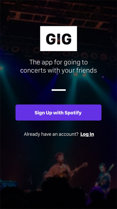
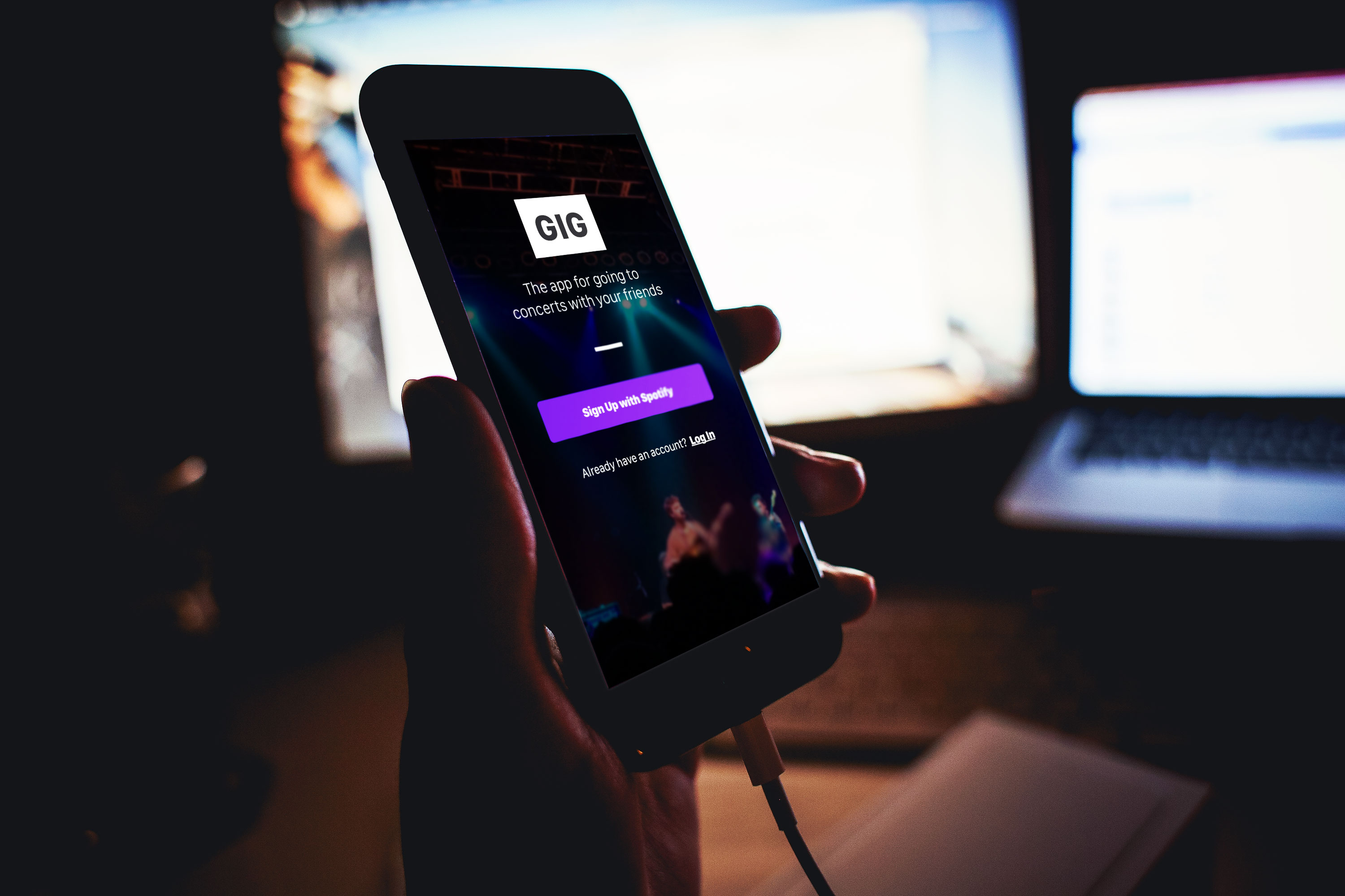 First screen of GIG app
Research
Original Problem Statement: People who attend many concerts have a disjointed experience purchasing, organizing and attending multiple events.
After deciding on what I thought the problem was, I looked at what already exists in the market to solve this problem. I looked at products that help people plan for events and products that allow you to buy tickets to an event, specifically concerts.
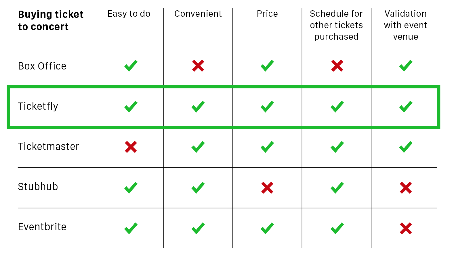 Ticketfly was the main competitor for buying tickets
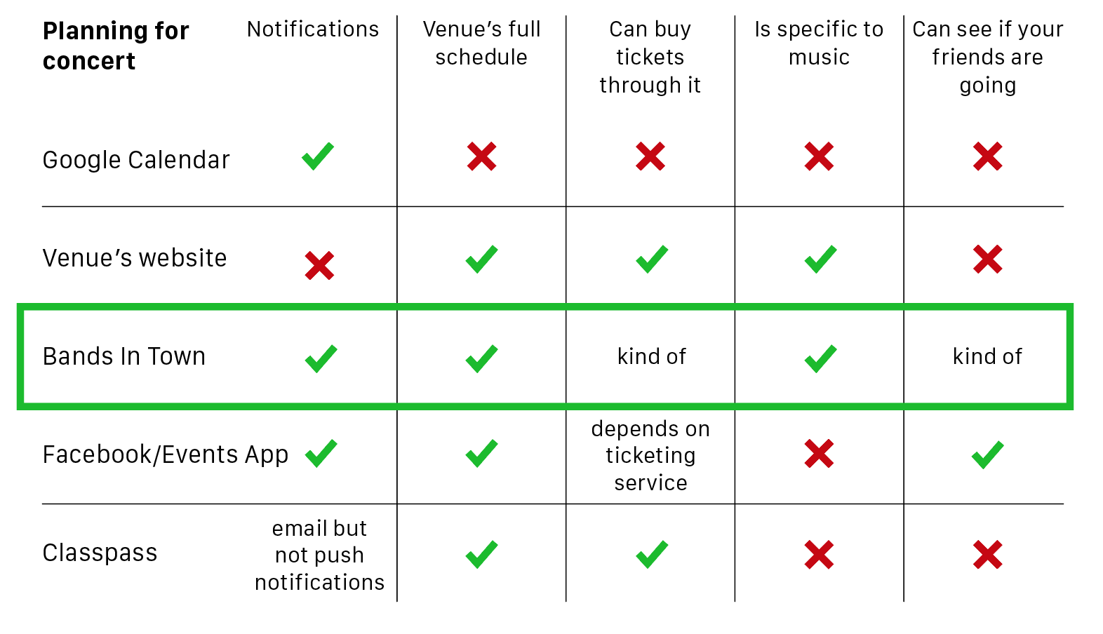 Bands In Town was the main competitor for concert planning
My main competitors, it seems, are Ticketfly and Bands In Town. But, neither one of them fully did what I wanted it to do.
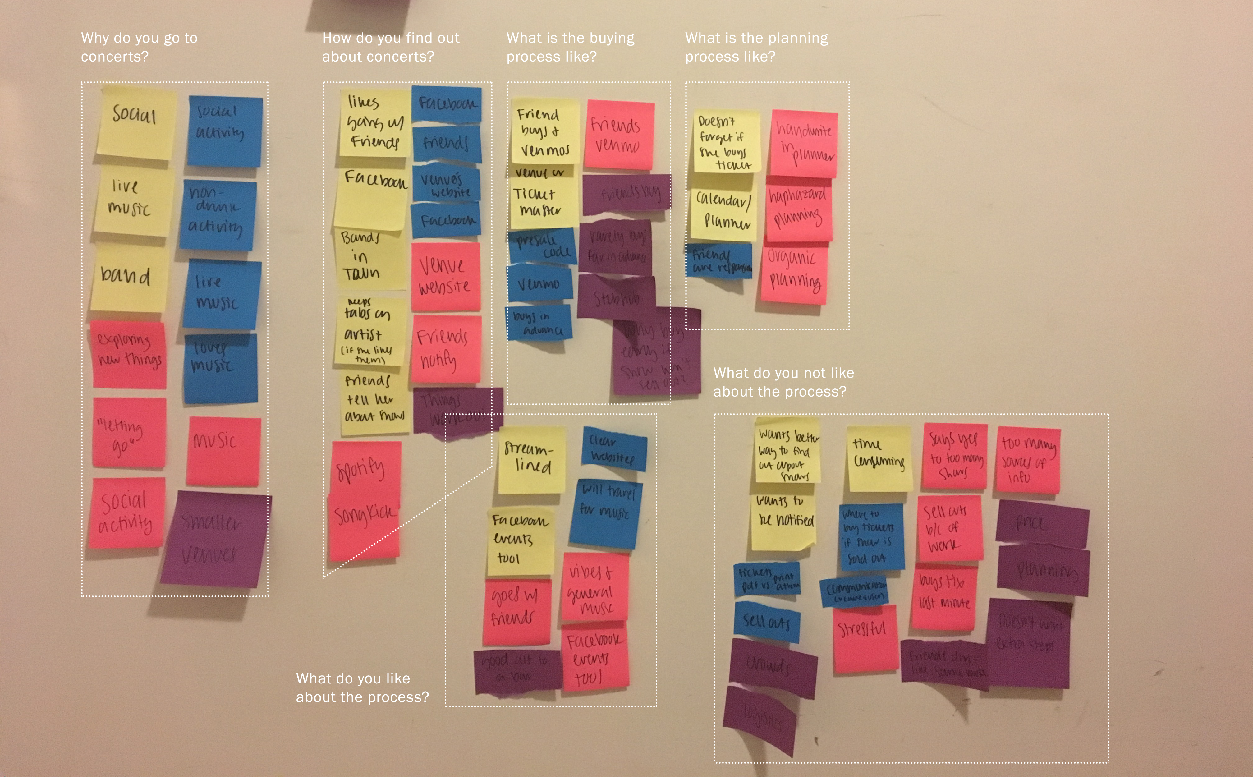
Next, I developed a target audience and interviewed people in that audience. My target audience is anyone who goes to a lot of concerts. Although this could be any age, this usually applies to a younger, 20s audience because, after interviewing someone in their 30s, it seems people who are older don't have as much free time to go to many shows.
 Sticky note grouping
From this research, I decided on the user's goals, problems and a new problem statement. Although I didn't structure the user interviews around their friends, every person interviewed brought up their friends when asked about their concert-going experience.
Goals:
- Interviewees wanted to be able to find and attend concerts easily
- All interviewees considered their friends’ interest when attending shows
Problems:
- Knowing about all the concerts available in their area
- Knowing which friends are interested in certain concerts
- Planning for event
New Problem Statement: People who attend many concerts have trouble accessing the information they need about the shows in their area and planning for the event with their friends.
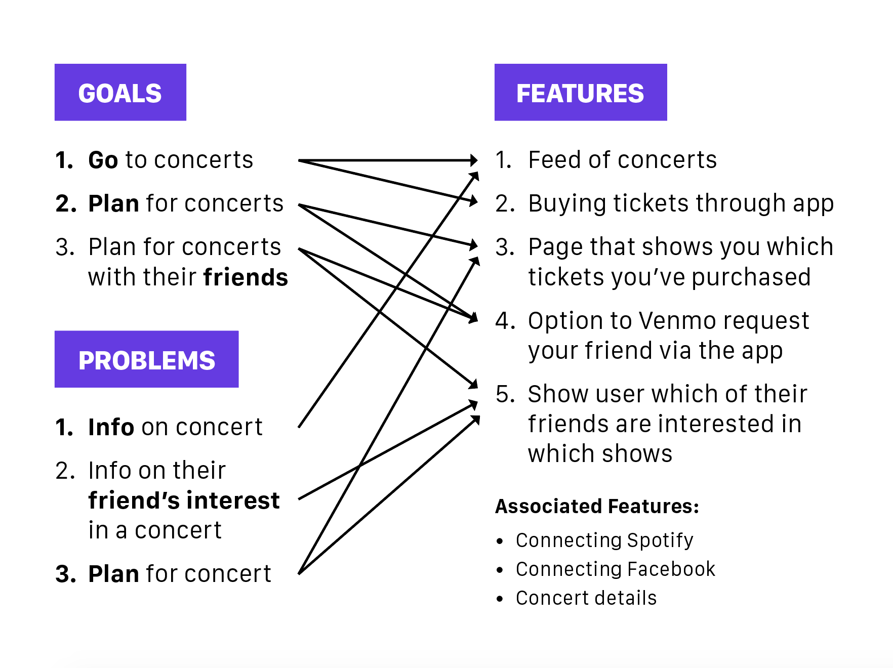 Goals and Problems mapped to features
Planning
The next step was deciding which features the solution should have. I decided on an app instead of a website because of convenience and the target audience. I also had the idea to incorporate Venmo which would require my solution to be an app.
Then, I moved on to sketching and wireframing. I talked to a few people about the information architecture of the site and they all grouped "shows you're attending" with "shows you're friends are attending." This was probably the most difficult thing to visualize because there were so many ways to show it.
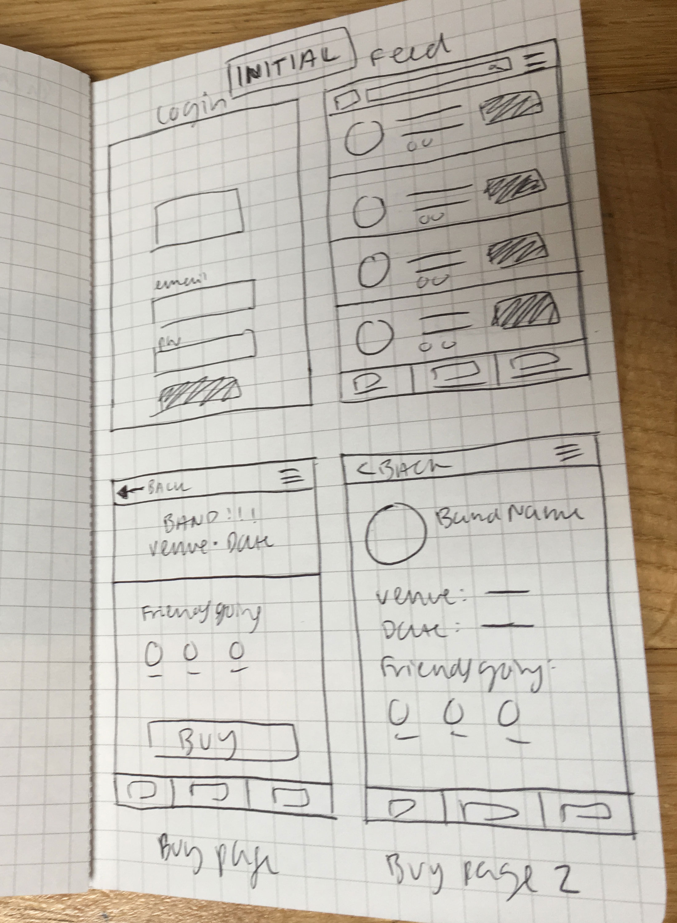 Initial sketching
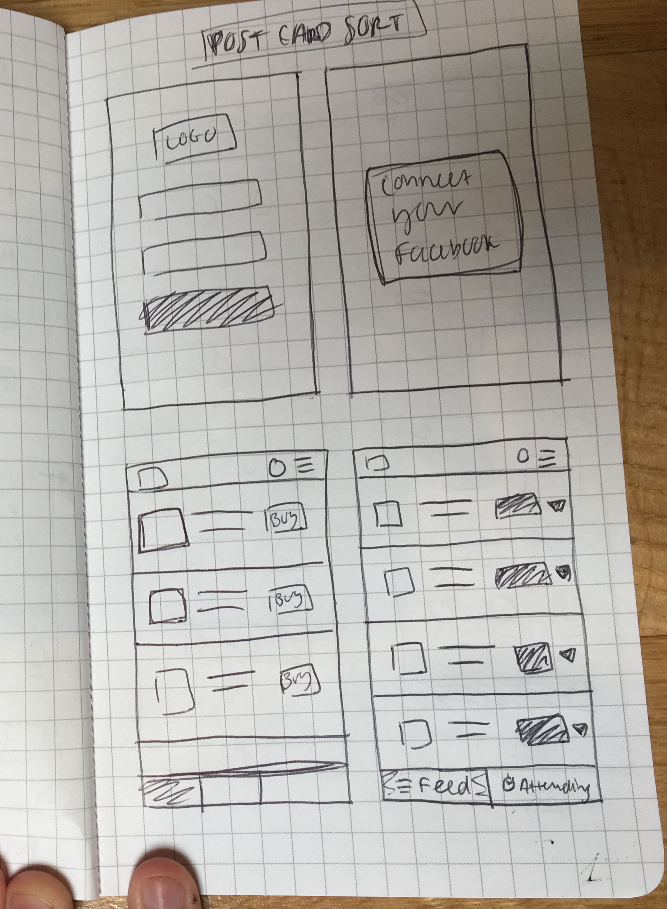 Post-card sorting sketching
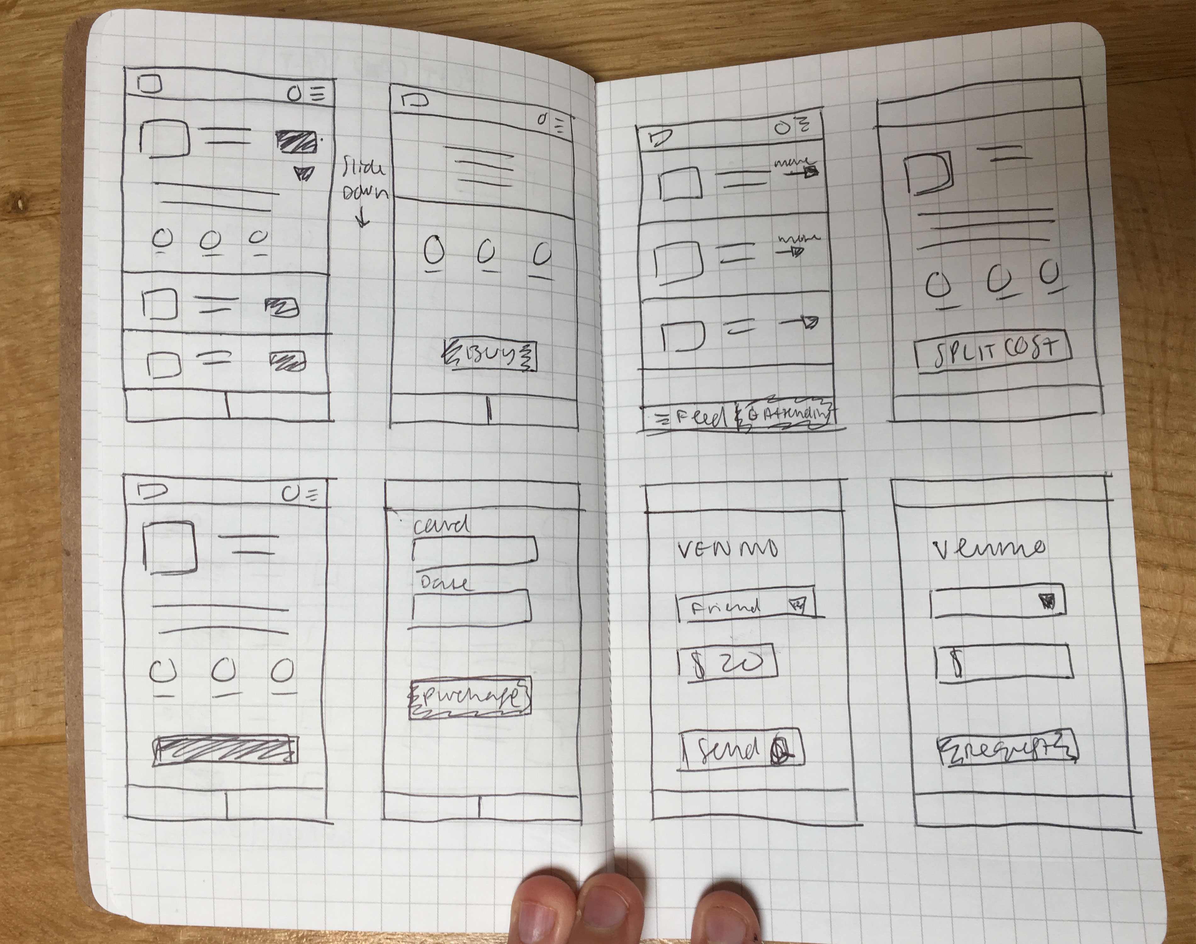 More sketching
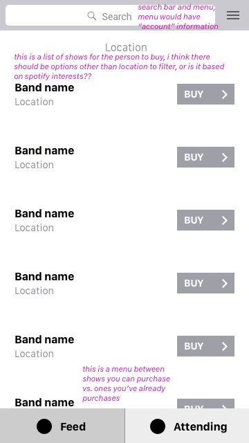 "Upcoming concerts" wireframe
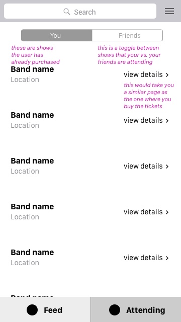 "Friends attending" wireframe
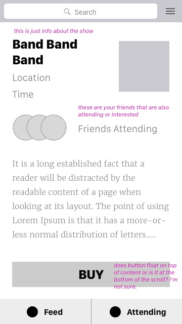 "Concert details" wireframe
After creating wireframes, I tested this initial setup with some users and people found the "Attending" menu item a bit confusing. I realized showing this information could maybe be done in a different way.
I then moved on to higher fidelity prototypes. After interviewing users with these new mockups, the menu items made more sense but users were confused by the onboarding. What exactly does the app do? How is the feed made? The ticket buying experience was clear but getting to that process was not. I realized the onboarding process needed some work.
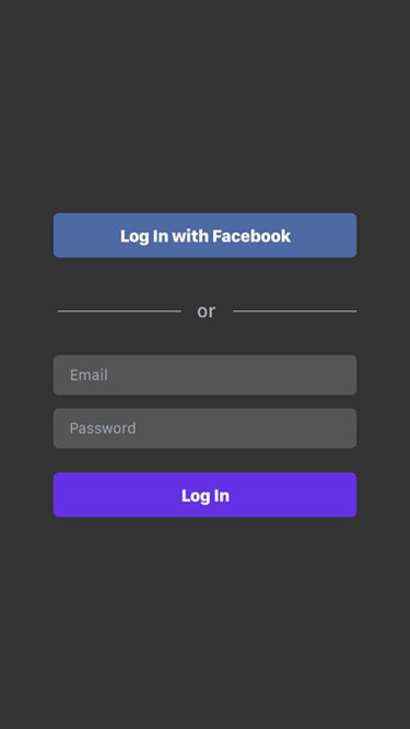 "Login page" high fidelity wireframe
 "Upcoming concerts" mock
Final Product
After many iterations, I decided on a final product that many users found clear and easy to use. See the prototype here and see screenshots of that prototype below.
 "Login page" final
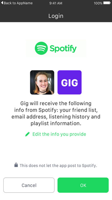 "Spotify linking" final
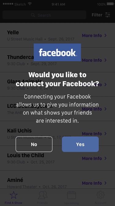 "Facebook linking" final
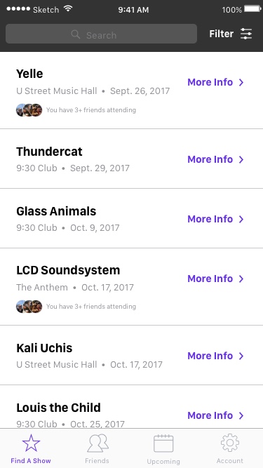
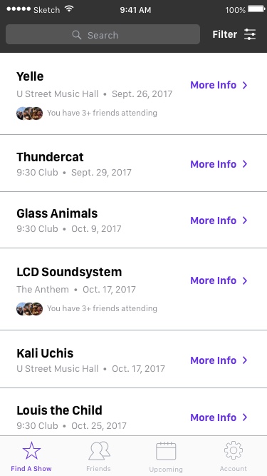 "Upcoming concerts" final
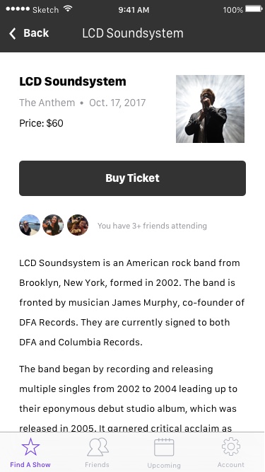 "Concert details" final
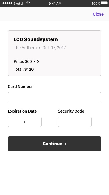 "Ticket purchase" final
 prototype of how buying a ticket would work in the GIG app
What I built is definitely the minimum to meet the user's needs. Some users suggested a few features that could be added in a future version of the app:
- “Favorite” feature - for shows you might want to attend but don’t want to commit to right away
- “Add to calendar” feature - option to “add to calendar” (iCal or Google) after you’ve purchased a ticket
- More social media-like aspects - “add friends”, “follow venues”, “favorite” artists