Library page redesign
January 06, 2018
I recently redesigned the Library page for each of Industry Dive's publications with the help of the dev team to better showcase the Dive Brand Studio's content.
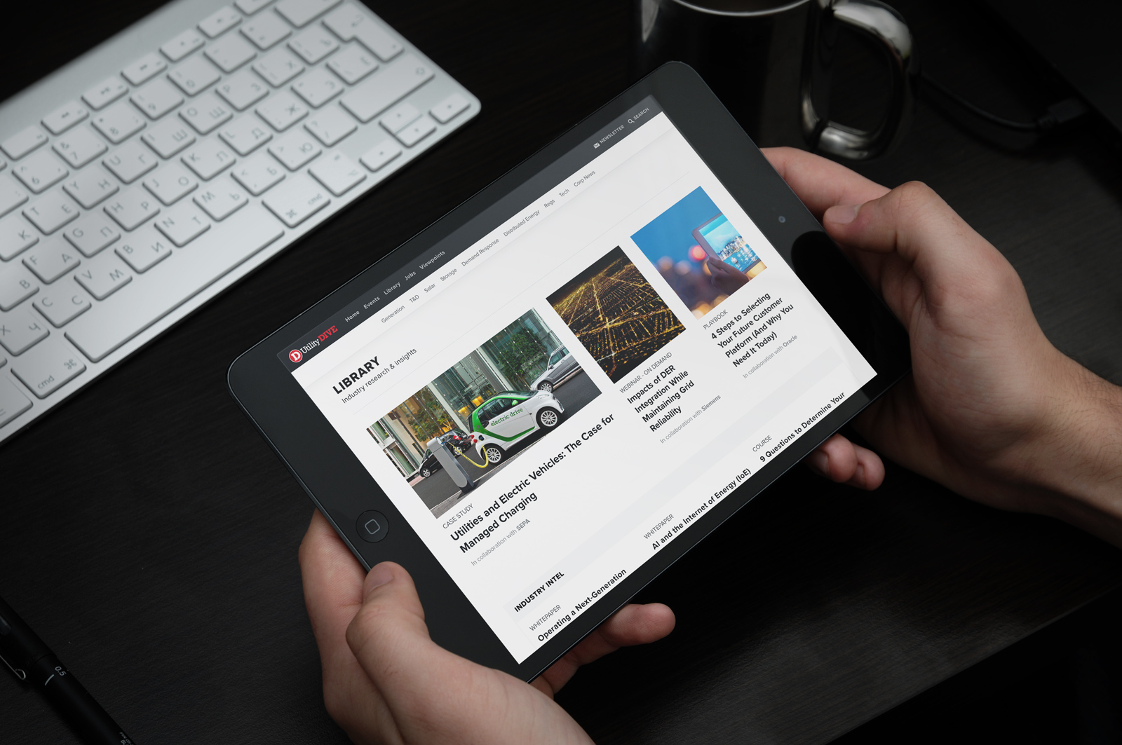 Finished library page on an iPad
Background
The Dive Brand Studio is the in-house content studio at Industry Dive. They work with clients to create playbooks, webinars and other lead-gen content for Industry Dive's readers.
Their content is promoted in a variety of ways but the only place is was all centrally housed was on the library page on Industry Dive's publication sites. The page features both Brand Studio content along with promoted content from clients. If redesigned, how could the new page account for both content types while focusing on the Brand Studio content?
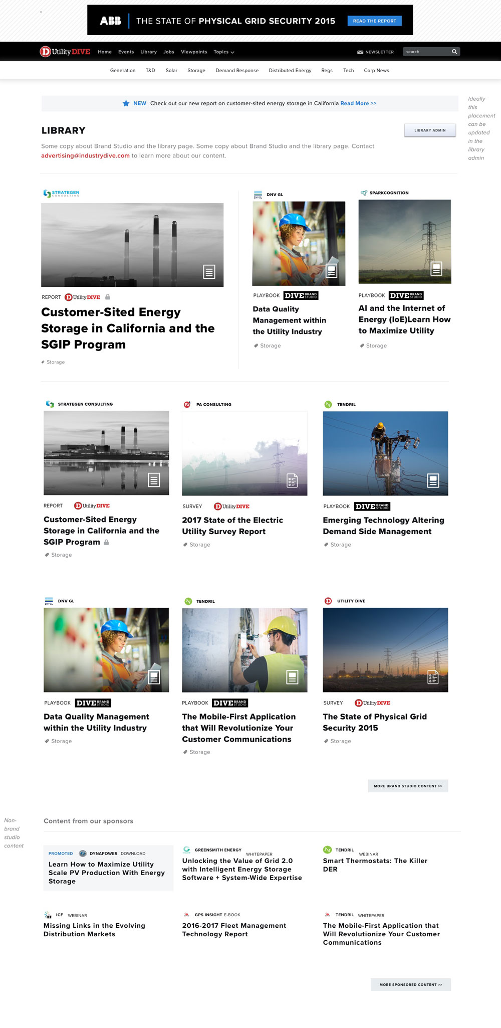
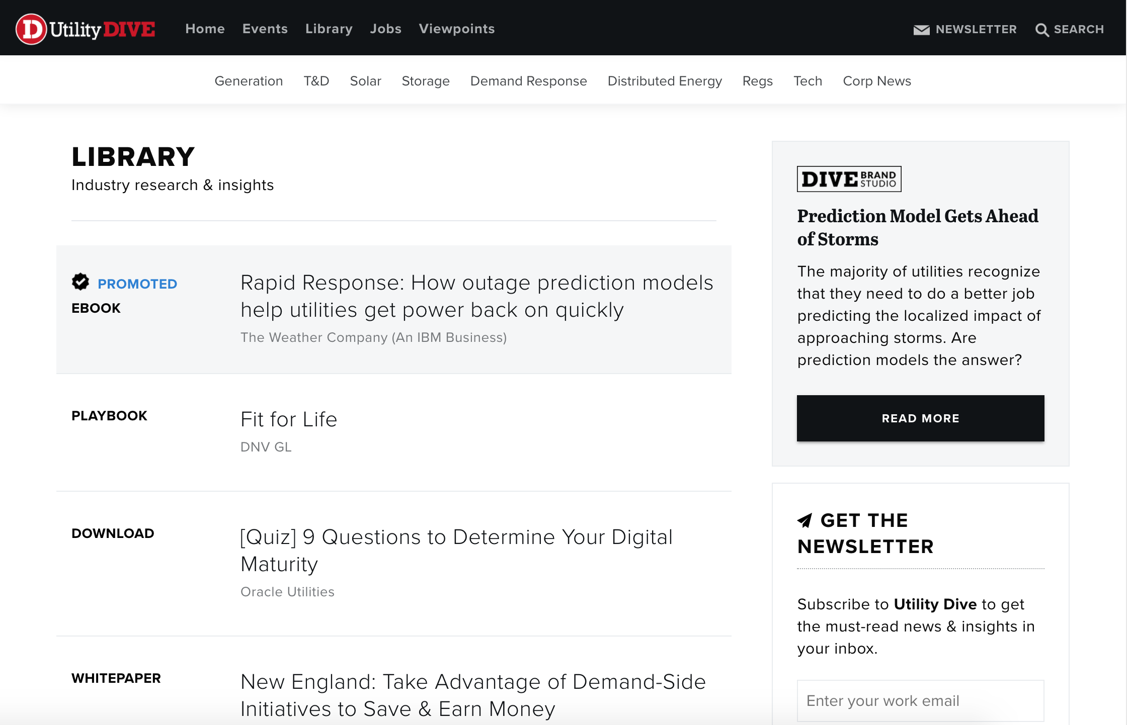 The old library page that doesn't show difference between the two content types
Planning
First, I spoke with the Brand Studio team about what its priorities were for this redesign:
- Increase leads from campaigns
- Ensure that the page is valuable to the user
- Increase Brand Studio brand awareness
- Create layout that is easy to manipulate (i.e. there are multiple ways to promote one item and this can easily be done through the CMS)
Then, I looked at the current options available for each listing (i.e. what fields are in the CMS) and considered other possible requirements Brand Studio might request. This would help when explaining the scope of the project to the back-end developer helping with the project.
- Client - All items have a client who is sponsoring the content regardless of the content type
- Item type - Is it a playbook, a webinar, an e-book or something else?
- Brand Studio vs. Client - Who created the content?
- Photo vs. no photo - Ideally all items have a photo but what if they don't?
- Title
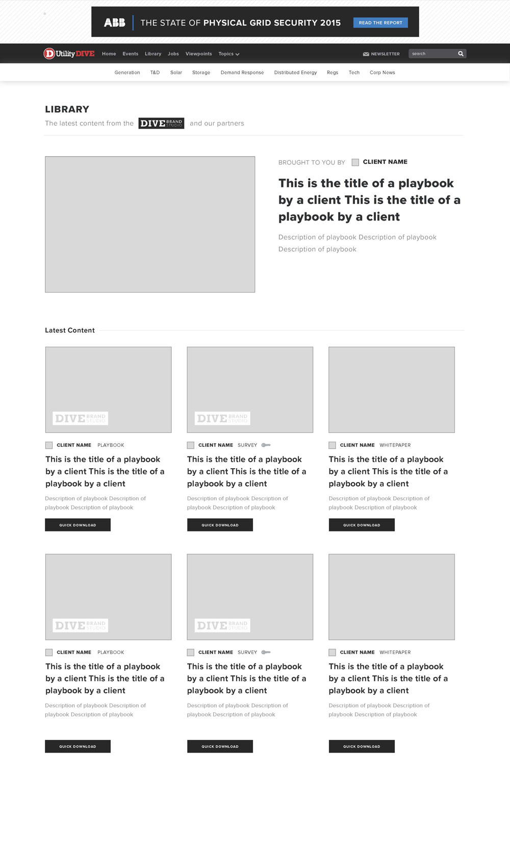 Wireframe featuring one item promoted at the top
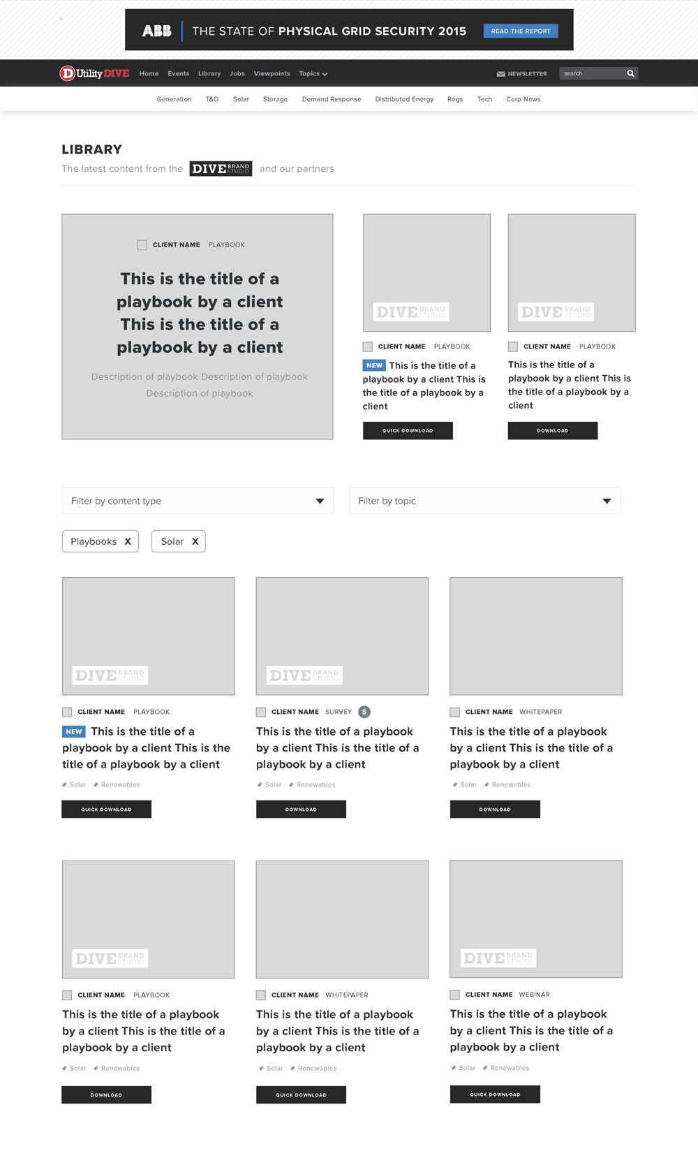 Wireframe featuring multiple items promoted at the top with option to filter items by topic and content type
Wireframes
After doing some research, I started wireframing the page. My first thought was to remove the sidebar, allowing the page to have a full-width template so it could be differentiated from the rest of the site. Also, being able to filter the content based on topic and content type would make the page easier to navigate for the user.
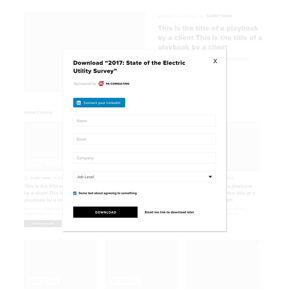
To make it more appealing for the user to enter their information, the actual download process needed to be simpiler. Historically, users had to click on the title that then took them to a landing page, which took users to a third party site to download the content. Wouldn't it be easier to have it all hosted on our site? I knew some of these ideas would get shot down for the MVP but I wanted to sell the vision of easy-to-download content.
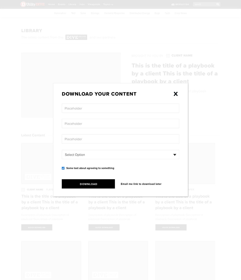 Option to download item on the page
 Option to download item once you click through to the landing page
Mockups
In the first few mockups of the page, my main challenge was how to layout each item with each variant (the ones mentioned above). What happens if a photo isn't uploaded? How can I better indicate what type of content the item is? Is the item made by a client or by the Brand Studio?
In the second mock below, I added a top ad placement, where the Brand Studio would be able to promote a particular piece. I also added ads within the feed of content to promote LinkedIn groups and the newsletter.
 First mock with filtering options
 Mock with additional ad/signup placements
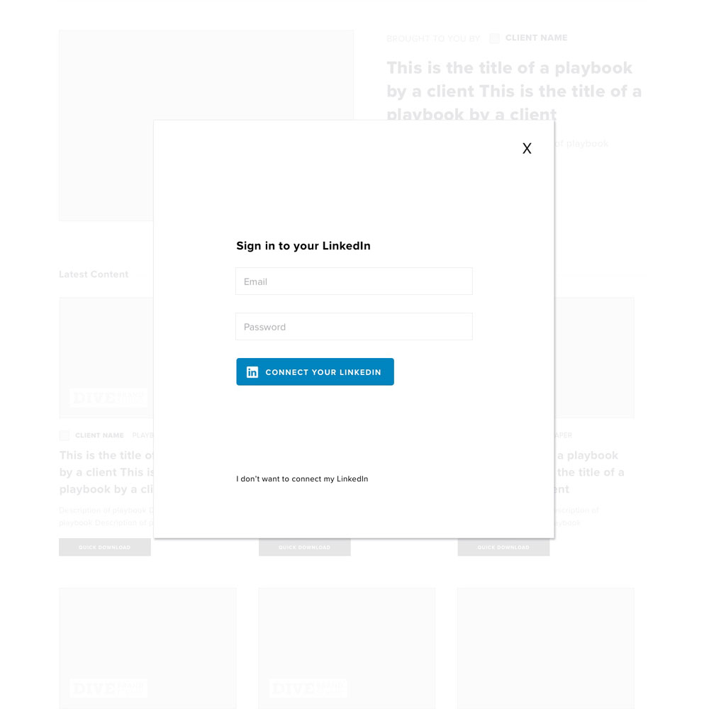
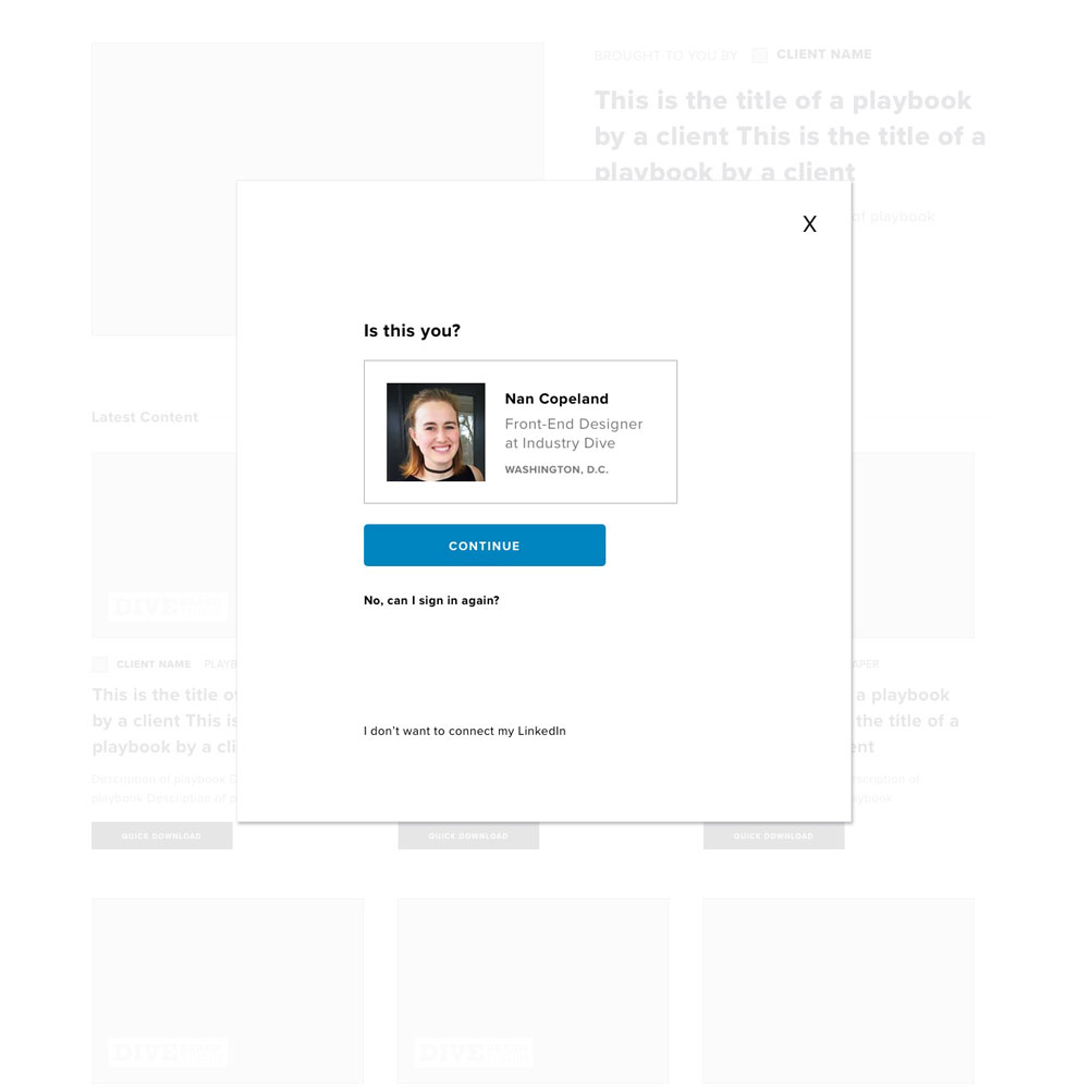
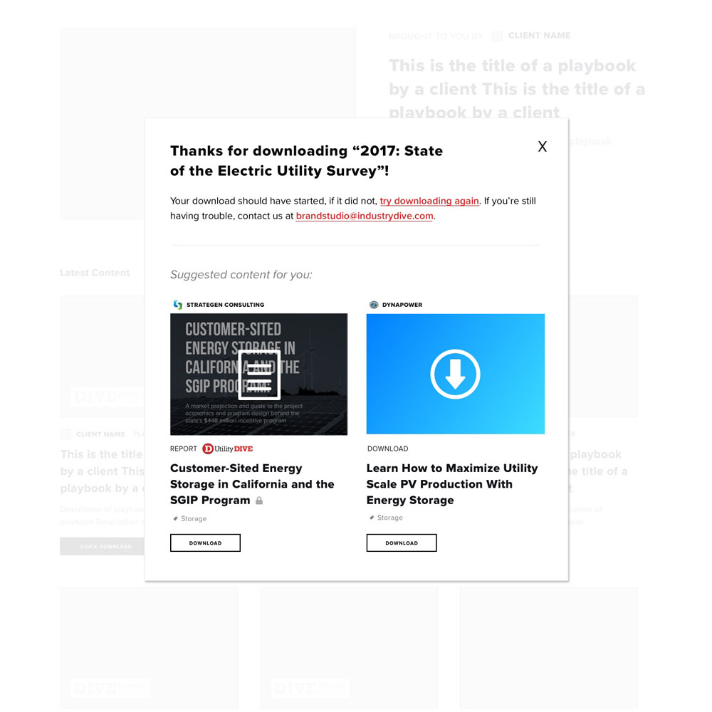
For the download process, I looked primarily at the Amazon's checkout process to see what would increase conversions. As previously stated, I wanted to make this more seamless. When talking to our audience development team, someone suggested adding the feature to sign in with LinkedIn.
 Download PDF flow - 1
 Download PDF flow - 2
 Download PDF flow - 3
 Download PDF flow - 4
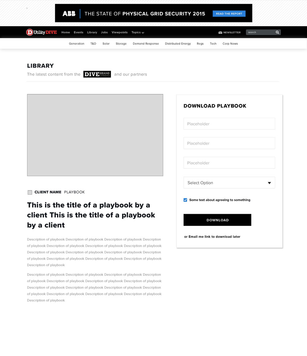
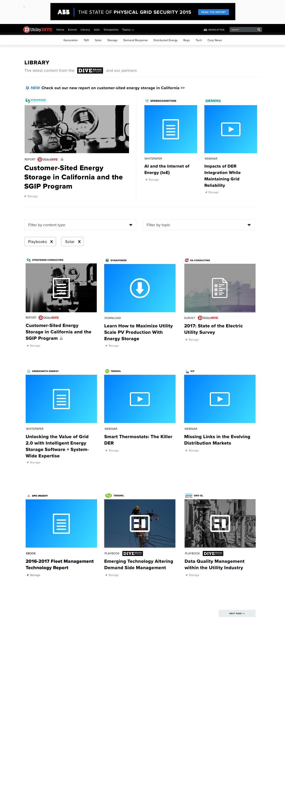
In the next iteration of mocks, I cleaned up the page by focusing on separating client (content in the grey box) vs. Brand Studio work (all other content on the page). I also decided that photos should be required because the icon + gradient style was starting to look a bit repetitive.
 Mock featuring client content at the bottom of the page
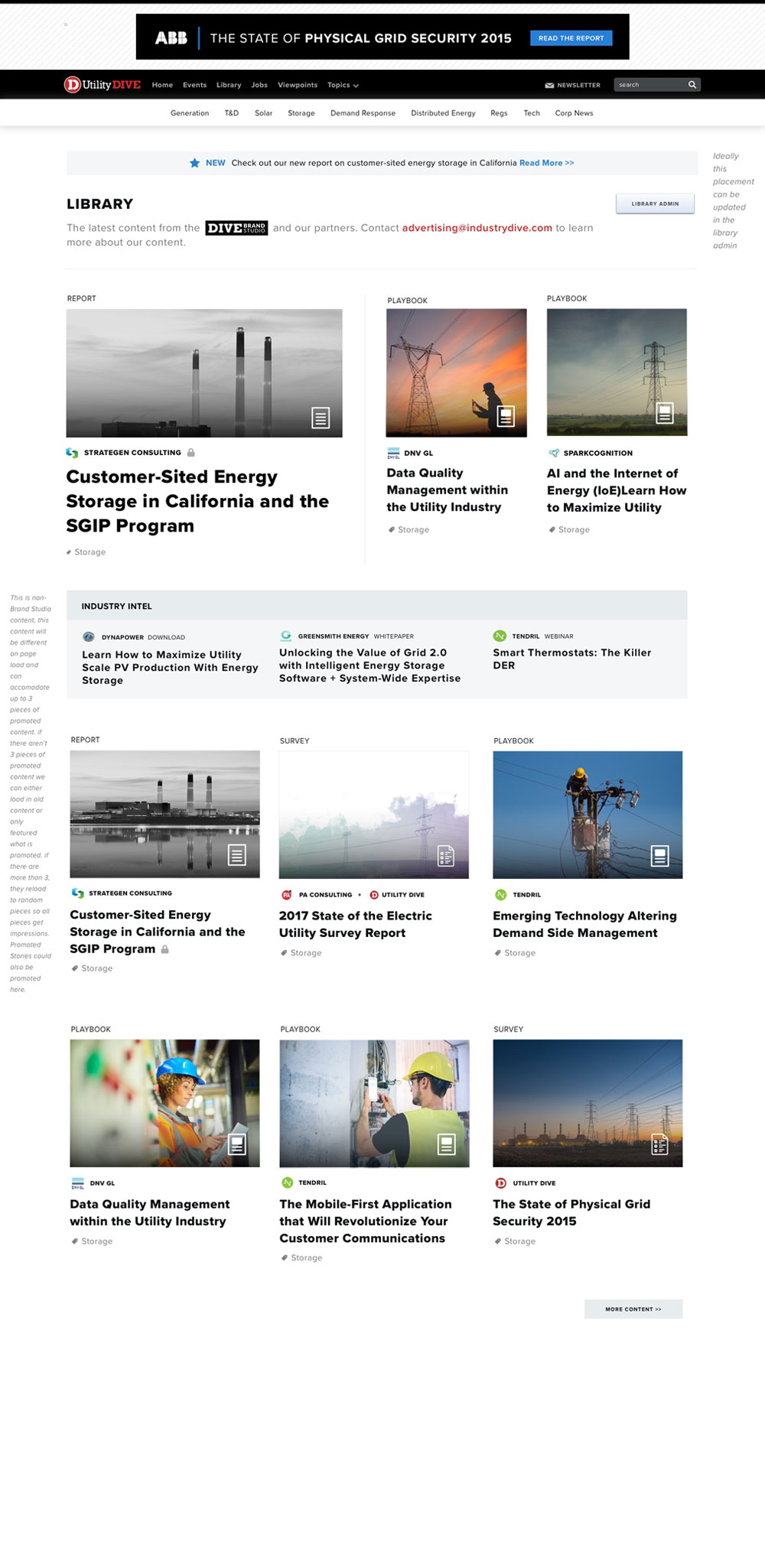 This mock moves client content up the page
Implementation
I knew this would be a large tech undertaking so after meeting with a developer, we prioritized what should be in the first release of the page:
- Adding photos to each item
- Differentiation between client and Brand Studio content
- Back-end refactoring to make the CMS process easier for users
This way, the back-end could be restructured before adding new larger features, such as making the content download from our site (not a third-party site).
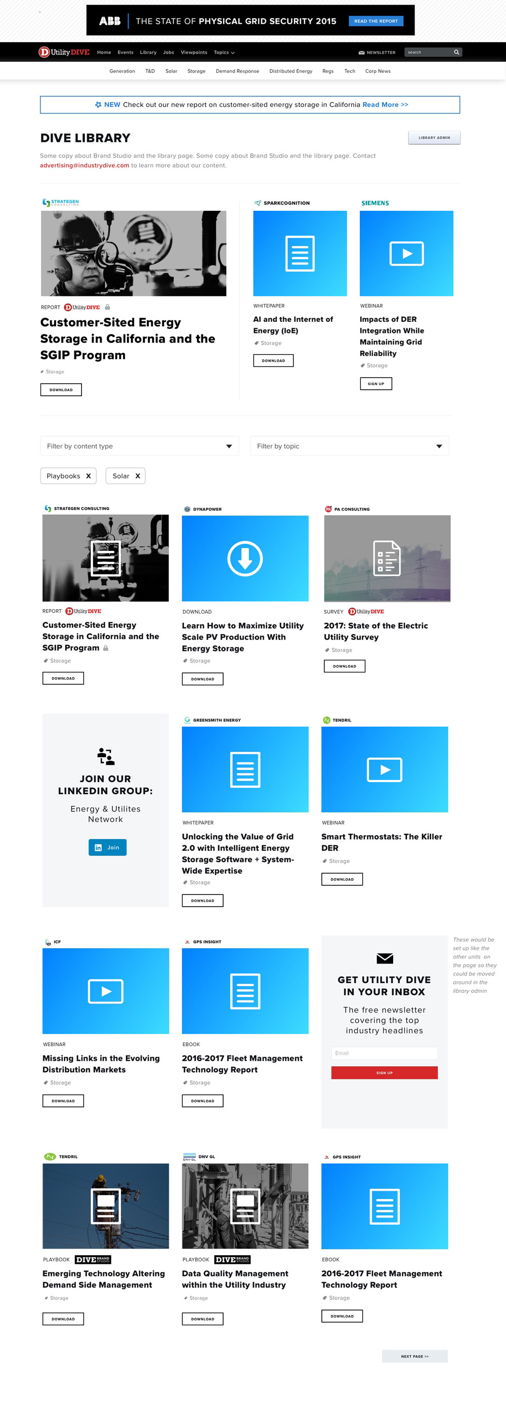
Rollout
The final product for the MVP looks relatively similar to the final mocks. The one difference is that instead of having the icon overlay on the photo, the icon along with CTA text appears on hover so the user can see the whole photo. Also the styling of the "Industry Intel" (i.e. the client content section) is slightly different.
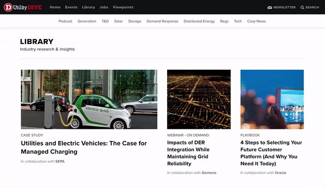 MVP on desktop
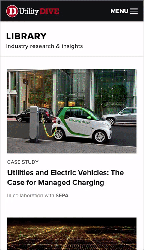 MVP on mobile
Next, I will look at engagement on the page and make tweaks accordingly as well as pushing forward on making the download process more seamless.
Development work for this project was done by Bethany Morin. This post was originally published on Industry Dive's Design Blog.