News quiz
May 20, 2021
History
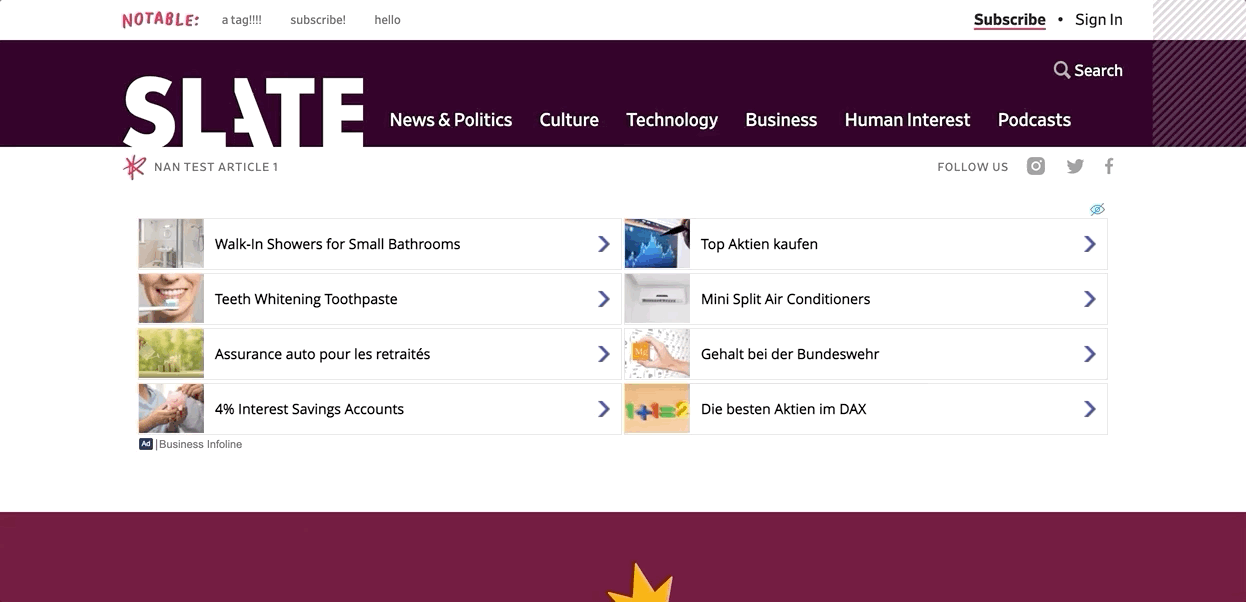
Chris Schieffer and I decided to update the Slate news quiz because it was one of the last features that hadn't be redesigned to fit Slate's new brand. The quiz had been built at least 8 years prior so the interface was outdated and, according to the dev team, the scoring was not secure making it very easy to cheat.
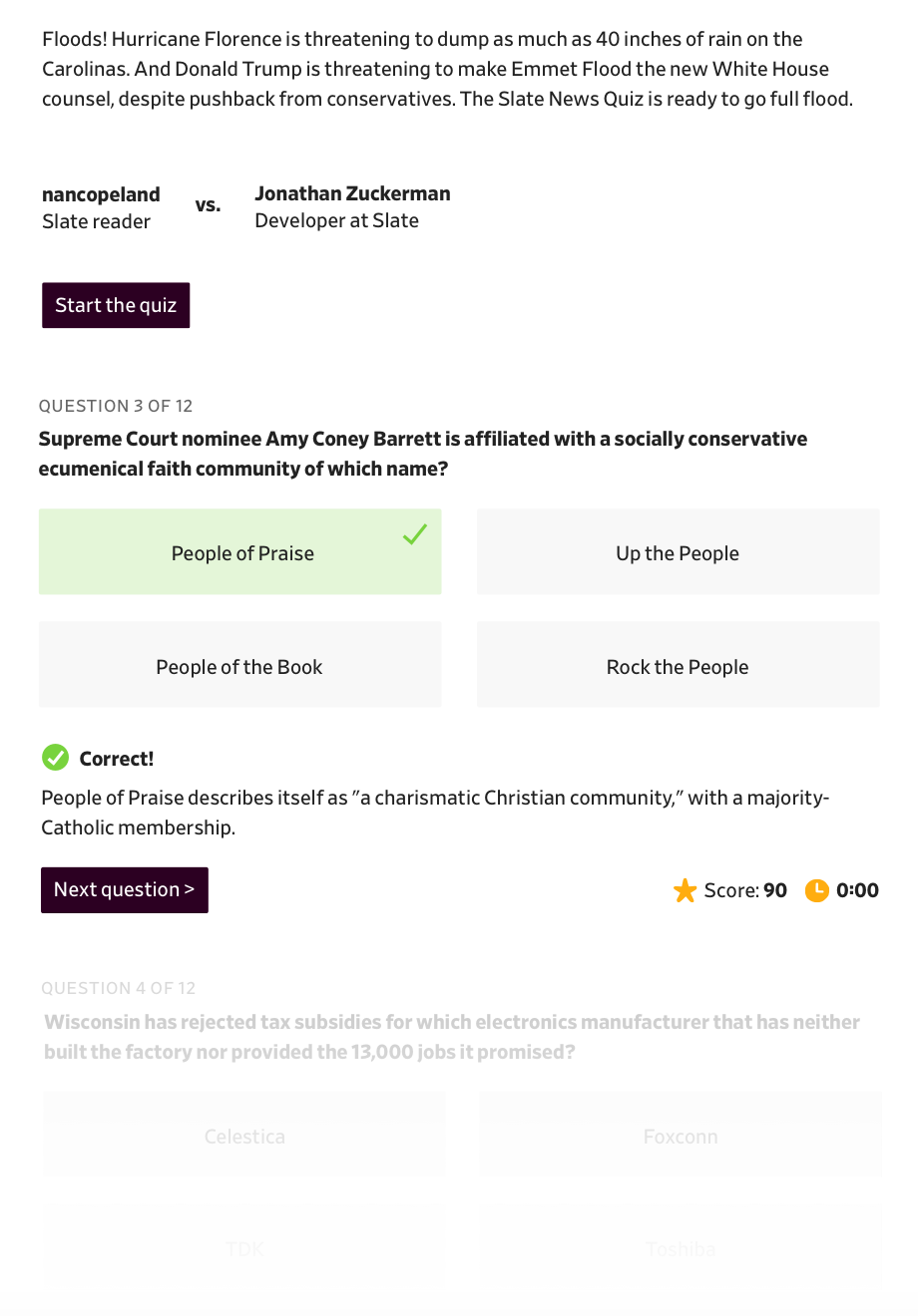
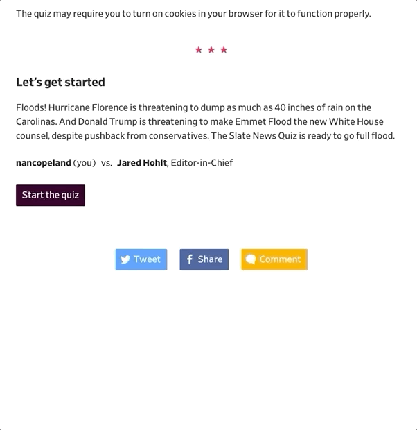
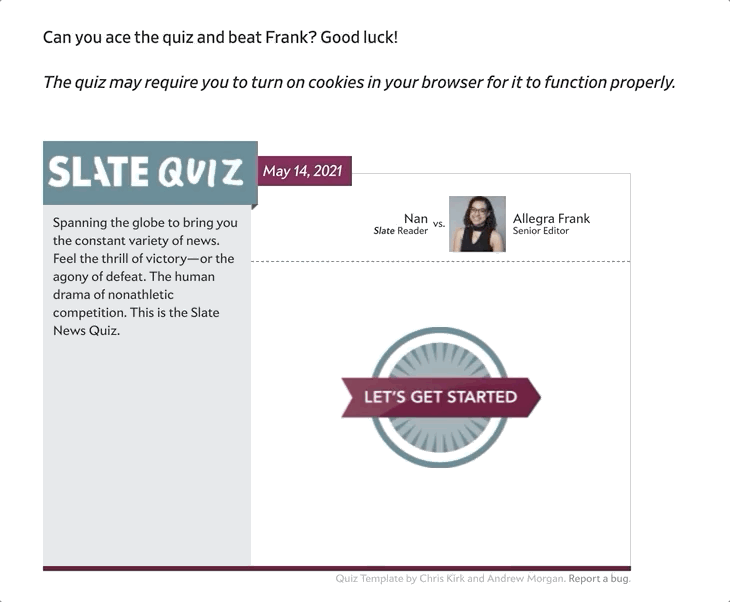 Old news quiz design for the week of May 14, 2021
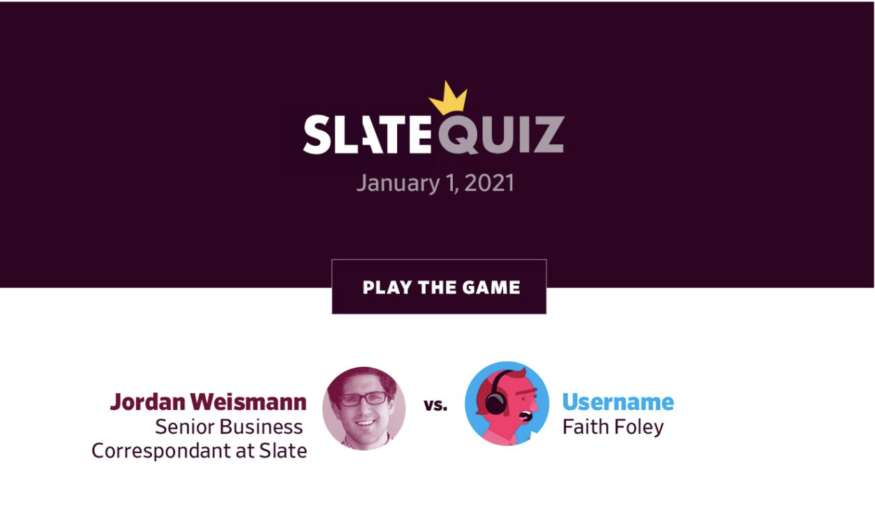
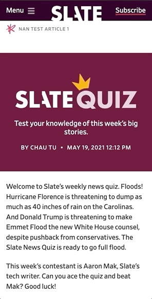
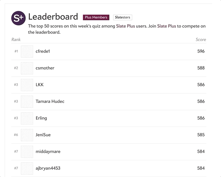 Old news quiz leaderboard
After meeting with the editorial, product and dev teams, Chris and I decided on this list of features for the MVP and post-MVP:
MVP
Features to keep:
- Basics
- Date
- Question
- Answer choices (4)
- Timer/countdown
- Score
- "Play against a Slatester"
- Leaderboard
- Show your score vs. the average vs. Slatester
- Show top scores for Plus members and Slatesters
- Way to review your answers
Features to disregard:
- Coin counter as the score
Post-MVP
- Account registration to take quiz
- Update quiz builder
- Non-news quiz > how is this built differently from a news quiz?
- Will there be a timer for non-news quizzes?
- Leaderboard should be able to be turned off based on "quiz type"
- Show percentage of readers that got each question correct
CMS
The old quiz was built with a custom quiz builder and placed in a regular Slate article template via a Clay iframe component. I, like most people, am not a fan of iframes because they make the experience feel unnatural so I wanted to convert the quiz to its own Clay component(s). The dev team overruled me on this because updating the quiz builder would be very difficult but assured me we could improve the iframe experience. This was important to know up front bc I needed to design for two different implementations:
- Clay template - are we using the regular article template or a new "quiz" template?
iframe- how the questions and leaderboard are added to the page
Wireframes
I started by laying out the current user journey of the news quiz to make sure I designed for all the various states.
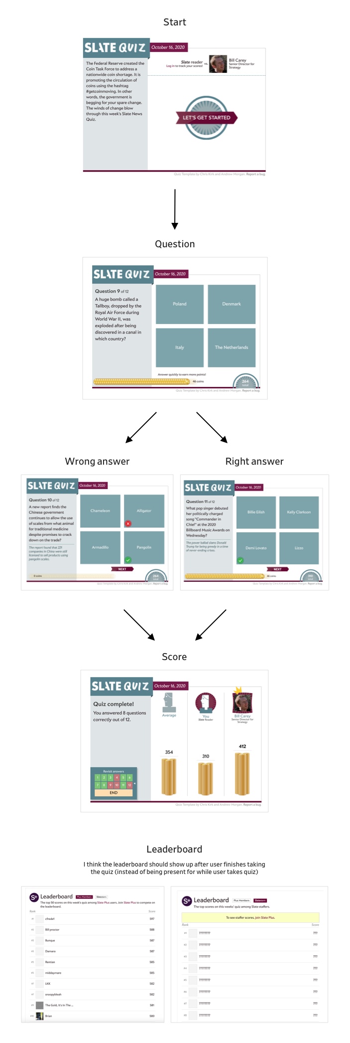 User journey
The first thing I knew I wanted to change about the old design was the powerpoint "slide" layout. Why hide the questions with a slide when they could build down the page for easier review at the end? I also knew I wanted to orient the questions on top of the answers (instead of side-by-side) because that is a more natural orientation for mobile scrolling.
 Wireframe idea that shows the timer and score in the top right and a preview of the next question greyed out below
 Wireframe idea that shows the correct answer, the timer and score in the bottom right and a preview of the next question greyed out below
I thought the transition between questions could be similar to the Typeform forms minus the difficult scrolling back up to see previous questions.
 Typeform demo
For the "end of quiz" experience, I knew I wanted to orient the score comparison chart horizontally (again, better for mobile). For the leaderboard in the old experience, you had to be a Slate Plus member to be on the leaderboard and to see the "Slatester" scores but anyone could see the Slate Plus member scores. This was a bit confusing so I thought I'd just make it so you have to be a Slate Plus member to see the whole leaderboard.
 Leaderboard being blocked by a prompt to sign up for Slate Plus
 Leaderboard visible because user is a Slate Plus member
User Testing
Once I decided on a wireframe and general experience, I thought it would be best to user test it before getting too far along. I thought the quickest way to test this in person would be to talk to internal Slate coworkers. I showed them the old quiz experience vs. the new quiz experience and asked them to compare.
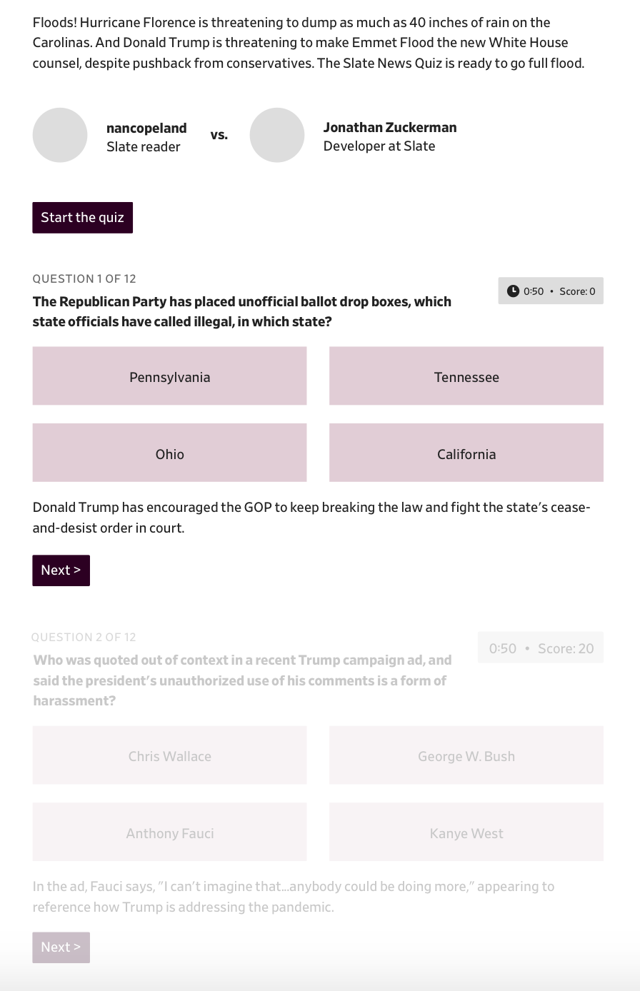
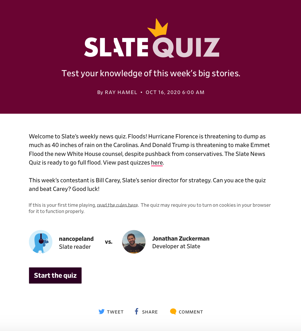
Old news quiz experience
 New news quiz experience
Users liked the new experience but missed the Slate-y whimsical design of the old experience. Users also indicated that the timer and score were a bit confusing, probably because of the removal of coins in the new design.
While the experience I showed users in this round of testing was a wireframe, I thought I should meet with Slate's art team to see if they had any suggestions on how to make the experince more whimsical. Natalie Matthews-Ramo suggested making the whole news quiz page feel more "special" with a banner at the top and generally adding more color to the page. She also suggested adding a circular timer that is only visible when the user is being timed.
 Beginning of quiz with banner at the top
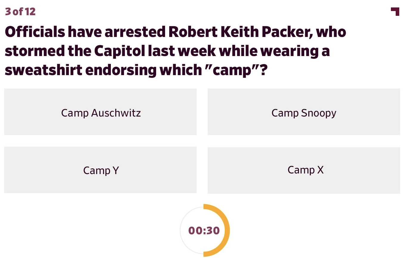 Question layout with timer counting down
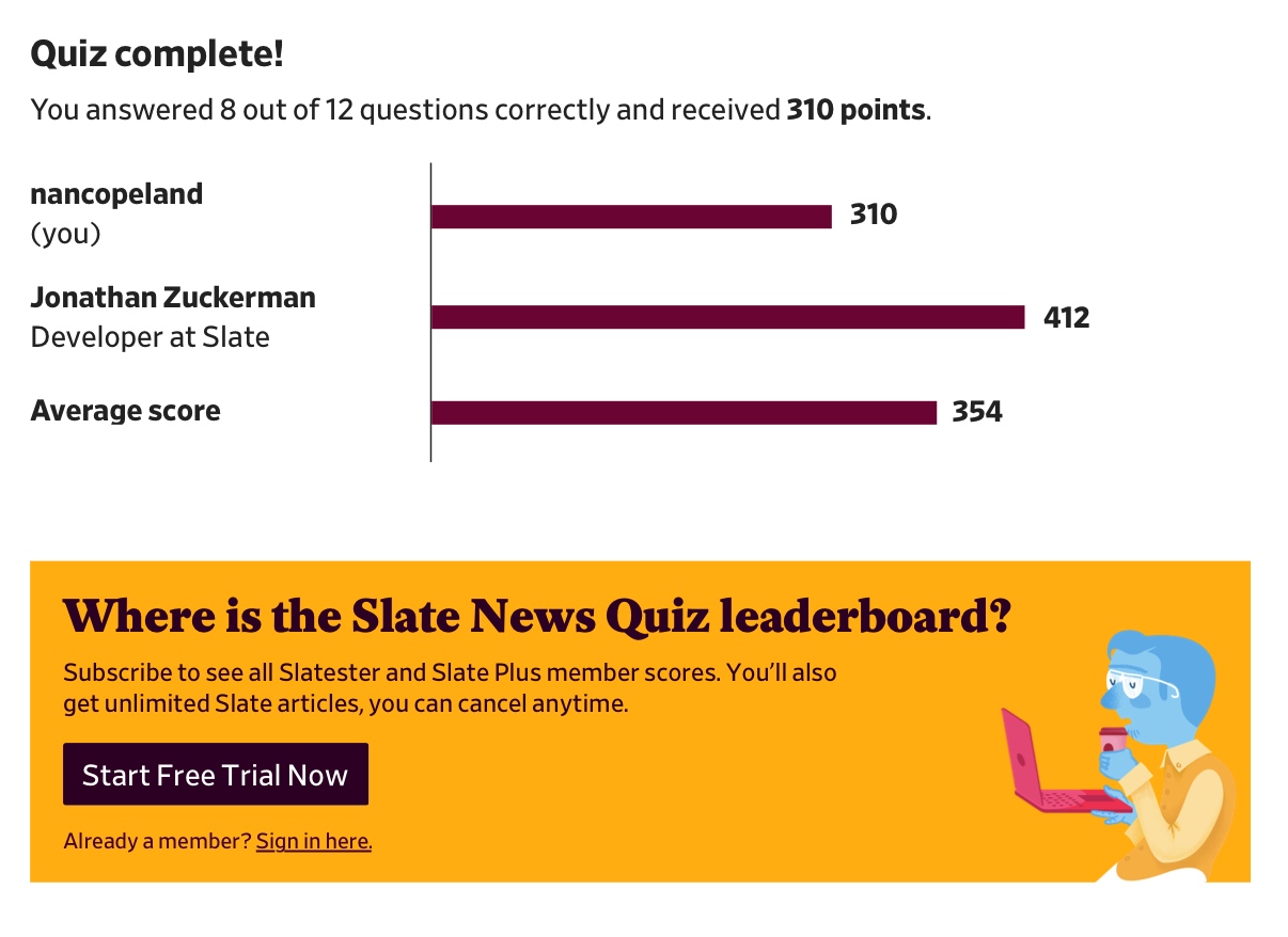
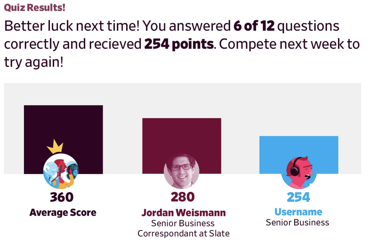 End of quiz chart comparing scores
I knew that adding the top banner would be a template change and not easy to do for user testing but I could incorporate the timer and some of the smaller design elements for the next round of testing.
For the next round of testing, I decided to test Slate readers who are frequent Slate News Quiz takers. Because these users were so familiar with the old news quiz experience, I decided to just show them the new experience and refer to the old one if necessary for comparison.
 New experience with design updates
Users missed the old experience but didn't think the new experience was difficult to understand so I proceeded with building this experience in a new template.
Final result
Editorial, product, dev, art and I all decided the new experience in a new template was a great idea. It was easier to use than the old quiz experience but still felt special and differentiated from a regular Slate article. But, I wanted to user test it one more time to make sure users wouldn't have trouble when it was finally launched.
 New experience in new template on desktop
 New experience in new template on mobile
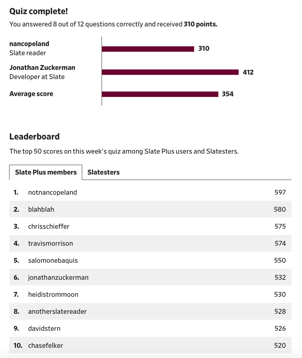
 New leaderboard experience
When user testing this, I noticed a few issues with ads that we needed to tweak for this template and also that the "start quiz" button and the share buttons were similar in size. To fix that, I updated the look of the share buttons to look more like secondary links.
 New template with updated share buttons
This project has not gone live yet but when it does, it will be at slate.com/news-and-politics/the-slate-quiz.
I worked on this project with many people: Product management was led by Chris Schieffer. Megan Wiegand and Abby McIntyre provided lots of valuable editorial and CMS feedback. Development work was led by Jonathan Zuckerman and Iván Felix. Natalie Matthews-Ramo provided me with great visual feedback and edits to make the whole experience feel more Slate-y.