New York Magazine Perks Program
NYC-based perks program for subscribers
I recently worked on the New York magazine perks program which offers NYC-based perks for subscribers. The perks program is primarily an additional benefit for current subscribers but ideally could attact new subscribers.
 perks redemption user experience in the New York Magazine app
Initial Idea
The original idea was each perk would have an Apple wallet pass that each subscriber would add and they would show it at the vendor to redeem the perk. The pass gave the vendor a way to scan the subscriber's perk and make sure that each subscriber only redeemed each perk once.
But, there were concerns that subscribers would add the pass before they were at the venue and then have trouble finding the pass in their Apple wallet.
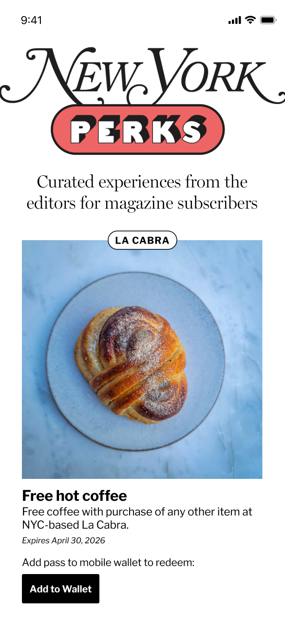 step 1 - "add to wallet" button
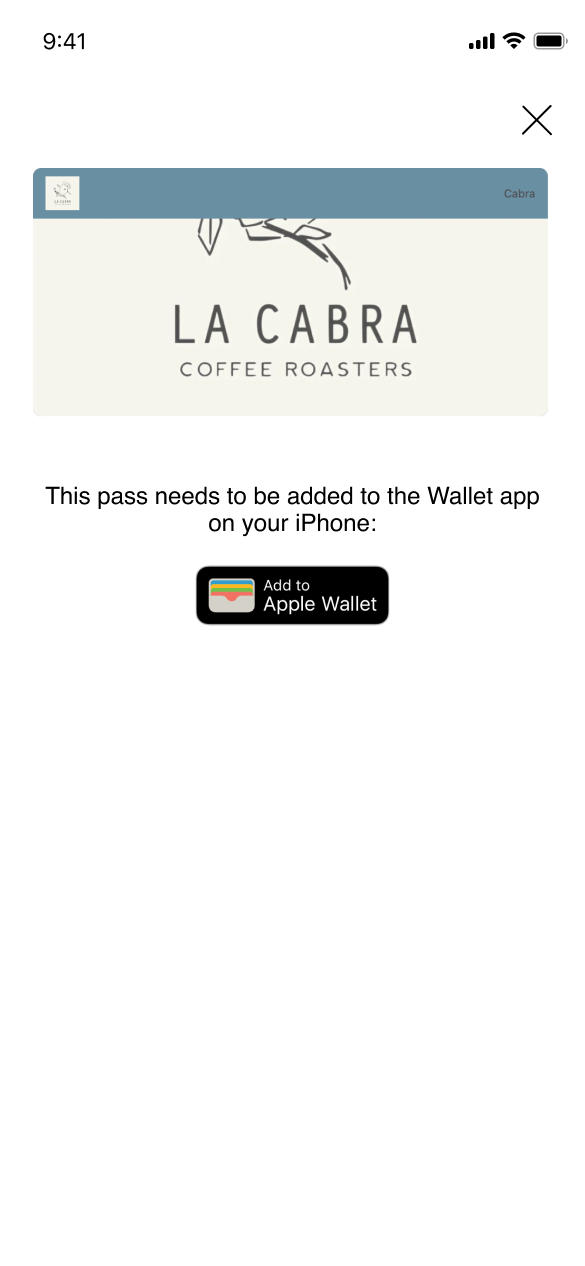 step 2 - 3rd party pass popup
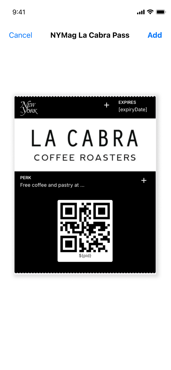 step 3 - native Apple "add to wallet"
MVP Launch
Because of the wallet pass concerns, we decided to design a custom experience that doesn't have a barcode and the subscriber doesn't have to leave the landing page. I added a screen that asked if the subscriber is at the vendor before redeeming the perk and then, the vendor could look at the timestamp to check that the perk was redeemed recently.
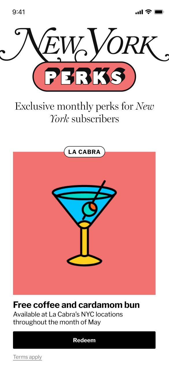 step 1 - "redeem" button
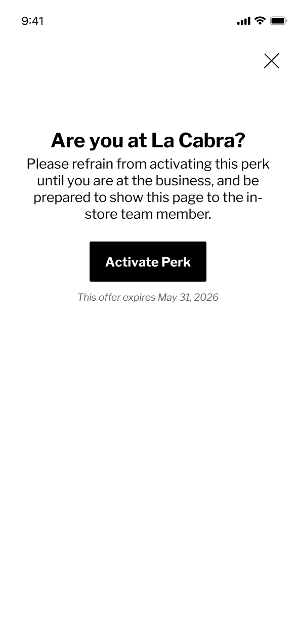 step 2 - "are you there?" screen
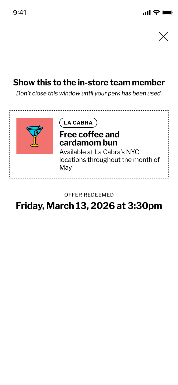 step 3 - redeemed screen
This flow worked but we noticed that with the first perk (free coffee and cardamom bun at La Cabra), subscribers were flying thru the flow and redeeming the perk before they were at one of the La Cabra locations. I needed to add some steps that slowed them down and made sure they were physically at the vendor's establishment.
Post-MVP Refinements
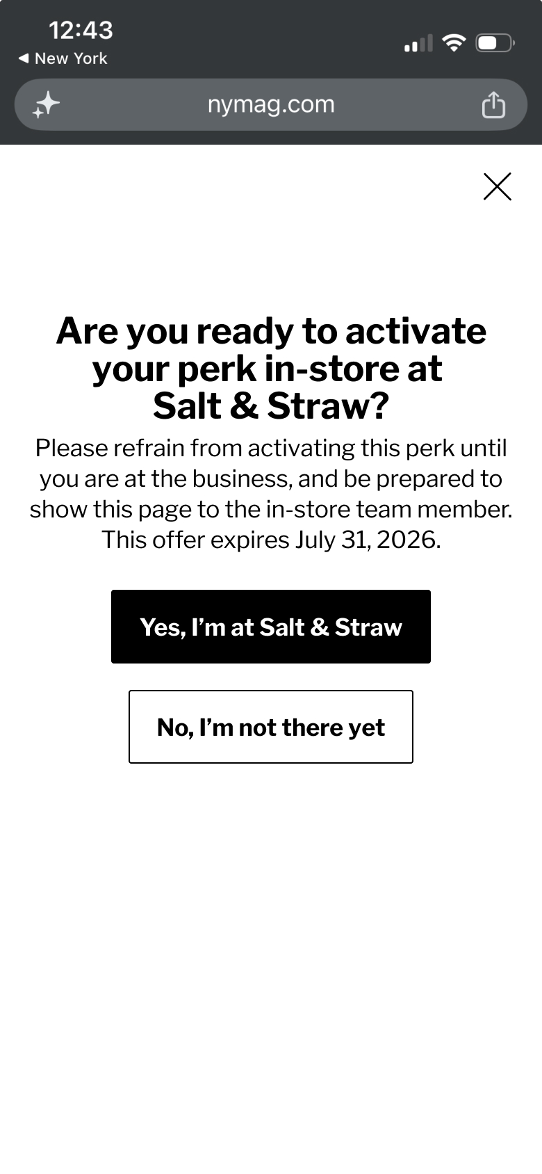
Before the Balthazar perk launched, we updated the flow to ask the user if they were at the vendor and added a "no, i'm not there yet" button. I also updated the initial button text to "redeem in-store". When I showed the new experience to a few users, I noticed users were actually reading the copy instead of just clicking the buttons.
This update resulted in a 98% conversion rate for perk redemption.
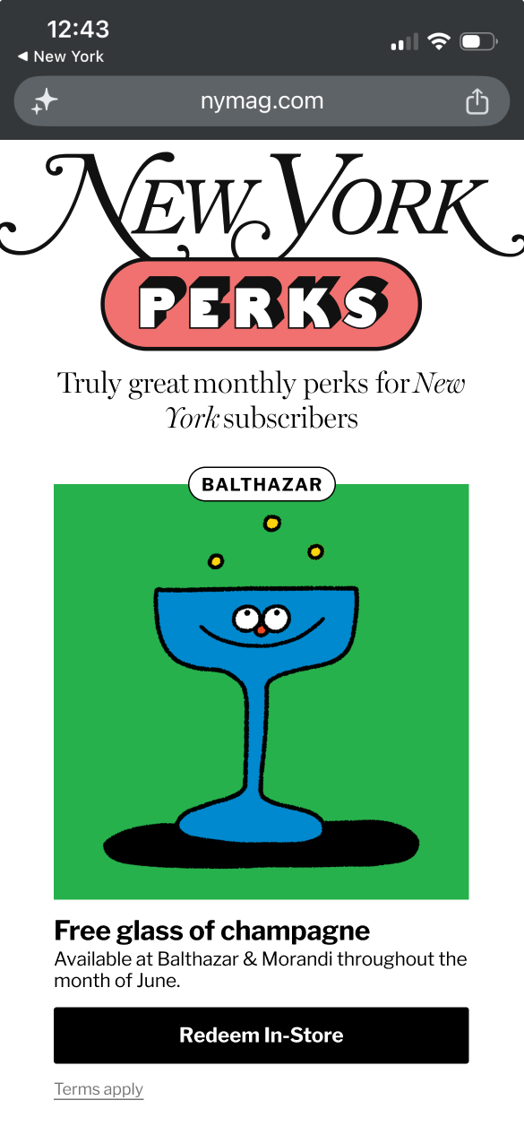 step 1 - "redeem in-store" button
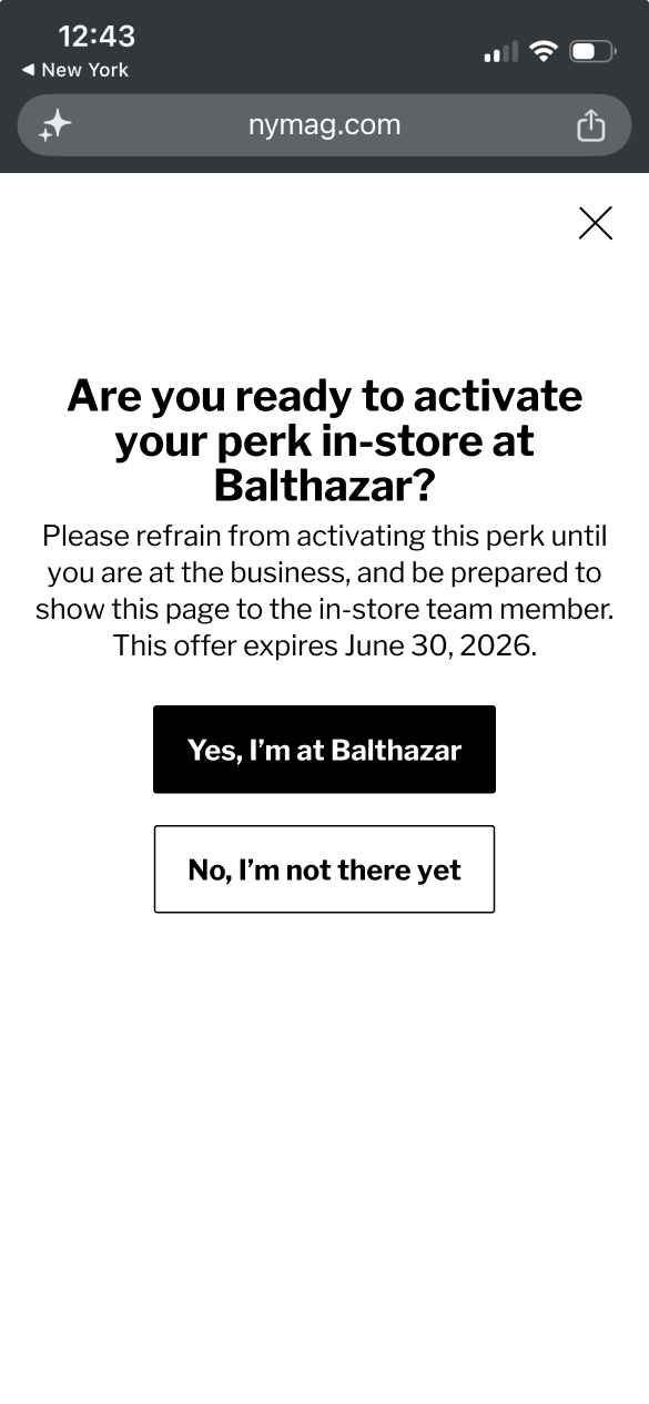 step 2 - yes/no buttons
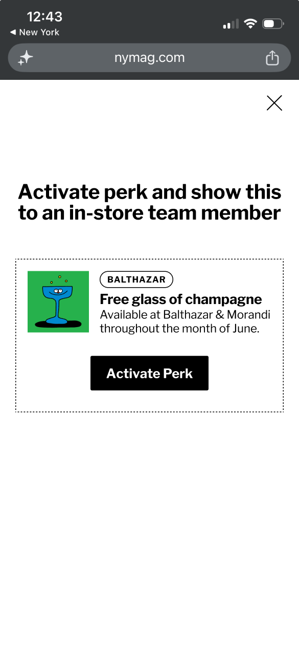 step 3 - activate perk
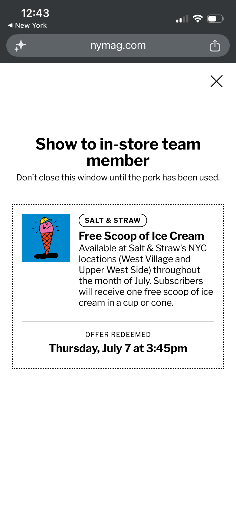
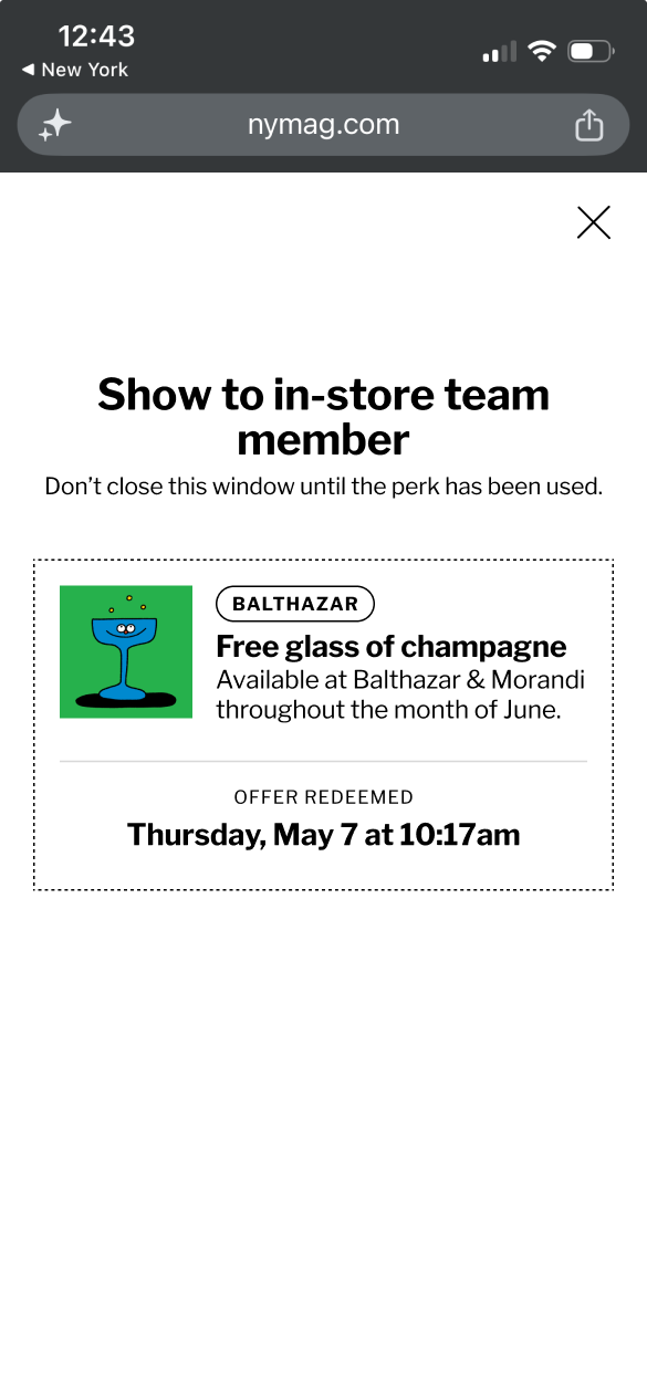 step 4 - show to team member
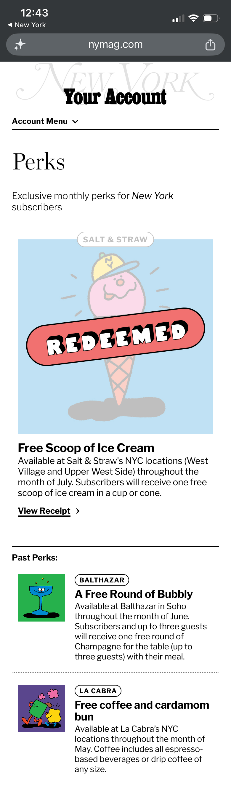
Account Center
The perks experience also works from the account center in case subscribers went there looking for their perks.
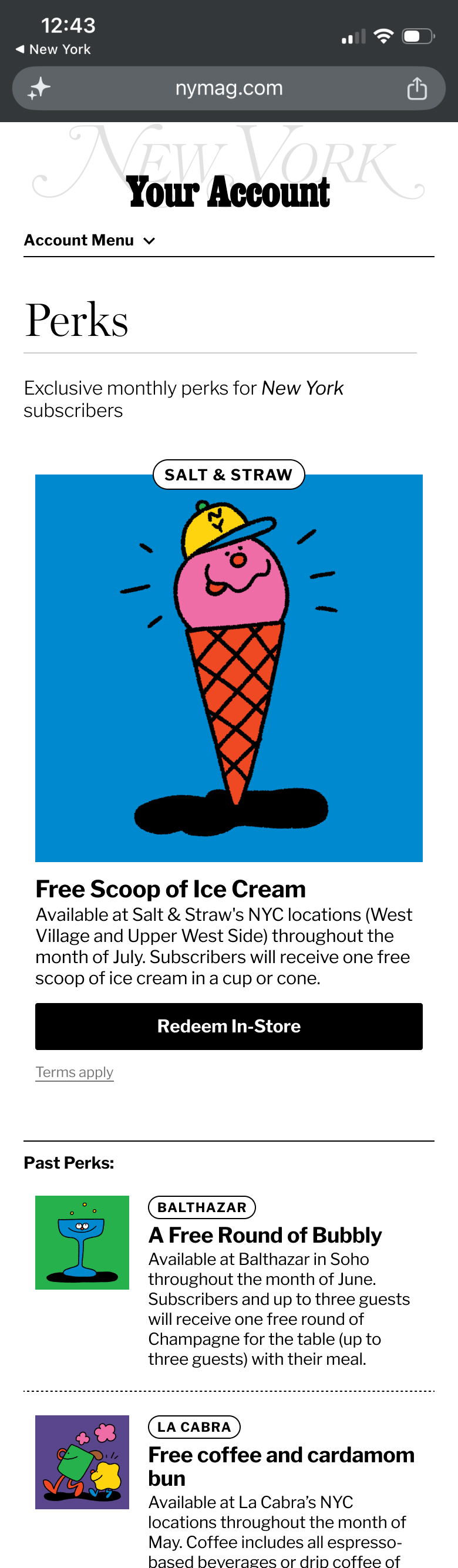 perks experience from NYMag Account Center
 perks experience from NYMag Account Center
 perks experience from NYMag Account Center
 perks experience from NYMag Account Center