Overtone Design System
A new design system for migrating from Chorus to Wordpress
I managed the migration of Vox, The Verge, Eater and SB Nation to the design system, Overtone, that I built 0-1. The migration was part of a larger project where we migrated these sites from Chorus to Wordpress. This project involved balancing design, product, editorial and engineering needs with good user experience and bespoke brand expression for each site. Design management specifically wanted designers to be able to manage the small type, spacing and color details for each site.
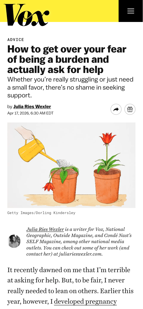 standard article template, Vox
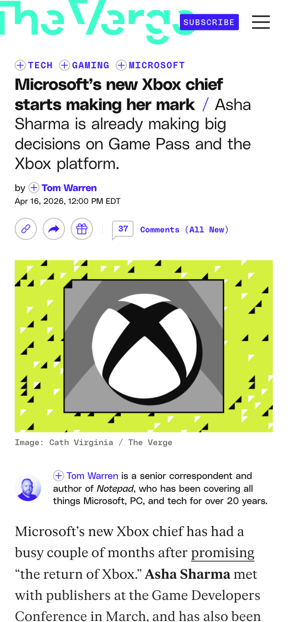 standard article template, The Verge
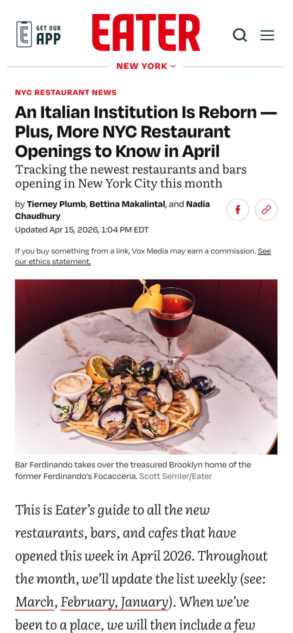 standard article template, Eater
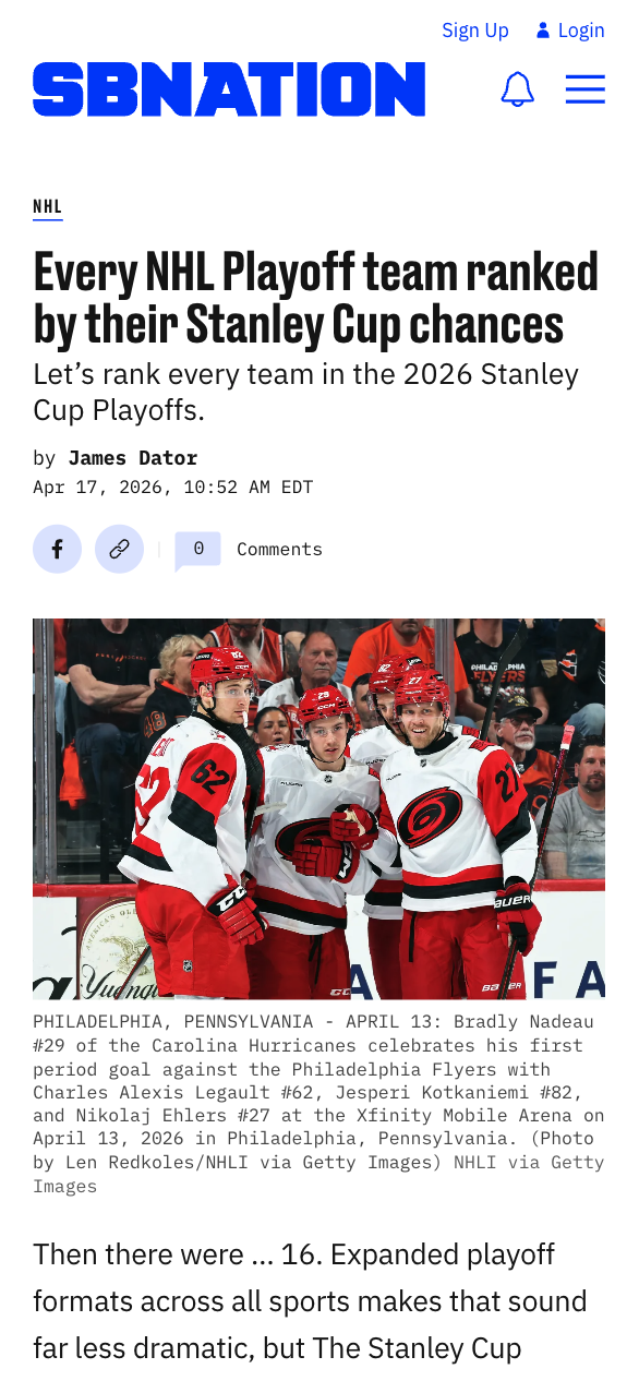 standard article template, SBNation
Project Goals
I spoke with design, product, engineering and editorial stakeholders and we decided on these goals:
- Same front-end system
- Designer-managed tokens
- Well-designed default layouts
- Bespoke brand expression
- System that allows for custom design + engineering work when necessary
Setup & Tokens
The goal was for each site to look good out of the box when it migrated to Wordpress but also allow varying levels of customization, depending on the brand's visual and editorial needs.
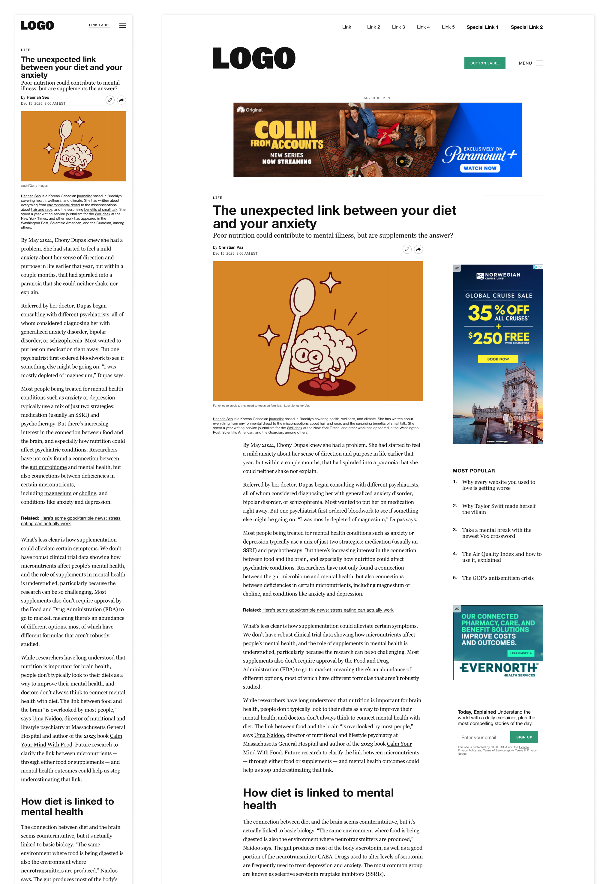 Default standard article template
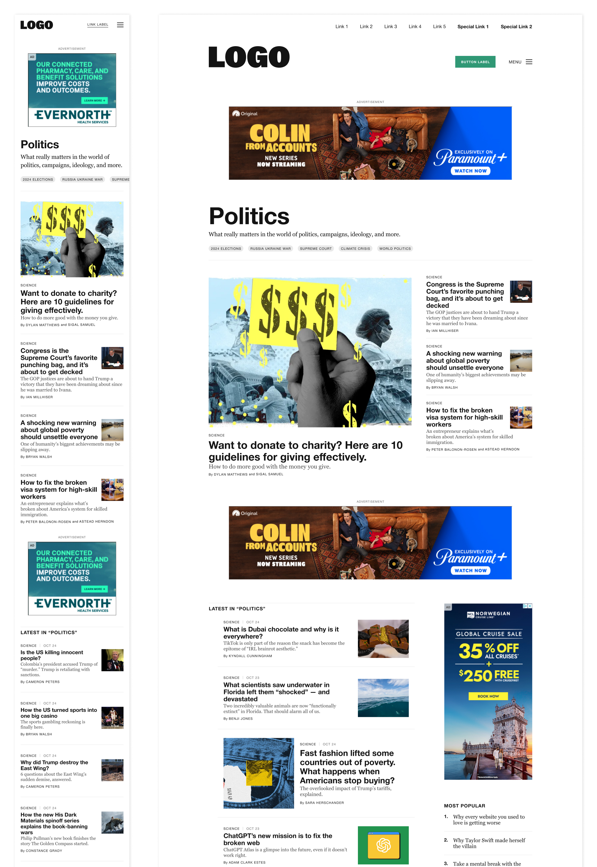 Default category page template
To set up a new site, a brand could set 1-2 fonts and 1-2 colors and use default layouts for everything. But, if a brand wanted to spend a lot more time customizing both their branding and tooling, that would also work within the system.
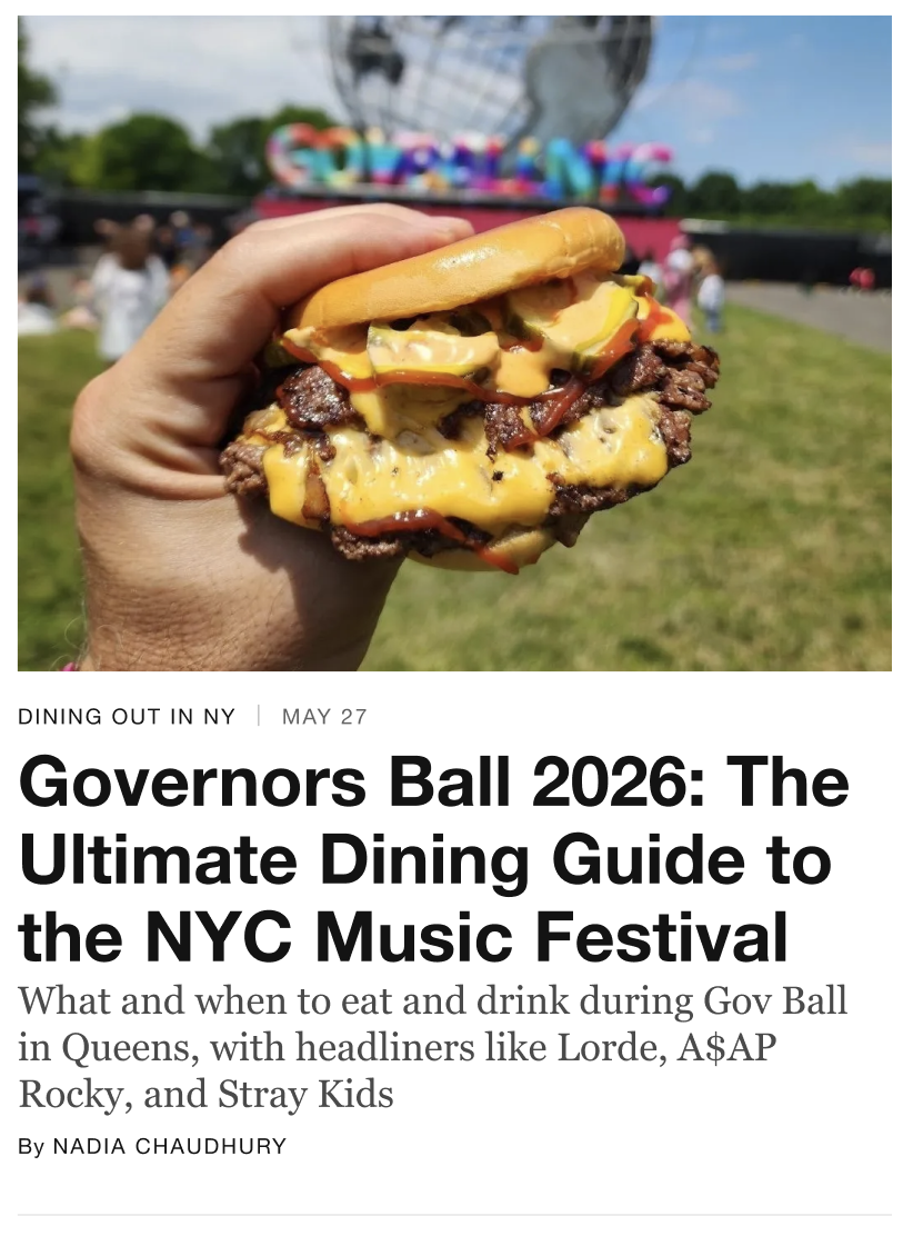 content card, default theme
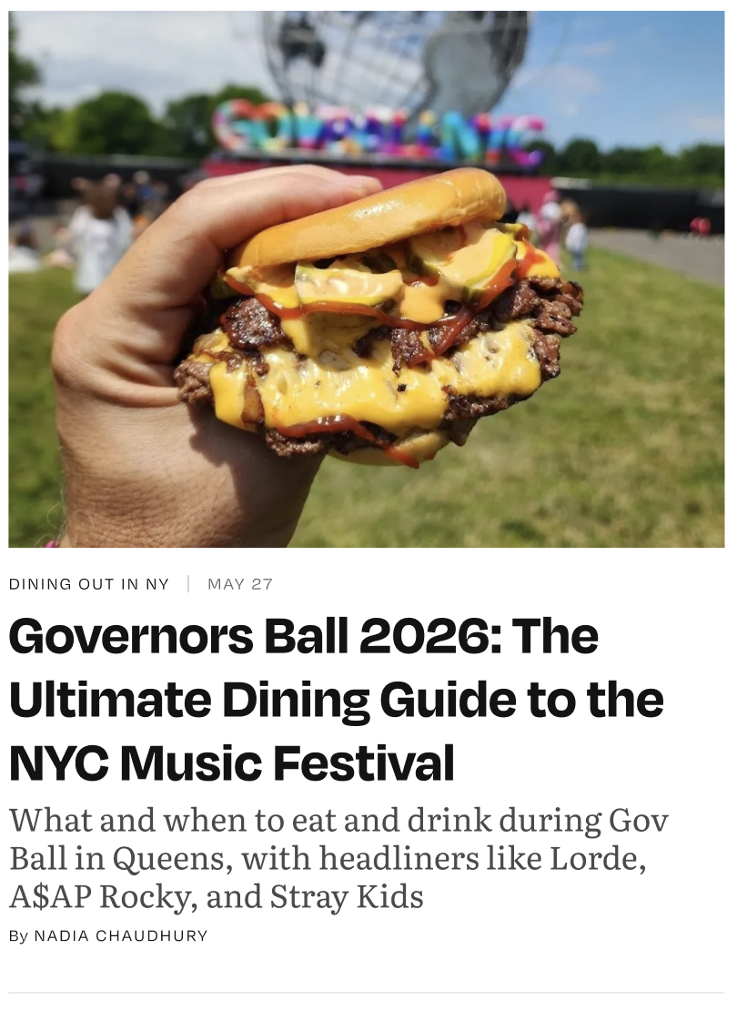 content card, eater theme w/ fonts
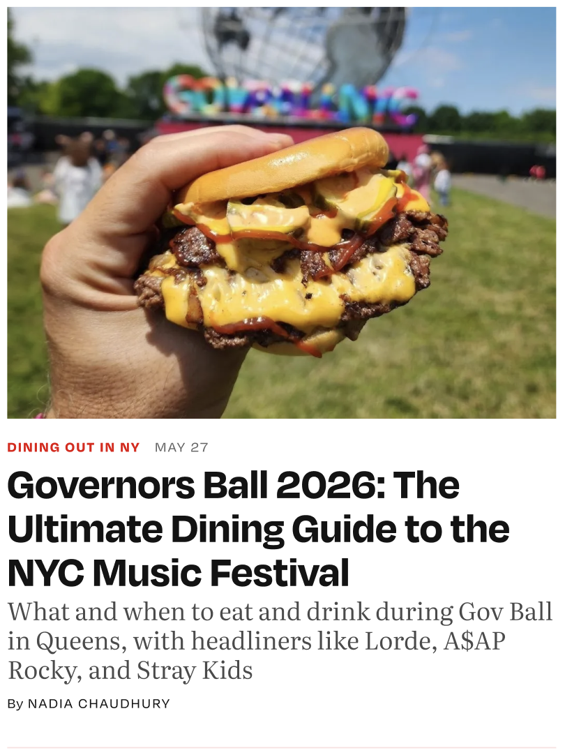 content card, eater theme w/ fonts, colors & finetuning
To achieve this, the system uses shared design tokens that are assigned to shared elements between the sites. The tokens have different styles (aka values) so each site can have different fonts, colors, etc. but be on the same system.
So, in the code, tokens look something like this:
| token name | Vox | The Verge | Eater | SBNation |
|---|---|---|---|---|
sys.color.primary |
#FFF200 |
#5200FF |
#E60000 |
#0033FF |
sys.font.primary |
Balto | Poly Sans | Degular | Druk |
But visually, that looks like this:
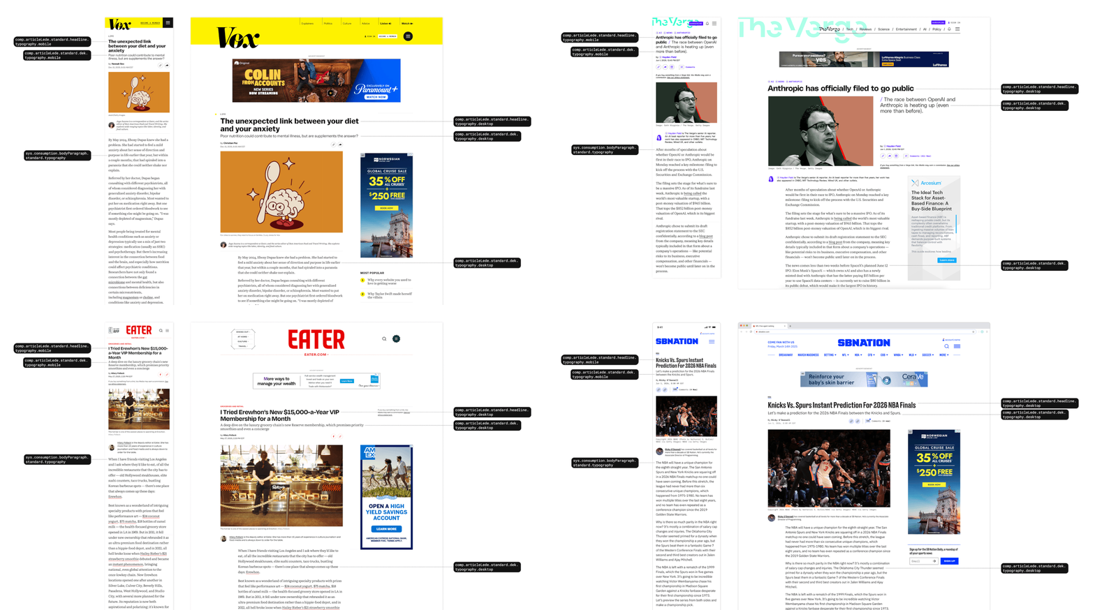 Standard article template on desktop and mobile with a few tokens labelled
Articles
In addition to the standard lede (illustrated above), there are also feature, special feature and overlay ledes and a shared set of article body components. The system used for articles is the most comprehensive and powerful part of the design system because any tooling designed for one brand is available for the other brands, if they choose to incorporate it.
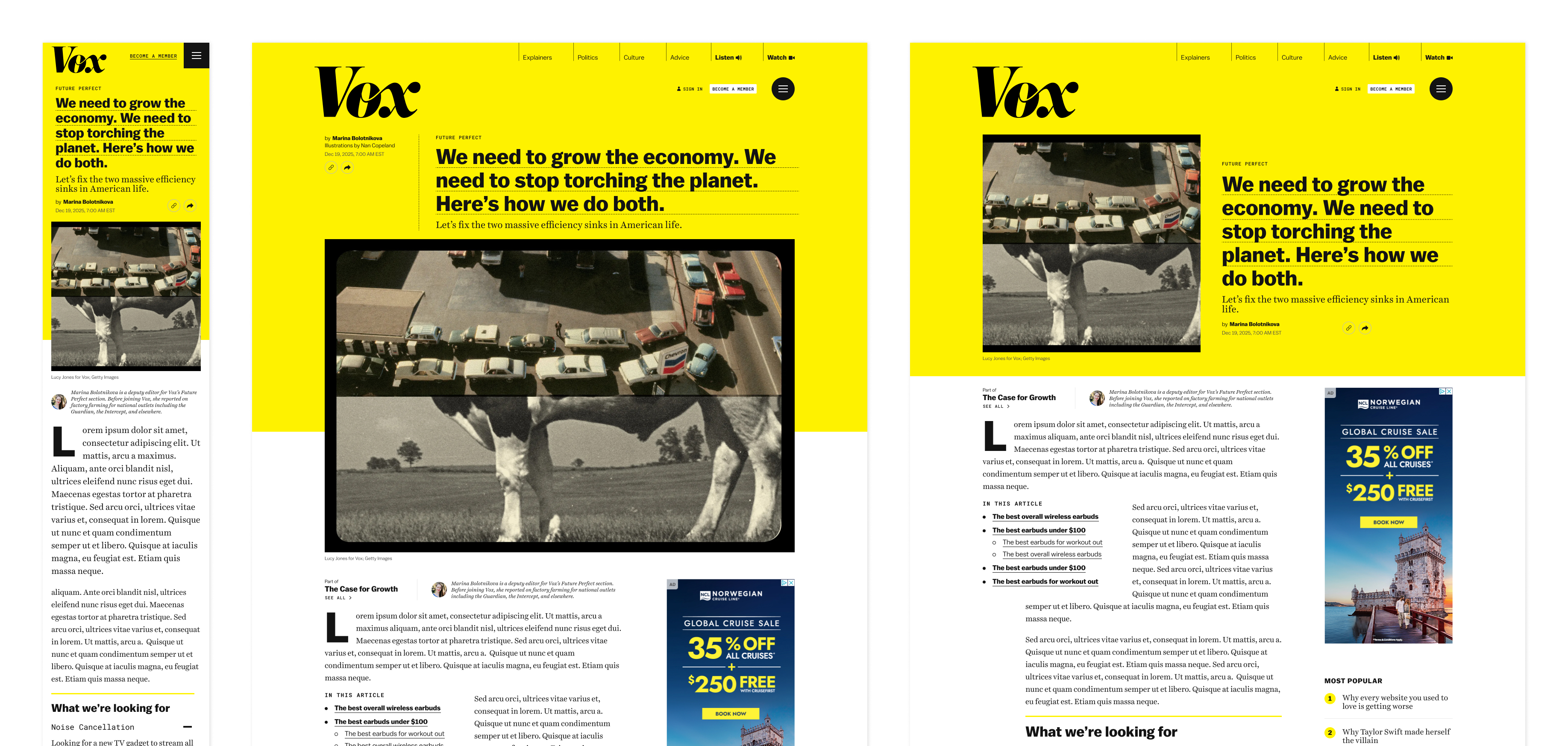 Feature article template on Vox
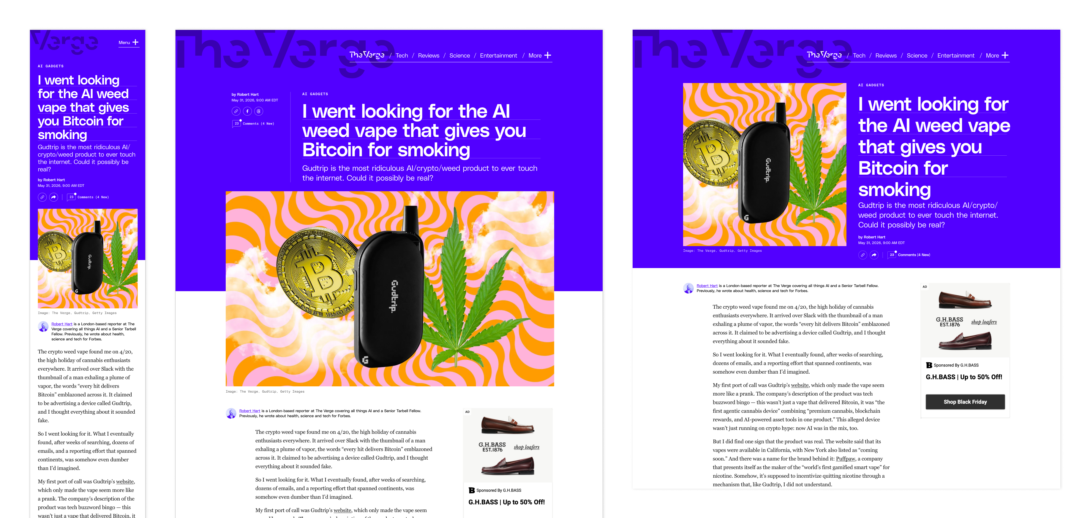 Feature article template on The Verge
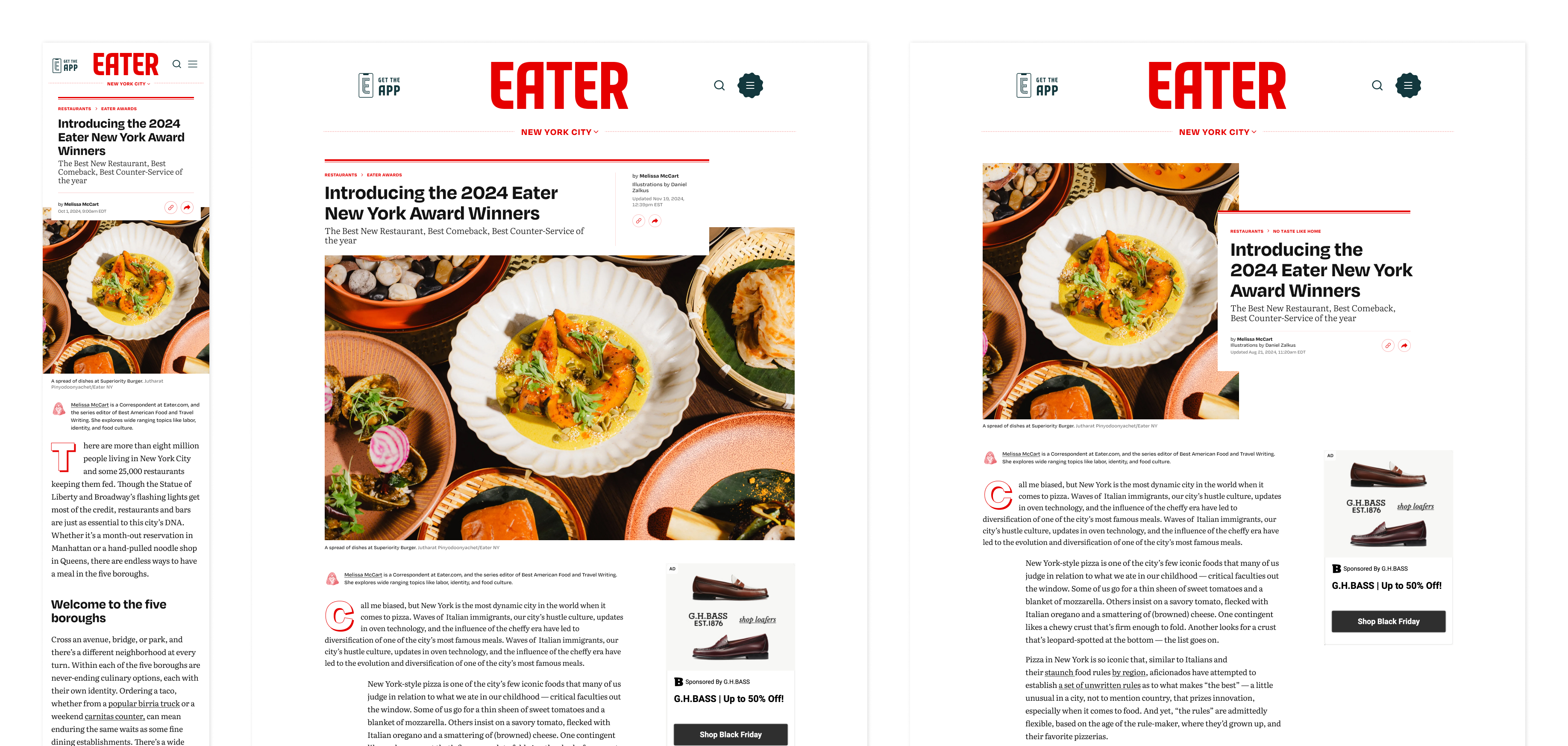 Feature article template on Eater
The article body components are more standardized compared to the ledes but still allow for customization, if the brand chooses to do that.
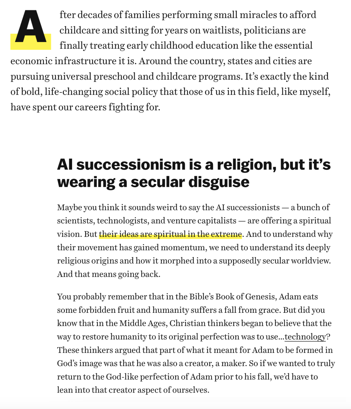 paragraph components on Vox
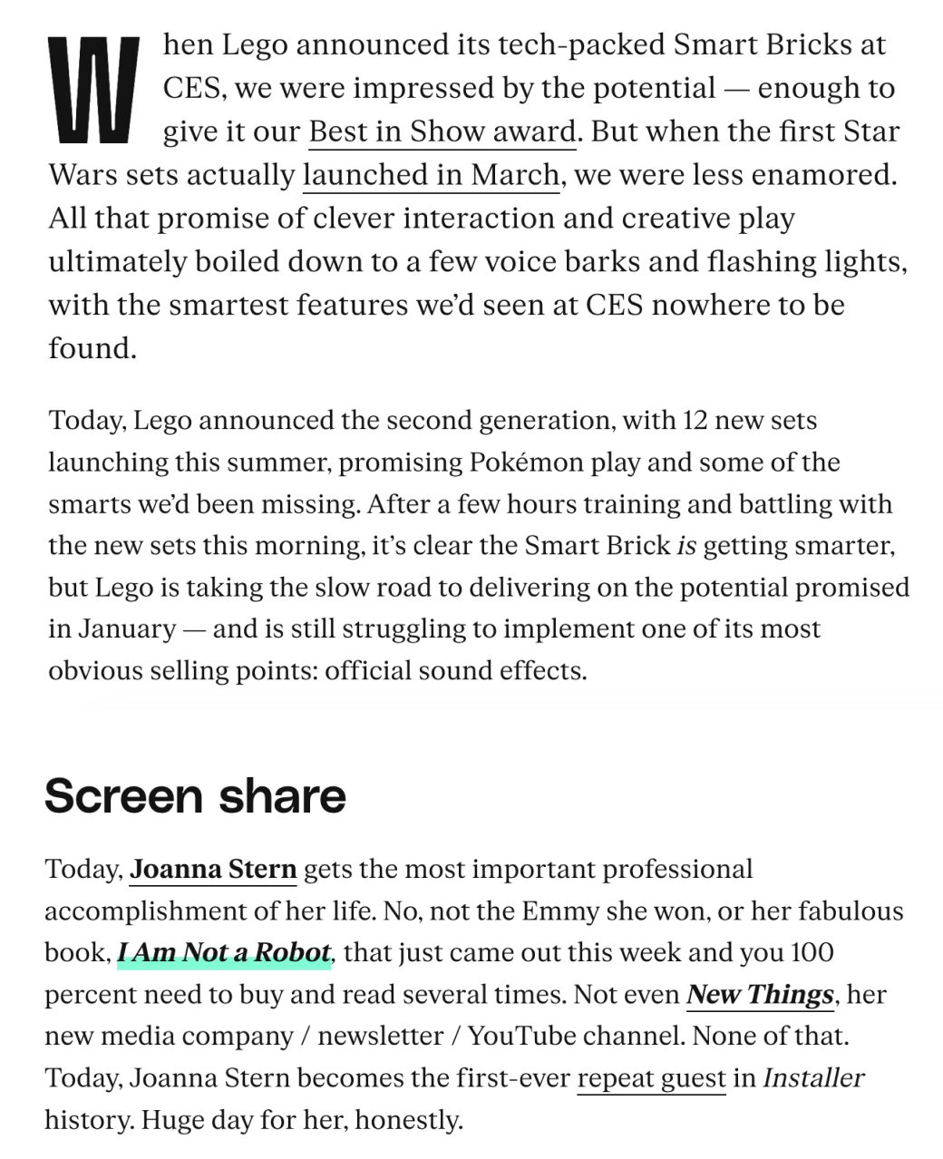 paragraph components on The Verge
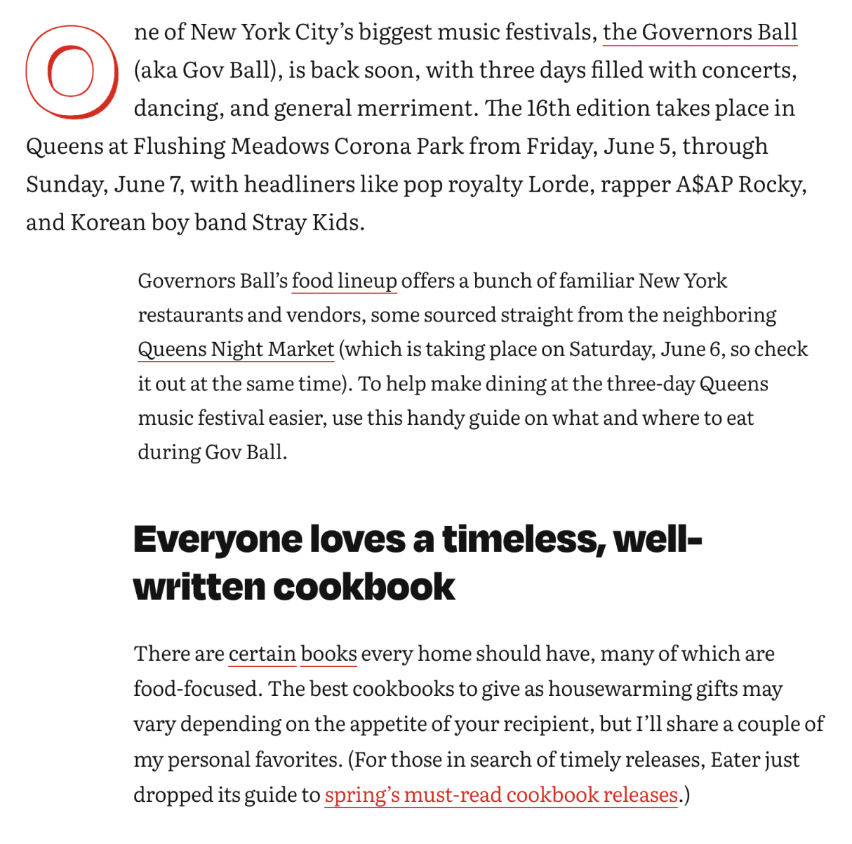 paragraph components on Eater
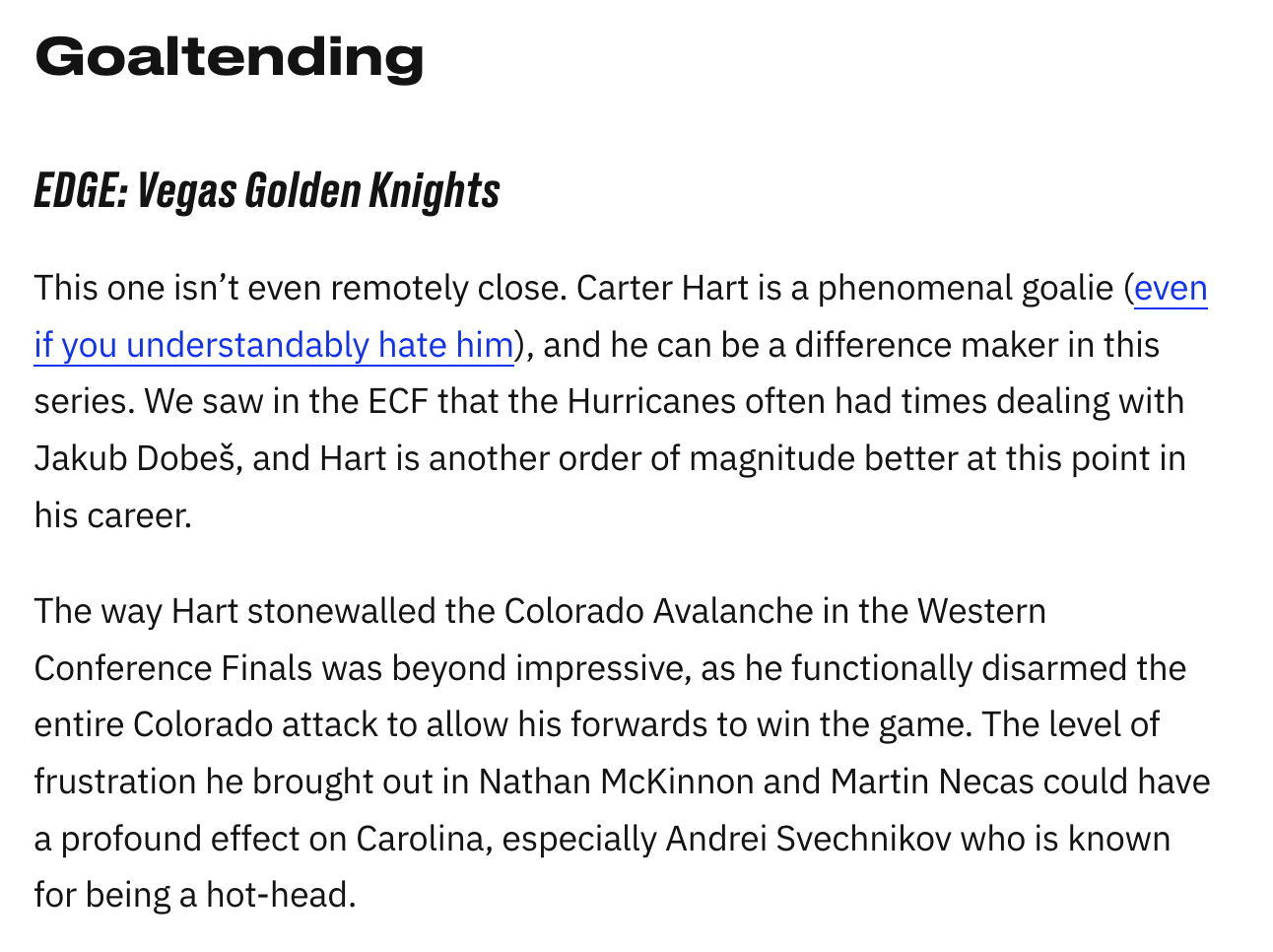 paragraph components on SBNation
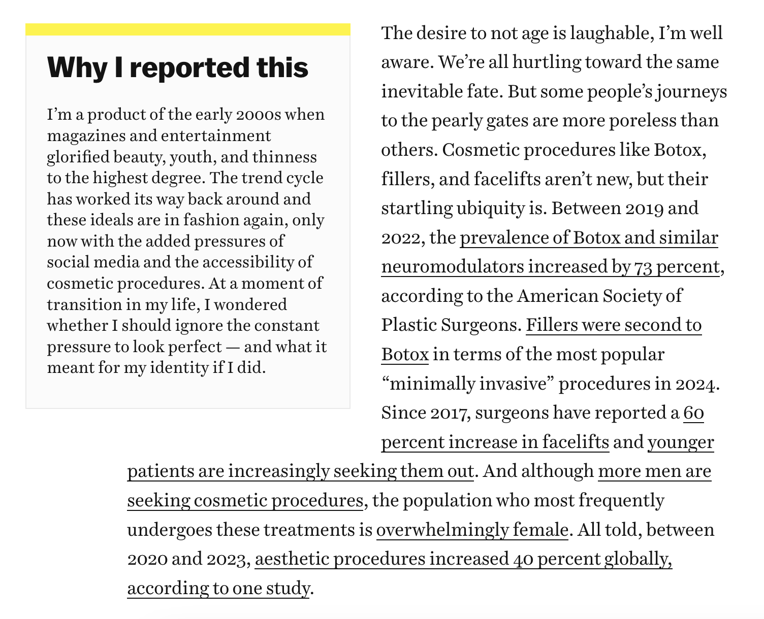 sidebar component on Vox
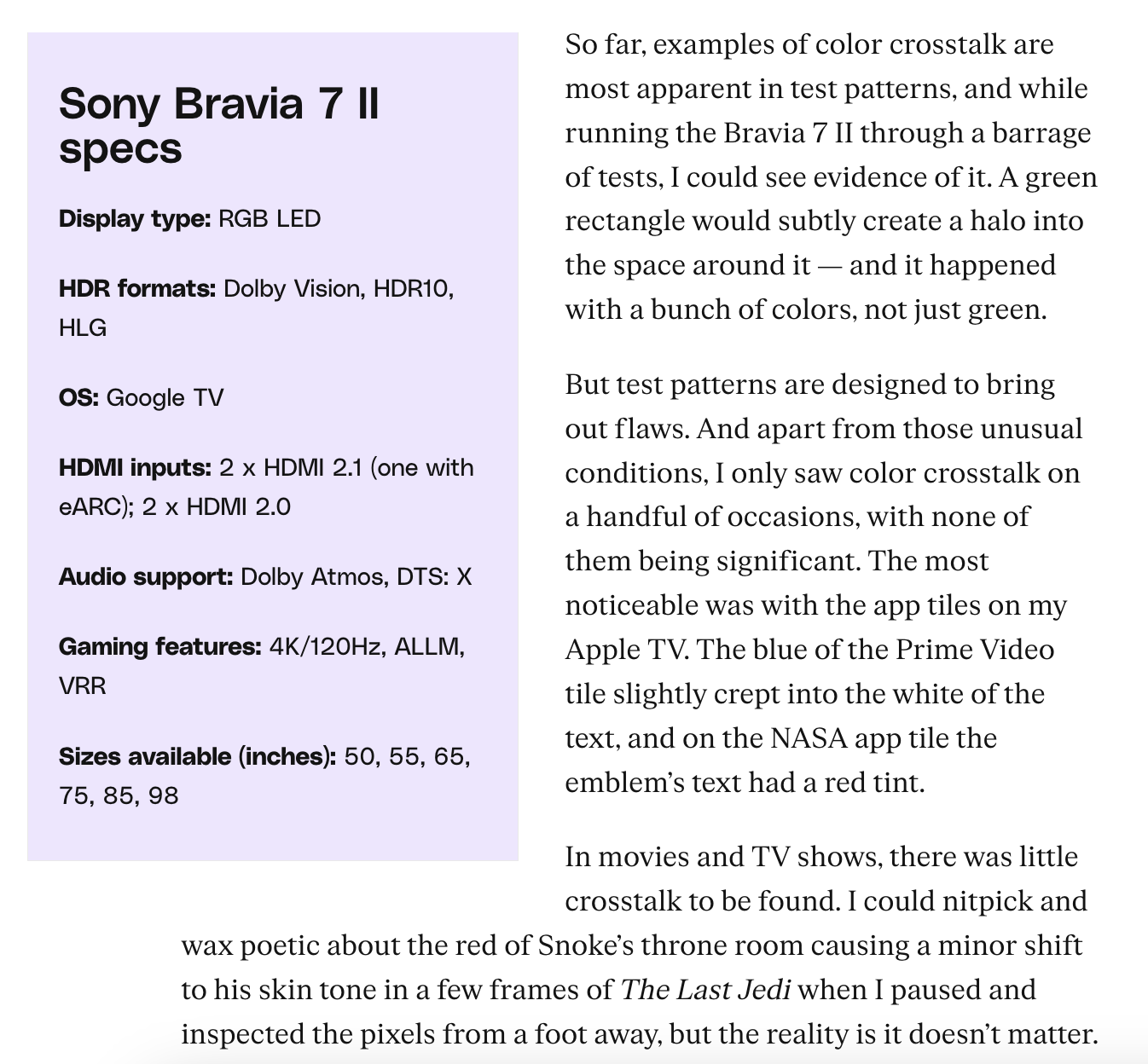 sidebar component on The Verge
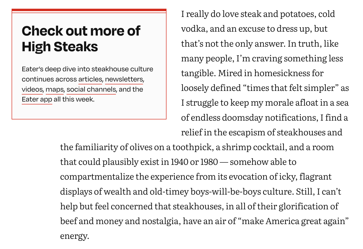 sidebar component on Eater
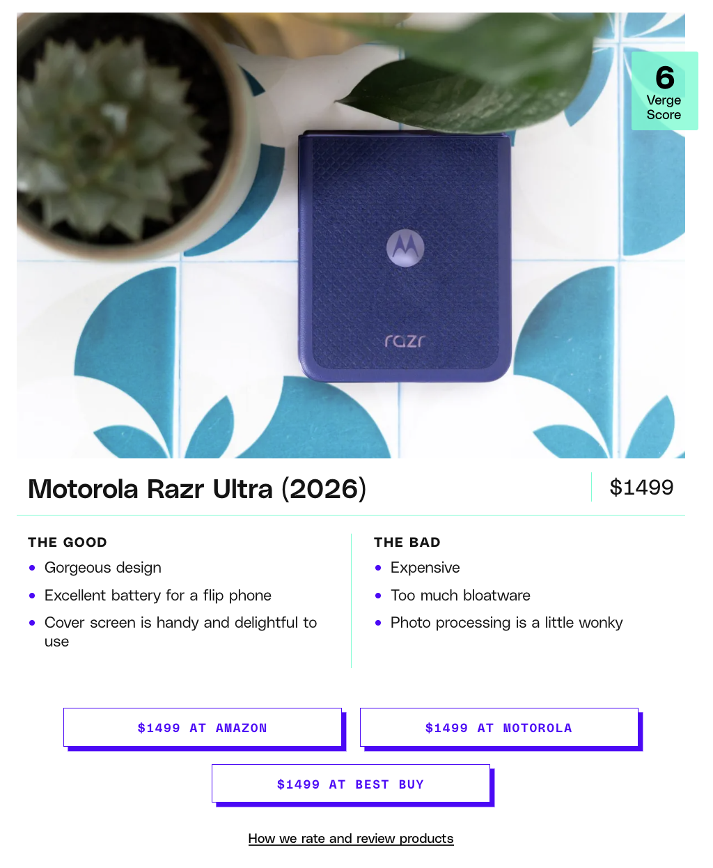 product card on The Verge
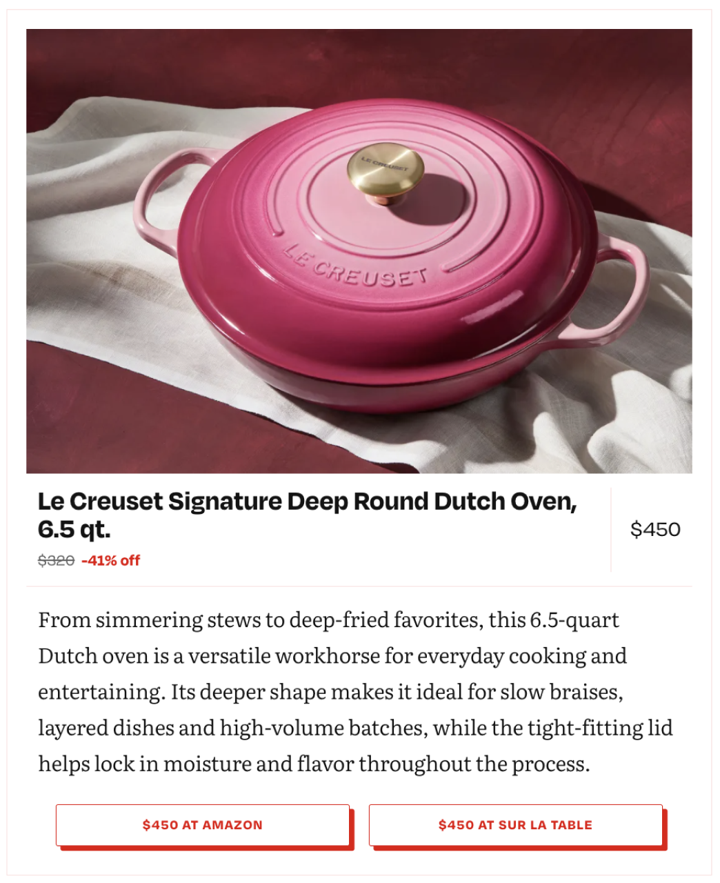 product card on Eater
Homepages & Navigation
Hompages and navigation are 2 of the areas of the system that allow for the most customization. The homepages obviously needed to be different based editorial needs. Vox is more newsy so could use more standard components while Eater focuses on service journalism and city-specific content. The navs are similar but also need to showcase the brand and what it covers because it is at the top of every page.
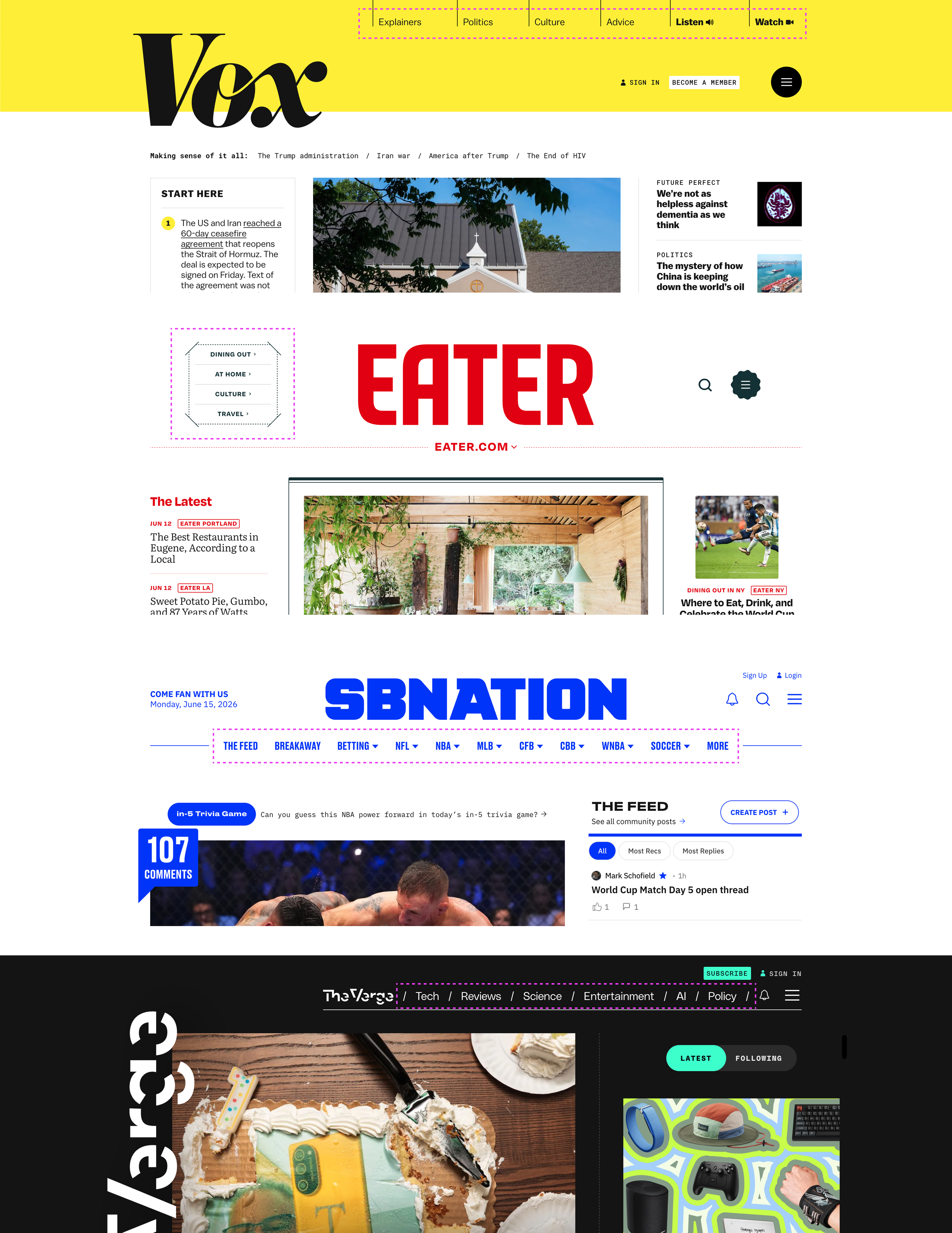 Same list of links in different nav layouts
For both areas, there are a set of shared components that can be arranged differently. This allows for different programming and design layout based on the brand’s needs and visual language.
 Shared components on Vox mobile homepage
 Shared components on Eater mobile homepage
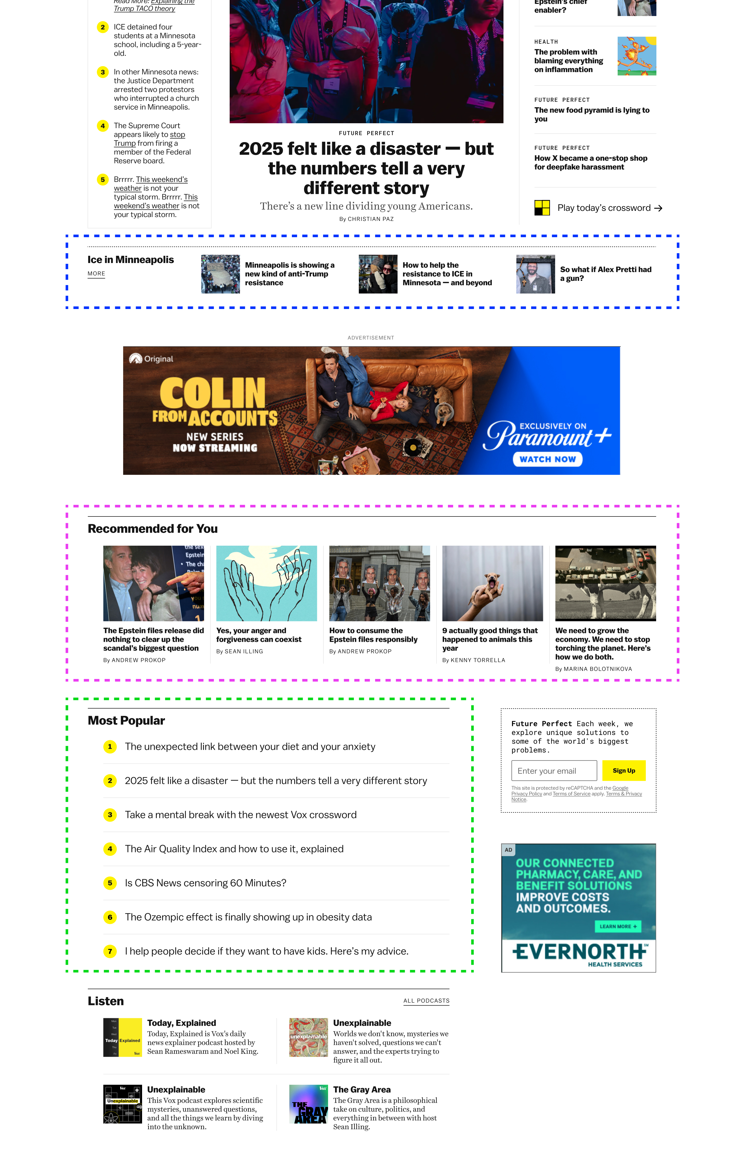 Shared components on Vox desktop homepage
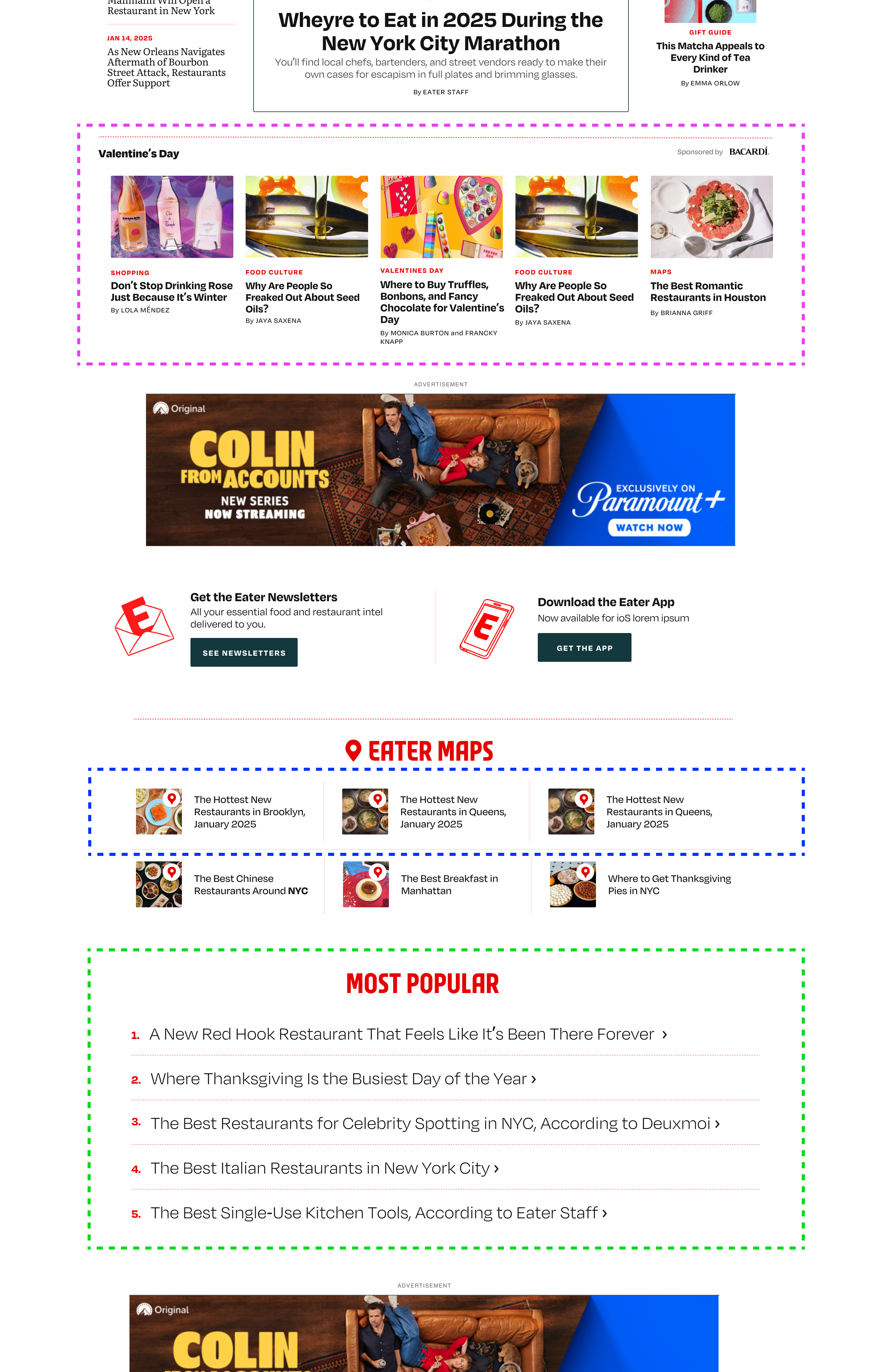 Shared components on Eater desktop homepage