Slate iOS app
Redesigning the Slate iOS app to improve navigation, podcasts, and the Slate Plus experience.
History
Chris Schieffer and I decided to start working on this project after finishing the podcasts project. According to Chris, the Slate iOS app has small but very dedicated group of users but the app was outdated and had many bugs. We didn't want to change the app too much (because of the loyal readership) but wanted to make it smoother and easier to navigate.
The overall goals of the project:
- Improve the Slate Plus experience: landing page and letting a user know they are logged in as a Slate Plus member.
- Improve podcast experience: are we presenting metadata in the best way, what updates should we be making so the app is update to date with podcasts on the website
- Review app navigation and menu: are we surfacing the most important sections of the app in the easiest way we can?
- Update style/brand of app to fit with redesign
Research
I started off the project by sitting down with some users to figure out how they use the app and what they would like to see in a redesign. I knew I wanted to talk to users in person (vs. using UserTesting.com) and I thought I could talk to both frequent users of the app and new users.
I talked to 5 frequent users and 5 new users and I wrote slightly different sets of questions for each (frequent users were asked about how they use use the app each day, new users were not). Both sets of questions asked users to go thru specific parts of the app: app home, navigation/menu, podcasts and Slate Plus.
 Old app experience
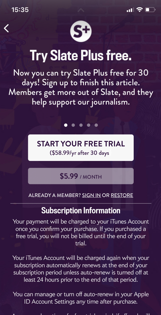 Slate Plus "landing page" in iOS app
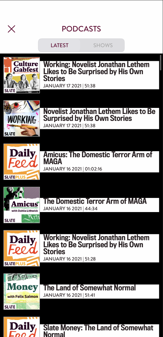 Latest podcast episodes in iOS app
Overall, I learned that Slate iOS users opened the app because they want to read the latest Slate news (some users also open it to read the most popular or their "saved" stories) and they want to be able to navigate to said news easily. But, users had difficulty understanding and signing up for Slate Plus as well navigating to and accessing podcasts. Specifically, I learned:
Current Users
- All previous users of the app use the “most recent” feed the most in the app
- 3 out of the 5 current users never use the menu (other than maybe “popular” or “saved) or podcasts in the app
App Home
- 7 out of 10 users were expecting something more curated that tells the reader what to read (like a homepage)
- The amount of space each story takes up is contested, some people find it scannable but some people find it too large
- 3 users use the swiping between stories/sections feature
Navigation
- 5 out of 10 users said the menu could use better content organization
- 7 out of 10 users said the menu is simple and easy to use
- 2 out of 10 users were very passionate about adding search to the app (it exists but is difficult to find) and making it work
- 3 out of 10 users mentioned how they like the “save” feature
Podcasts
- 8 out of 10 users were confused by the headphones icon (the headphones icon is how you get to the podcasts section), some users thought this icon was for accessibility
- Most of these users looked in the regular menu first for “Podcasts”
- Half of the users thought the podcasts page should land on “Shows” first instead of “Latest”
- 3 out of 10 users said linking from Slate’s app to the show in podcast apps would be helpful
Slate Plus
- 7 out of 10 users said their benefits (ad-free podcasts, ad-free reading experience in the app) are not clear from the current UX of the app
- Some users noted that the Slate Plus landing page experience (the landing page pops up after clicking into a Slate Plus article) has the info they expected but they didn’t expect it in that location in the app
- Many users were expecting a sort of landing page on the “Slate Plus” page instead of a stream of content
- 4 out of 10 users had a hard time finding “Slate Plus” in the menu: a few users scrolled past the “Slate Plus” page and looked at the FAQs page for Slate Plus info
Wireframes
From the above findings, I decided on the following features & recommendations for the redesign:
App Home
- This is the most-used page for current users but users were expecting something "more curated" so I think the home screen should pull in the hierarchy and editorially-picked stories from slate.com
- Keep the swiping feature because it seems well-liked
- It should be easy to navigate to a “Most Recent” page (because people use it so much currently) but the homepage is separate
 App homepage with "top stories" vs. "recent" filter and search in top right
 App homepage with bottom nav and Slate Plus promo across the top
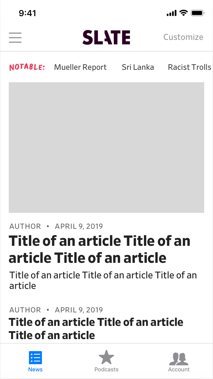 App homepage with bottom nav, notable links from slate.com and "customize" link for customizing the homepage
Navigation
- Navigation should stay simple but have better organization, especially regarding rubrics’ relation to their section
- Different content types in the app that should be reflected in the navigation: Articles (Home, Most Recent/Most Popular/Saved, Section/Rubric content), Podcasts, Slate Plus/Account Info, Support
- Fix search function and make it more prominent
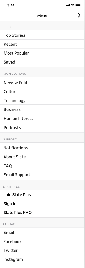 Nav with "podcasts" in "main sections"
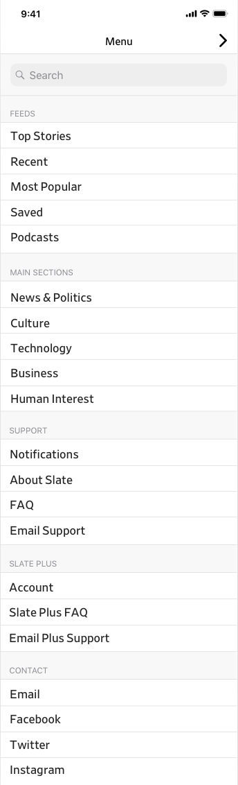 Nav with search at the top and "podcasts" in "feeds" section
Bottom nav with quick links to "news", "podcasts", "search" and "account"
Nav with search at the top and "podcasts" in "feeds" section
Bottom nav with quick links to "news", "podcasts", "search" and "account"
Podcasts
- Podcasts should be easier to find, that ideally would be solved by updating how the navigation works (see above)
- Half the users expected "Podcasts" to land on "Shows" instead of "Latest Episodes" but this means half of them thought the opposite...maybe try this page defauting to "Shows" because that is how slate.com/podcasts works?
- Episode feeds should have the ad-free versions if the person is a Slate Plus member
- Episode pages should link to podcast apps
 Podcasts page - podcast shows with one on each line
 Podcasts page - podcast shows 2x2 with large art
 Podcast show page with app buttons
 Podcast episode page with app buttons
Slate Plus
- Create Slate Plus landing page in the app: this page would explain the benefits of Slate Plus and provide price info and the option to sign up from this page
- If you are already a member, you would just have an account info page where you could get your podcast feed, etc
- I think there shouldn’t be a Slate Plus feed page w/ Slate Plus bonus content, bonus content should just be indicated throughout the app w/ a Slate Plus logo (like it is on the website)
 Slate Plus landing page wireframe
 Feed page with Slate Plus content indicated
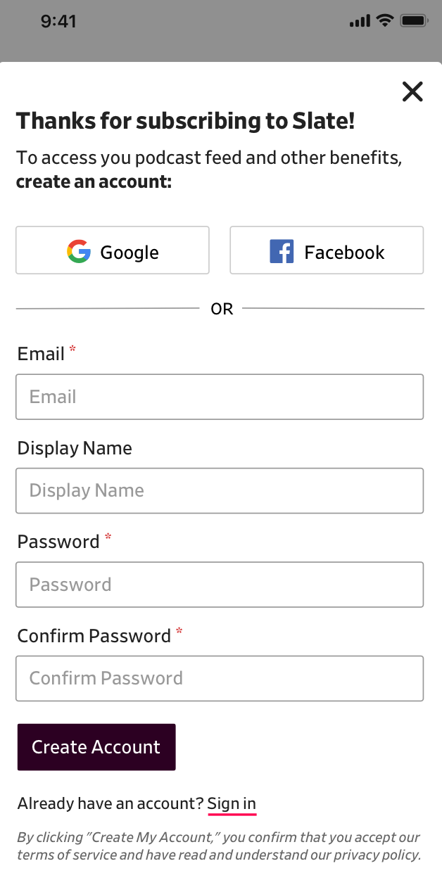
In addition to user feedback, I had heard from the Chris that account management was notoriously difficult for both devs and users in the app. Many readers would subscribe to Slate Plus in the app and pay with their Apple ID. After subscribing the app, Slate would send users an email to create an account with slate.com but users rarely created one. Then, members would try to access their Slate Plus benefits outside the Slate iOS app (i.e. finding their private podcast feed link) but couldn't because they didn't have an account to log in with.
To fix this, I created a user flow for account creation:
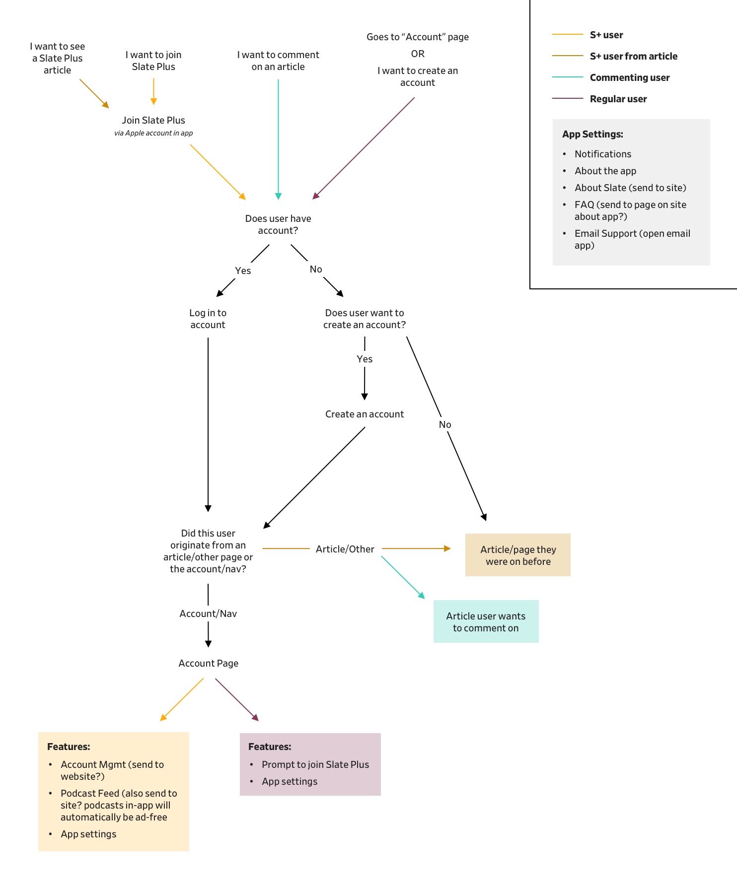 User paths for creating an account
I thought prompting new members with account creation right after they subscribe would be an more streamlined way to encourage them to create an account (vs. an email). I also thought prompting users on the "Account" page would help.
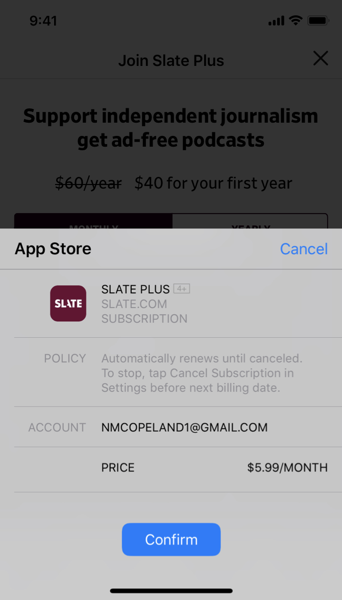 Apple subscription payment (on top of Slate Plus landing page)
 User would be prompted with account creation right after Apple payment
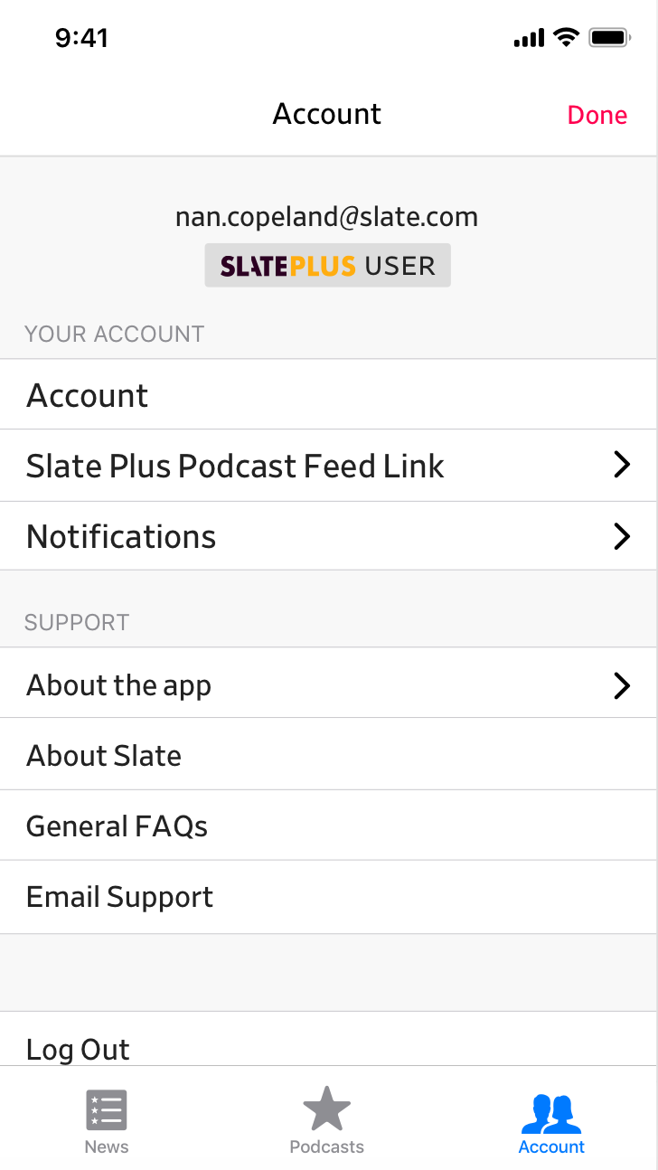 Account page for a Slate Plus member, able to access podcast feed link
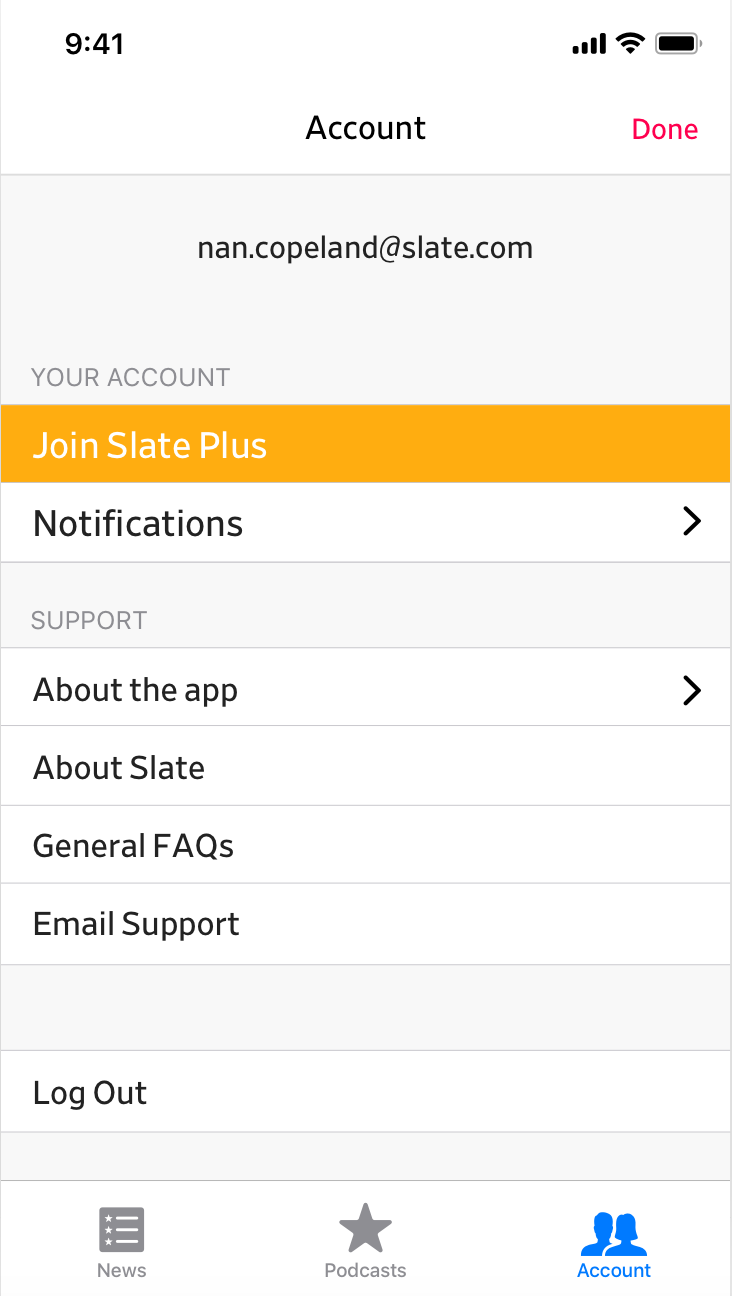 Account page for regular account holder, prompted to join Slate Plus
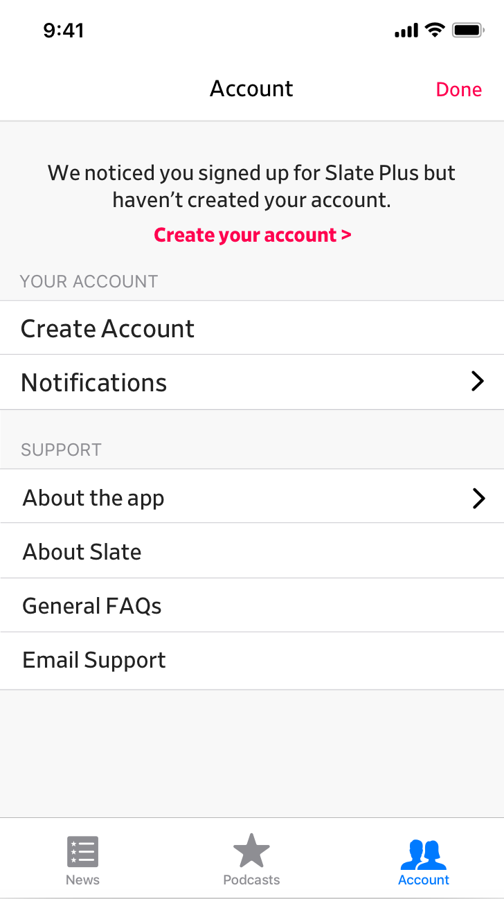 Account page for Slate Plus member who hasn't created an account, prompted to create an account
User Testing
Once I had a solid prototype, I decided I should talk to users again. I already knew users' problems with the old app so I decided to just give users the new prototype and ask them to do a few general tasks:
- Can you find the article "How Meet Cutes Have Changed in the 21st Century" by Heather Schwedel?
- Can you find the "News & Politics" section?
- How would you find the latest episode of What Next?
- How would you join Slate Plus?
I talked to nine users. Users had mostly positive things to say about the new version of the app but commented on the navigation:
- 5 users liked how the app is now more consistent w/ the site in terms of brand and navigation.
- 4 out of 9 users said we should change “Top Stories” to “Home”
- 5 out of 9 users didn’t notice or were confused by the bottom bar, this was usually because it looked like the Safari bottom bar
Final Product
I decided to make the navigation updates above and also update the UI so it reflected Slate's brand a bit more.
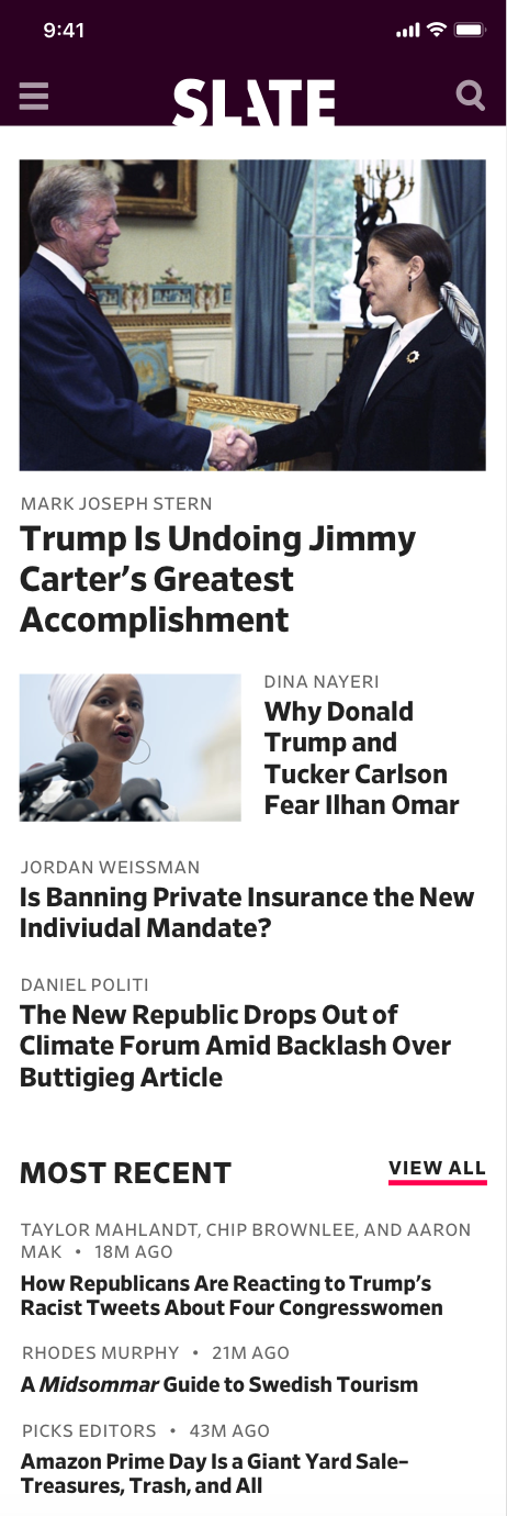 Homepage
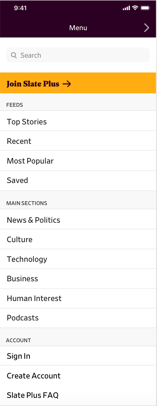 Navigation menu
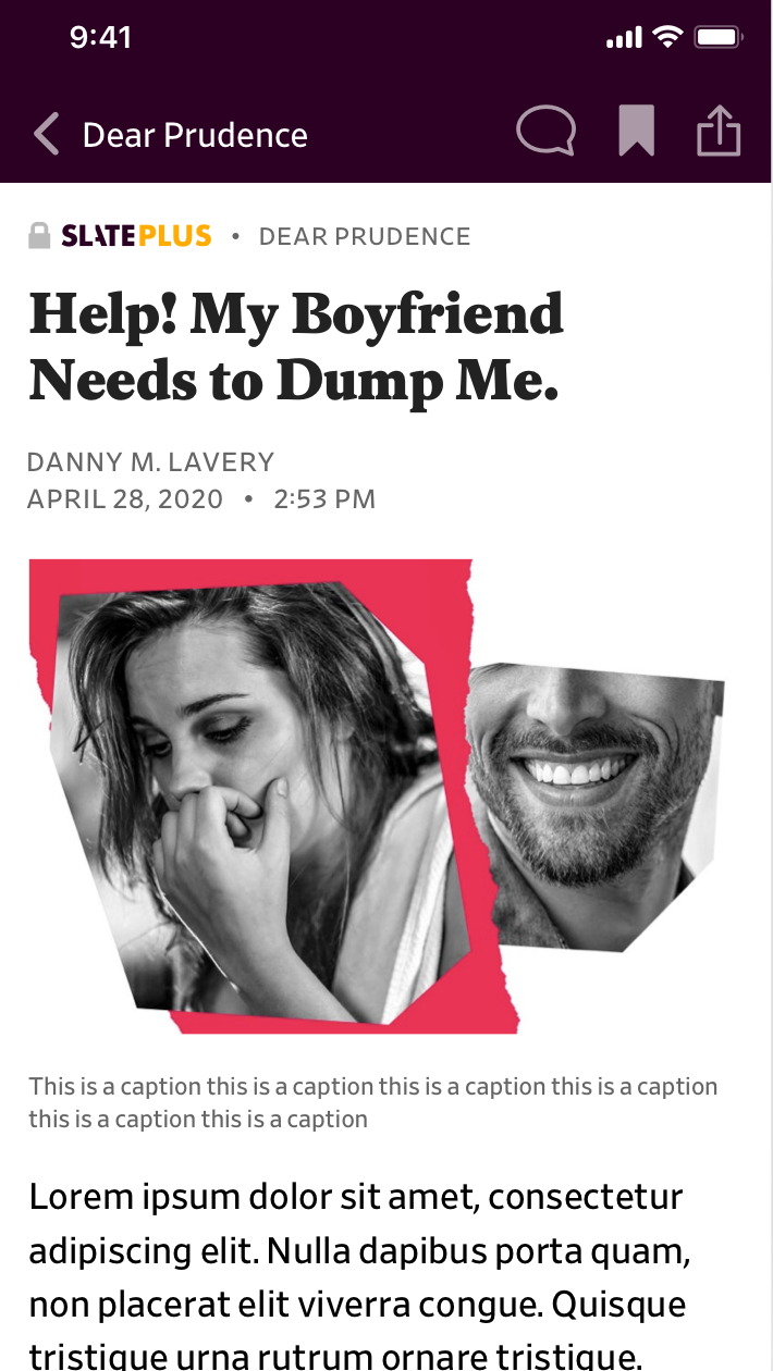 Article
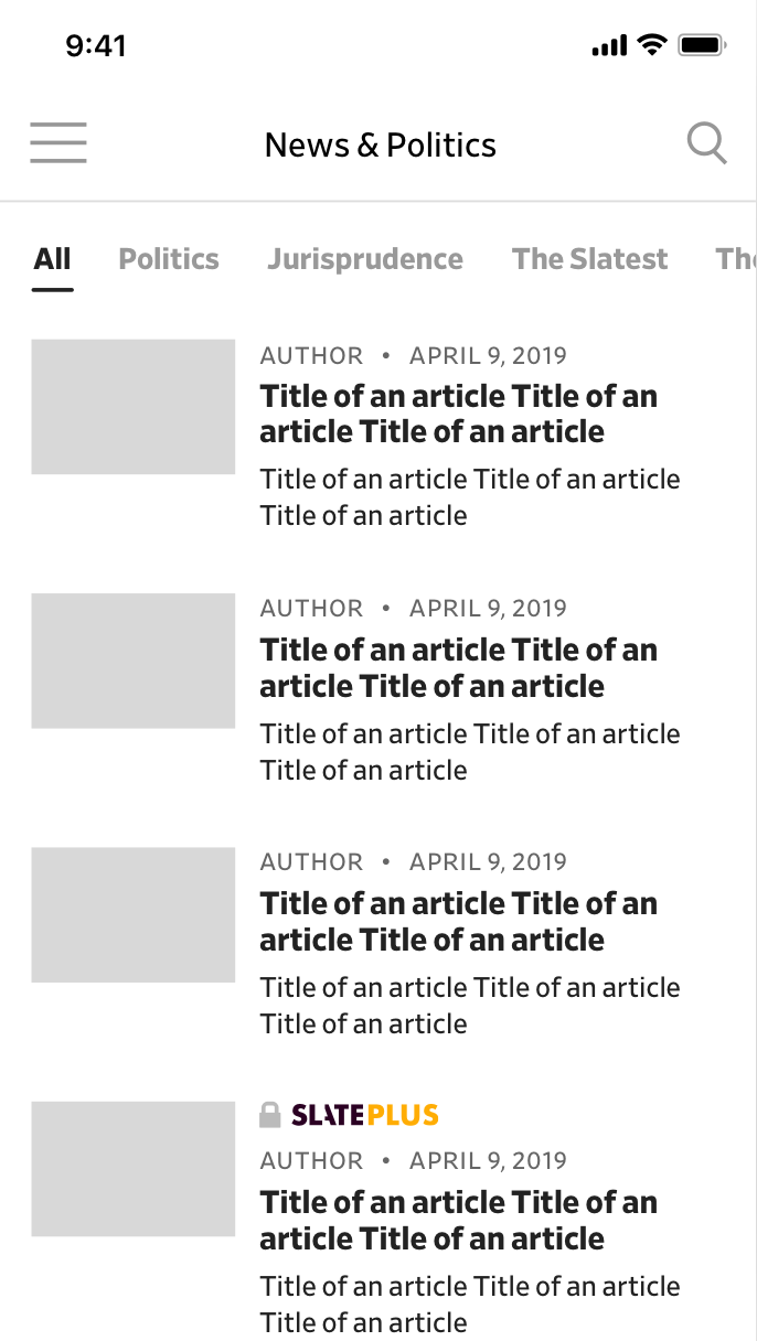
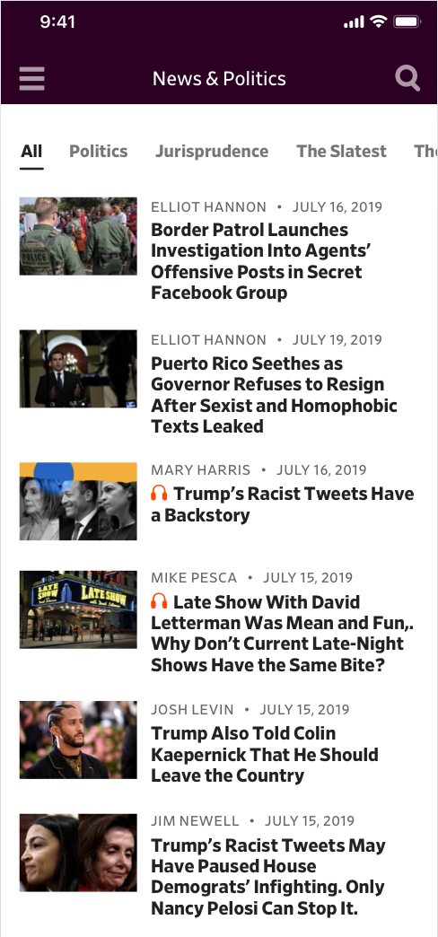 Feed page
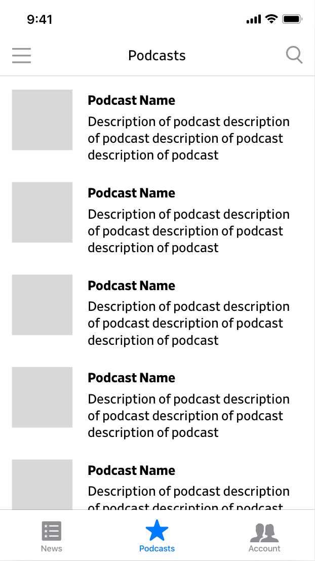
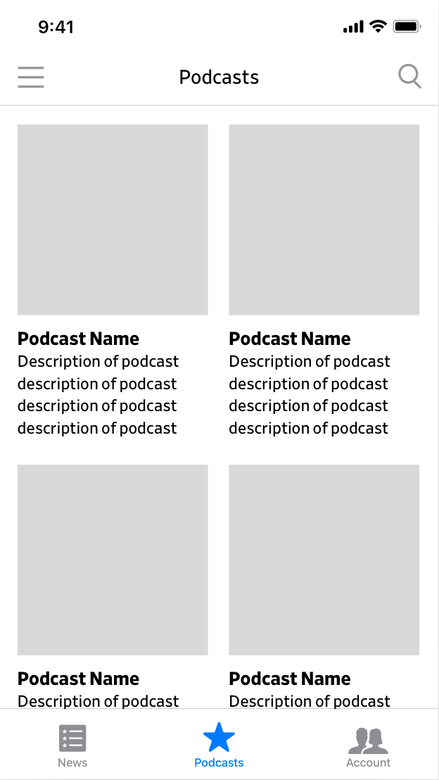
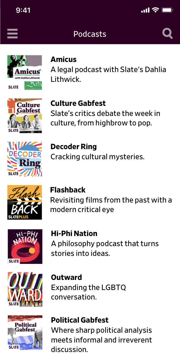 All podcasts
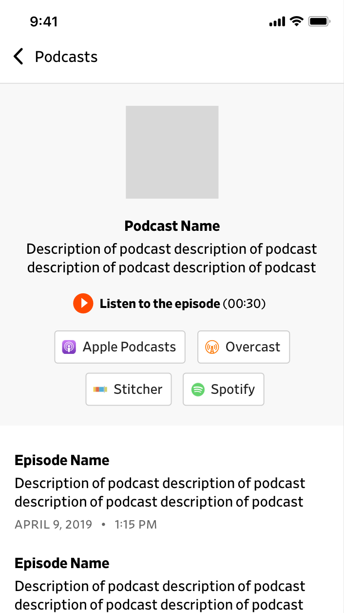
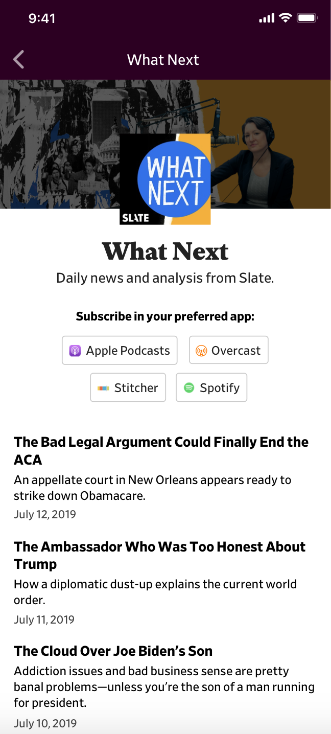 Podcast show
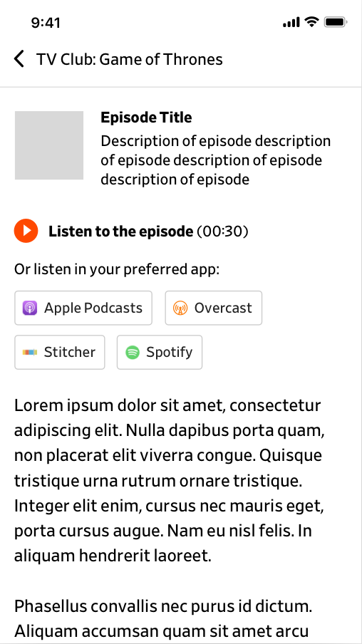
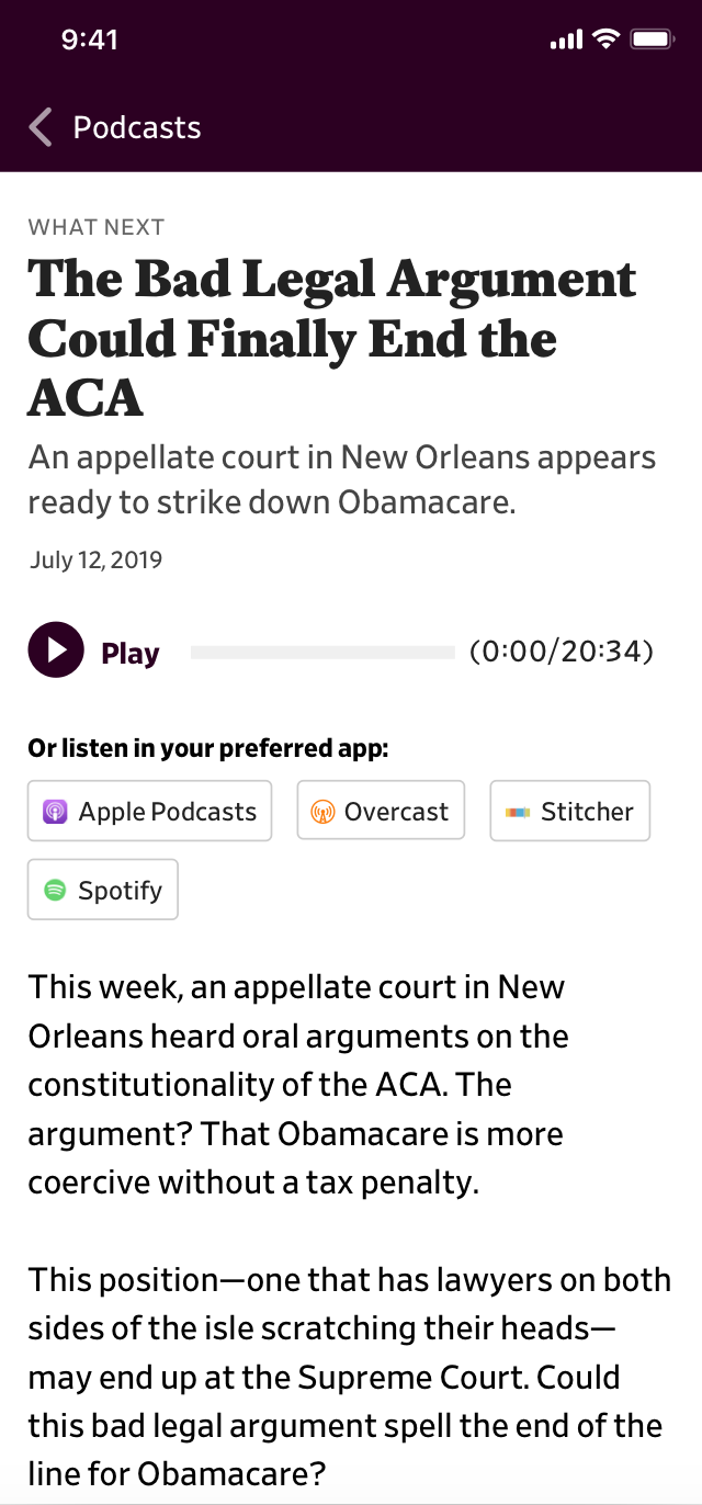 Podcast episode
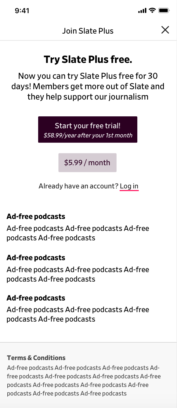
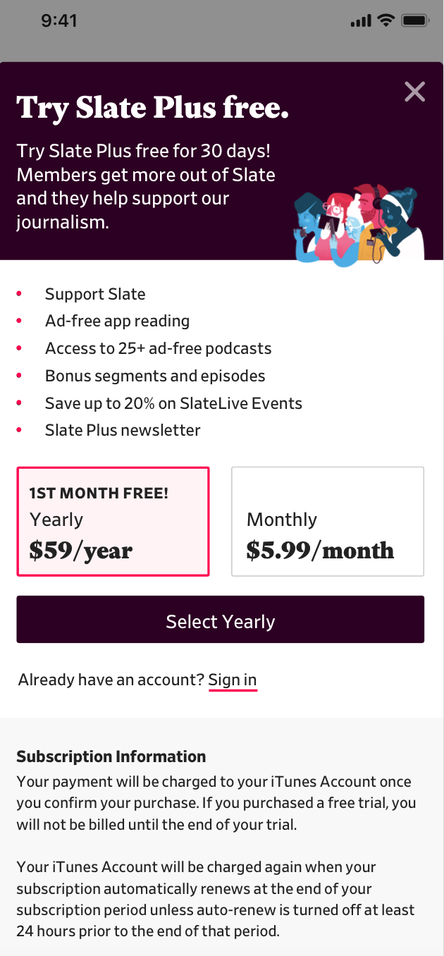 Slate Plus landing page
 Account creation push after subscription
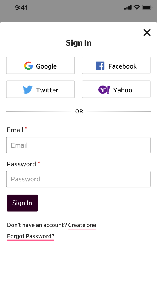 Sign in
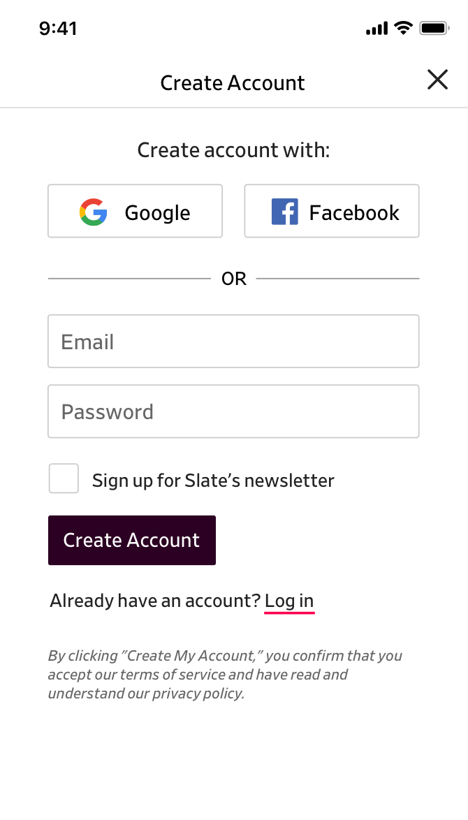
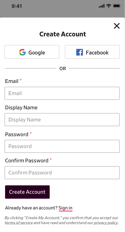 Create account
Due to planning, this redesign is not live yet but hopefully it will be soon! Thank you to product manager Chris Schieffer who reviewed the many rounds of design and testing.