Podcast experience redesign
January 13, 2019
I updated the Slate podcasts process to make it easier for users to explore Slate's shows, find what they're looking for and subscribe. The design was updated to fit the new Slate brand launched in 2018.
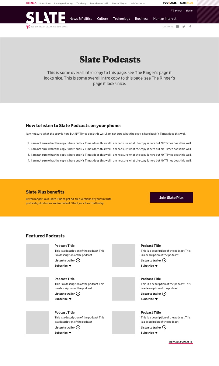
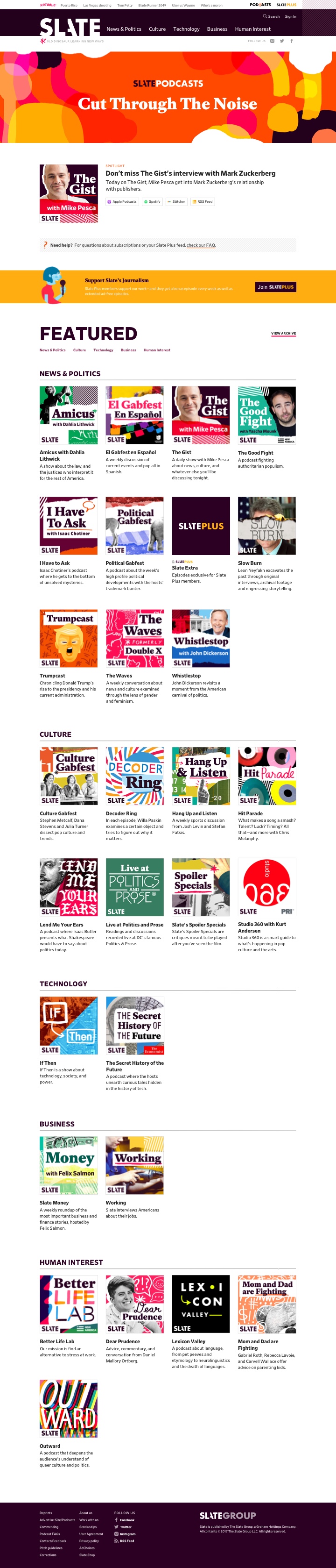
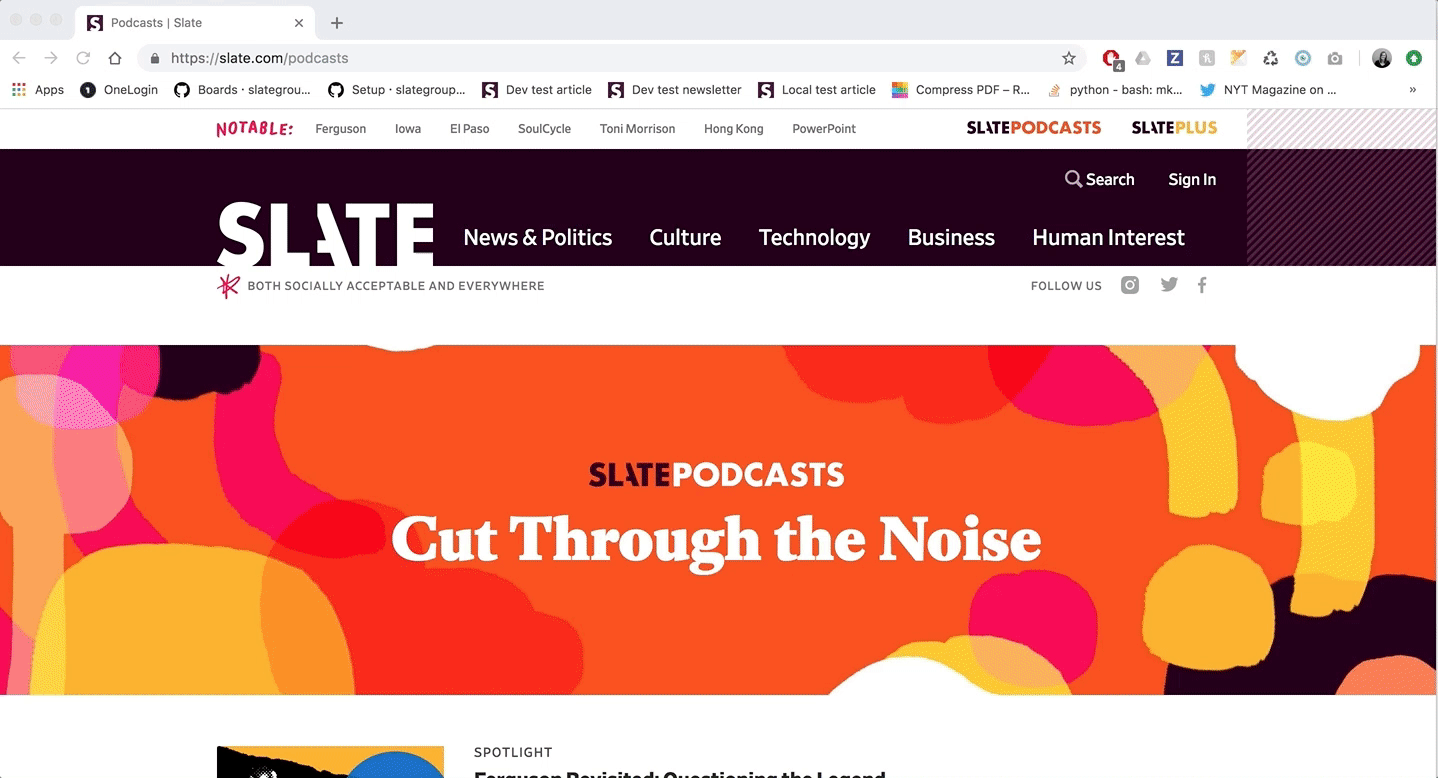 Finished slate.com/podcasts page
Background
The podcast redesign process followed Slate's site redesign where Slate updated their design process and CMS. Slate's articles were prioritized during this process so when I started as a designer, podcast publishing was still done using the old CMS.
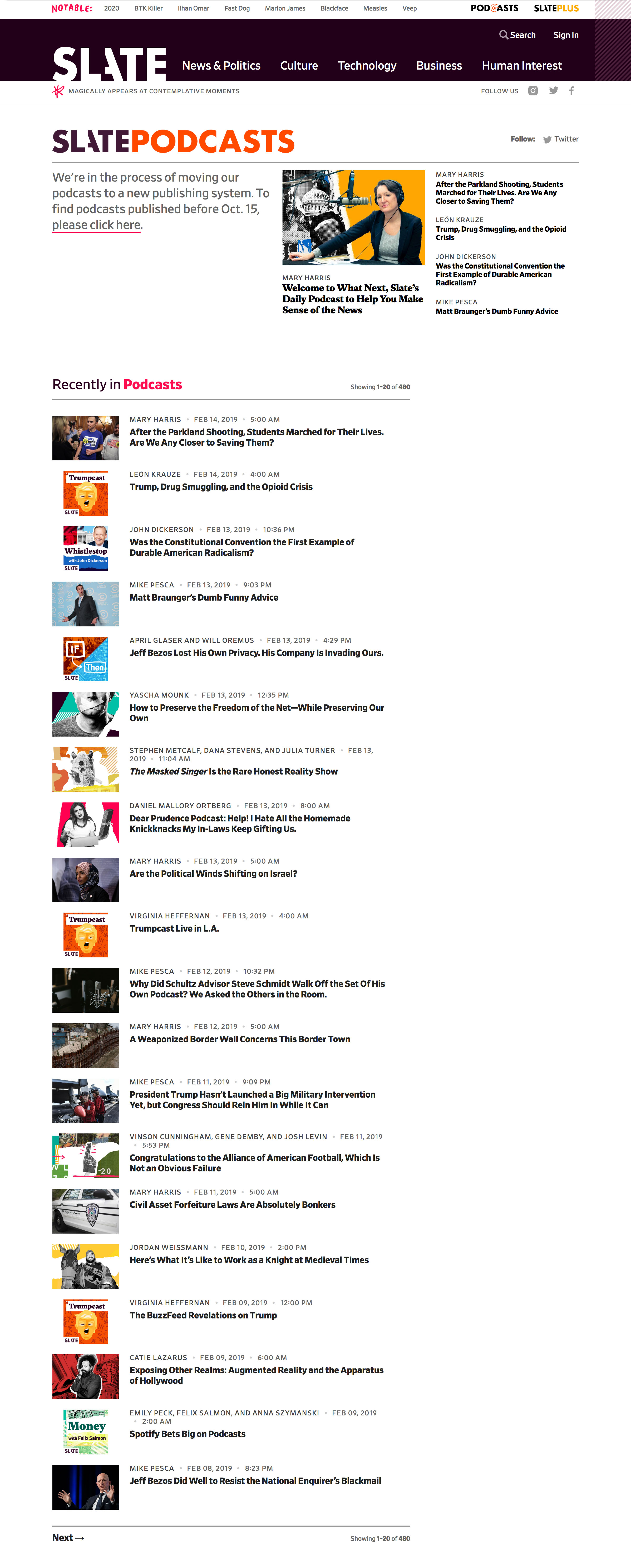
When the old site was built, podcasts weren't as high of a priority for Slate so the old podcasts landing page was just a "podcasts" tag page that featured the latest podcast episodes in reverse chronological order.
 Old Slate podcasts landing page
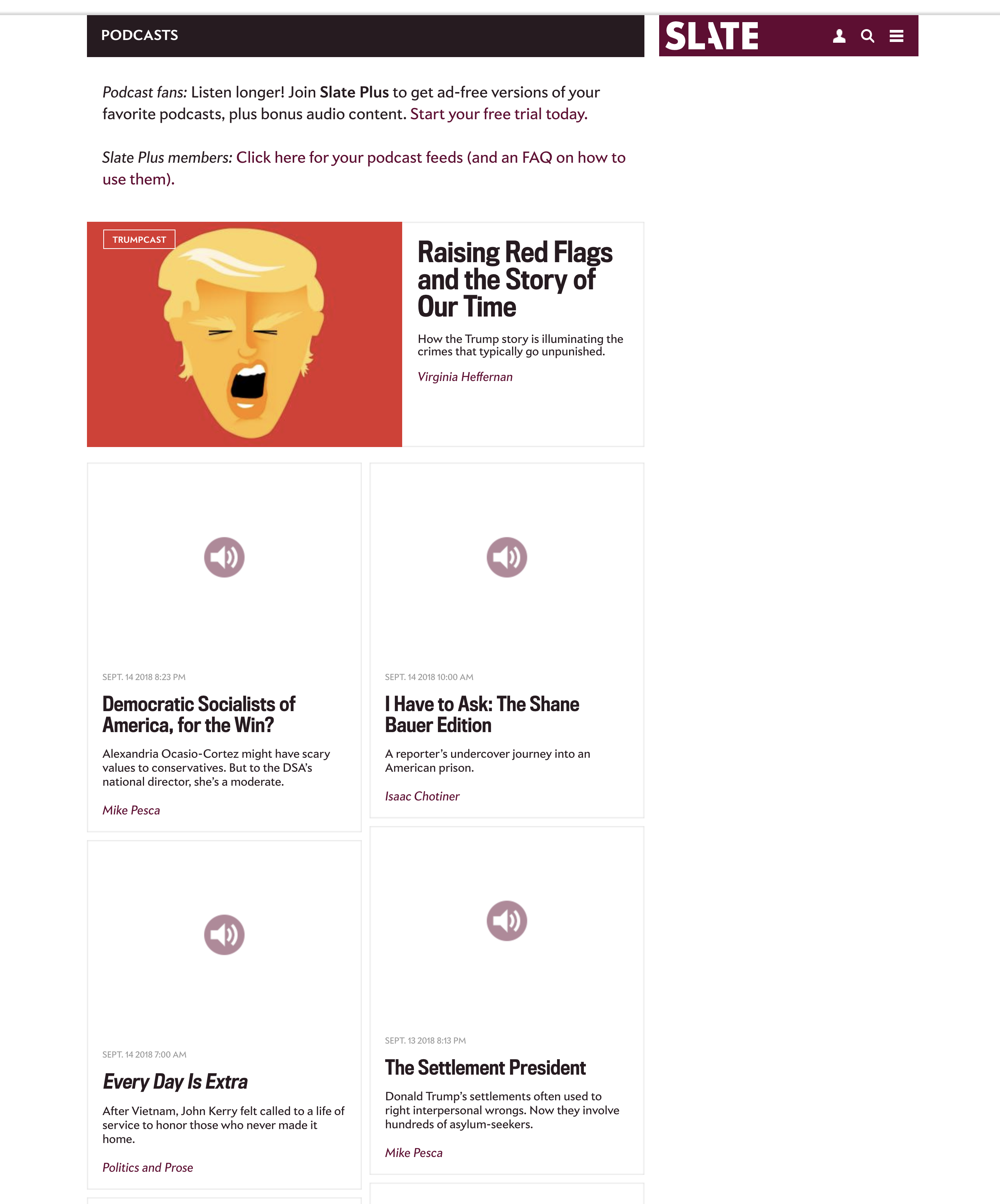
After we started working on the new podcast templates, a temporary page was put in place that functioned the same as the old one but publishing was in the new CMS.
 Temporary Slate podcasts landing page in new CMS
While both of these pages did display the latest podcasts published by Slate, they didn't offer information on each show nor were they set up to encourage users to subscribe to podcasts in their players.
Planning
Product Manager Chris Schieffer conducted extensive interviews with various Slate people to see what they wanted out of the new podcast pages. He decided there would be three pages and came up with the following priorities and features for each page:
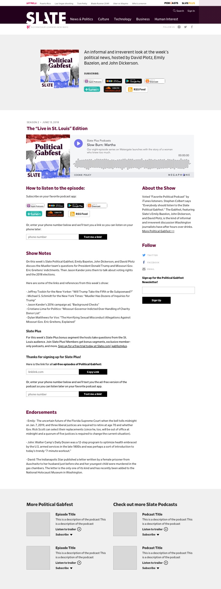
Landing Page:
- Understanding the breadth of the podcasts Slate is making
- Listen to a trailer
- Subscribe
- Slate Plus pitch
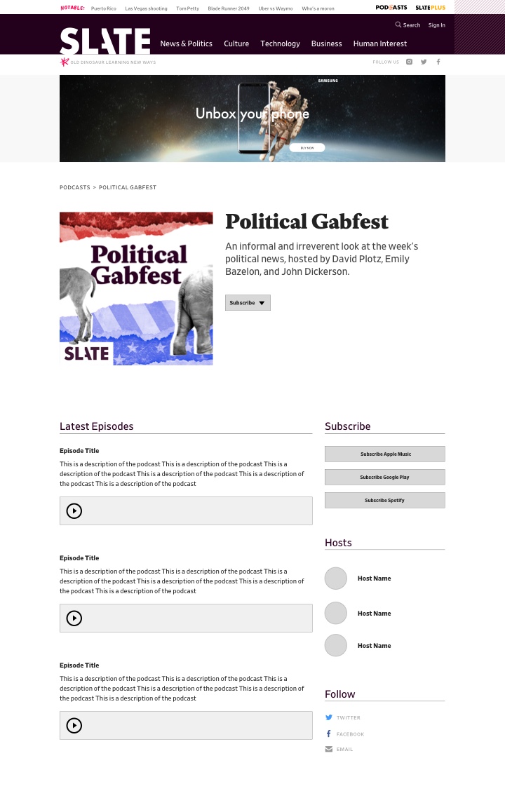
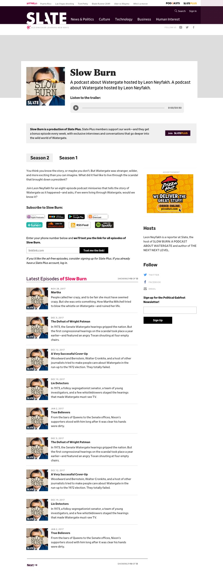
Show Page:
- Learn about the show
- Listen to a trailer
- Subscribe
- Slate Plus pitch
- Interact with episodes inside of show
- Social links, newsletter sign up, link to discussion group
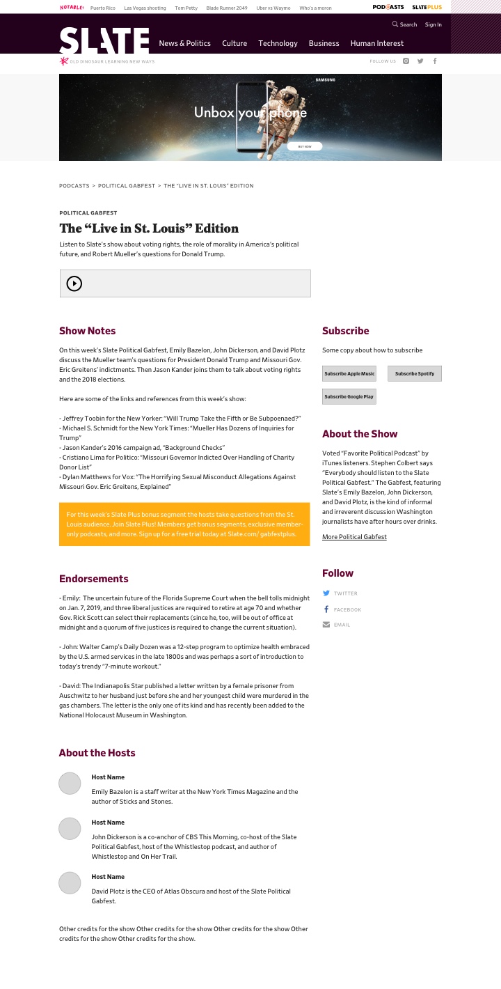
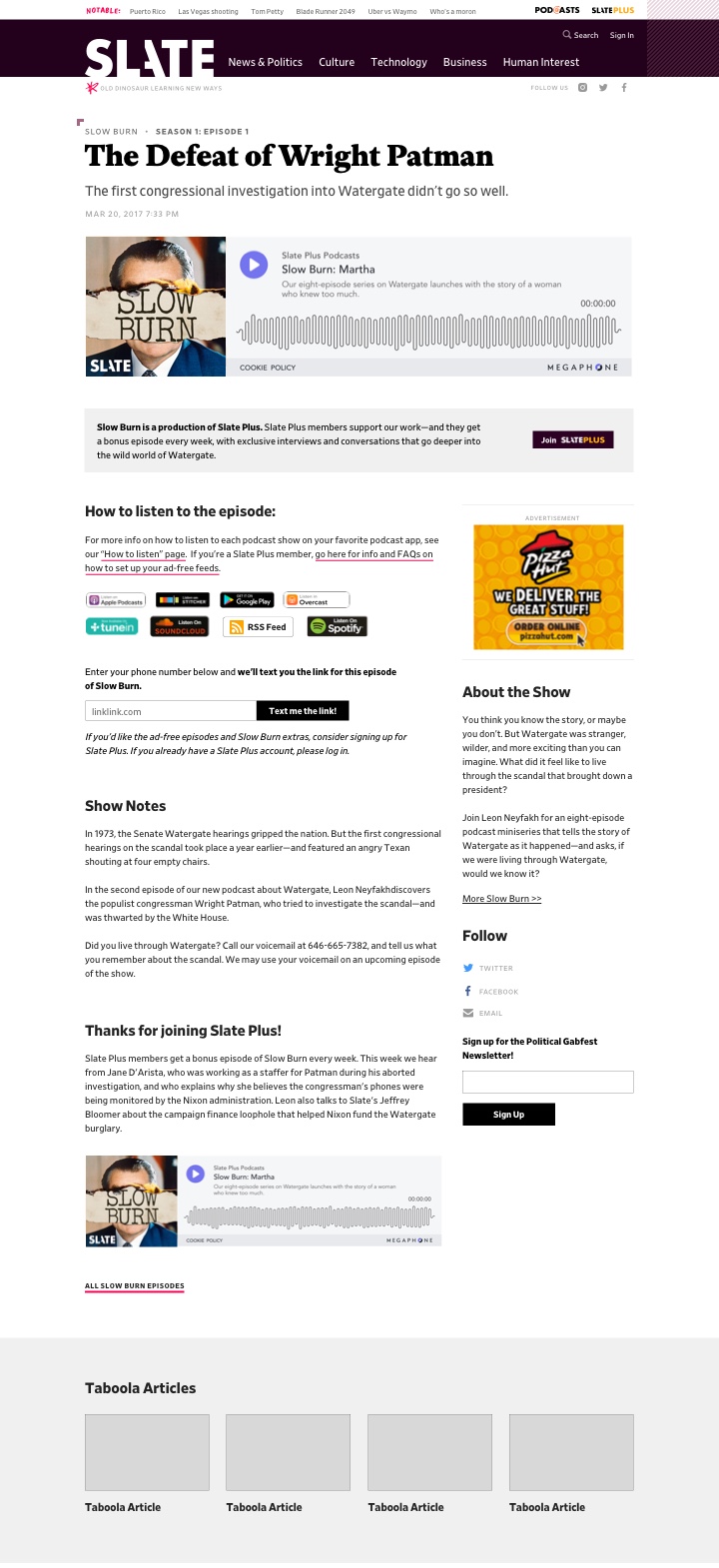
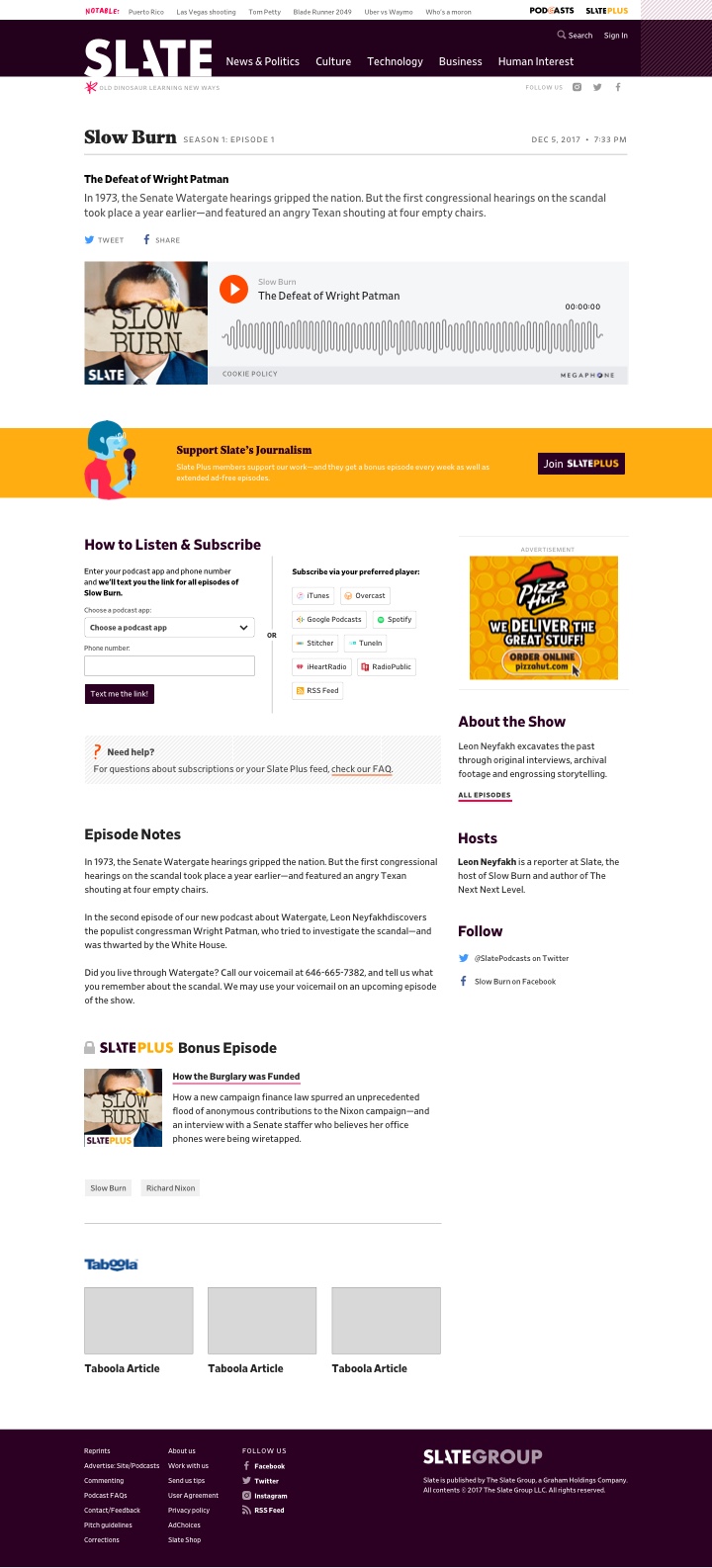
Episode Page:
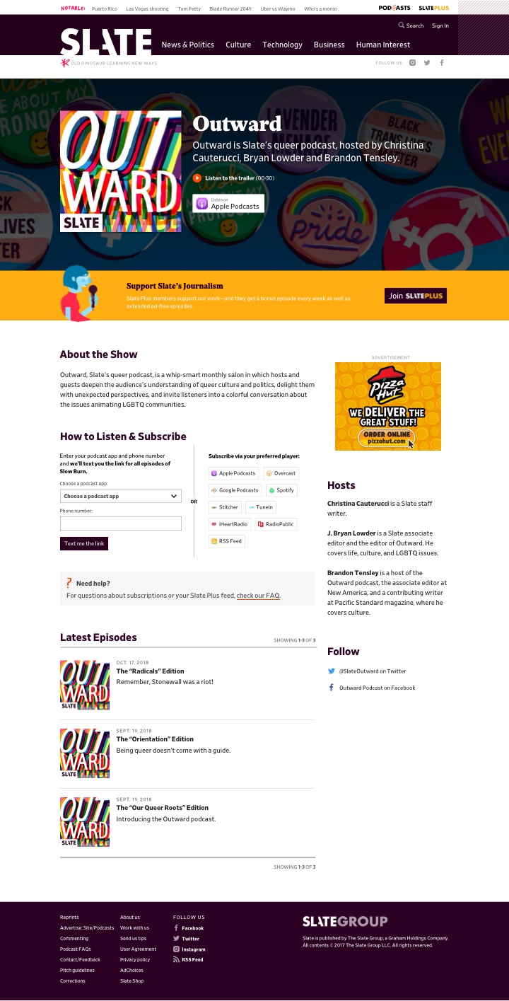
- Learn about the episode
- Listen to the episode
- Subscribe
- Slate Plus pitch
- Recirculation (text and audio via topic)
- Social links, newsletter sign up, link to discussion group
Design Process
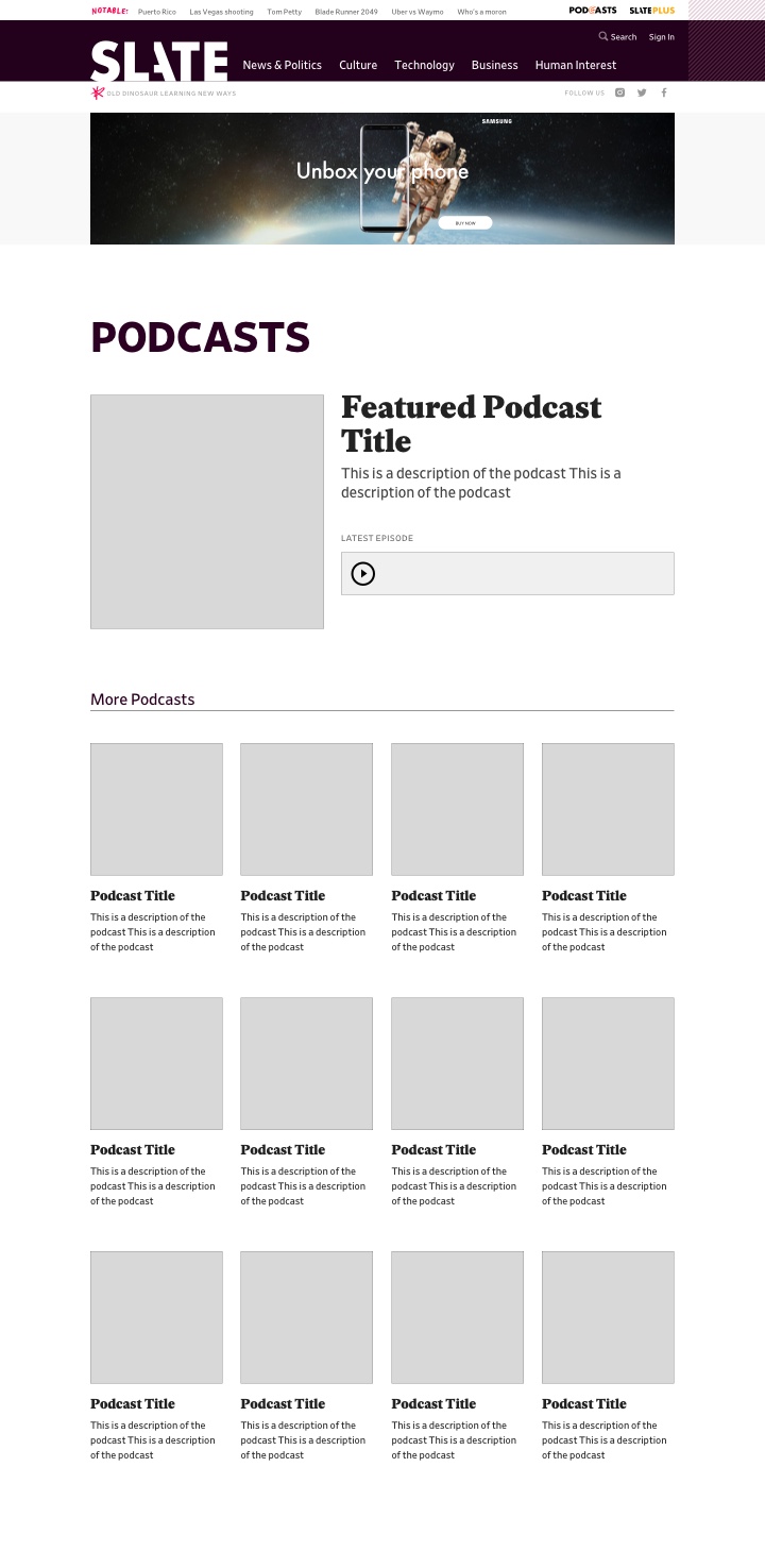
After carefully reviewing Chris's notes on the project, I started on some very basic wireframes.
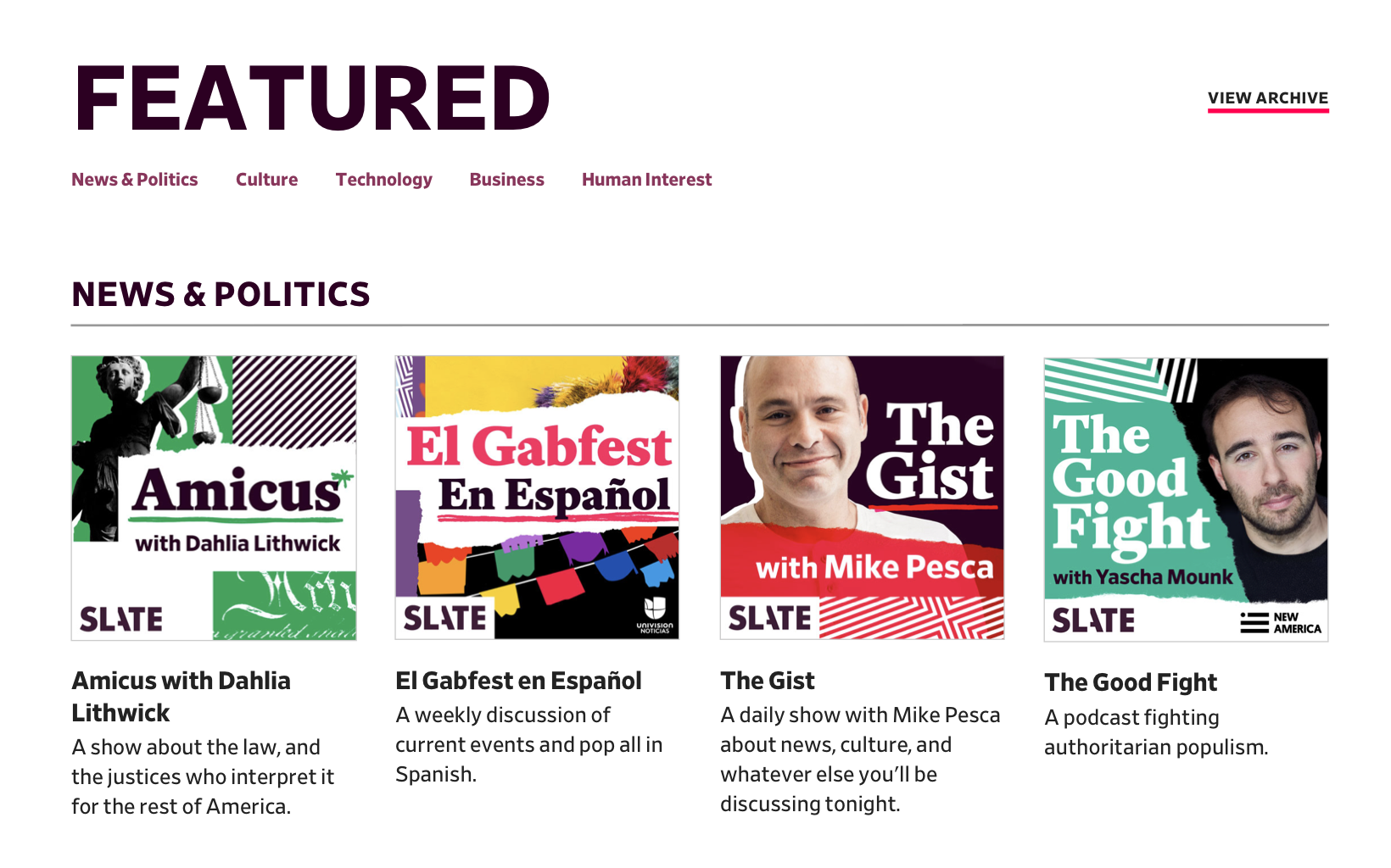
Based on the notes, I figured the landing page should focus on featuring Slate's shows, specifically the ones currently in production.
For the show page, I focused on explaining the show concisely, including a trailer, and linking to the show in various players (since that is how most people would be listening).
I also featured the latest episodes for each show. The one caveat here was how do we represent episodes differently for ongoing (ex. Political Gabfest) vs. seasonal (ex. Slow Burn) shows?
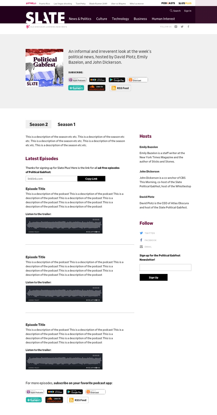
For the episode page, I focused on learning about and listening to the episode as well as, again, linking to the episode in various players.
After deciding on wireframes, I needed to design the pages in a way that felt consistent with the new site design but also made sense within the podcast project.
While designing the podcast pages, I had to consider how podcasts fit into the site's information architecture. Each podcast fits under a section (ex. News & Politics, Culture, etc.) so they're not on the same level as sections but they aren't exactly rubrics (ex. Jurisprudence, Movies, etc.) either. How could the design reflect this in a clearer way?
Another thing I had to consider were components because Slate's CMS Clay is built with components. At first the component structure seemed limiting but I ended up really liking this setup because it reuses dev work and makes the experience consistent.
The Slate Plus and "Need Help?" components are used on all three pages while the "How to Listen & Subscribe" component is on both the show and episode pages.
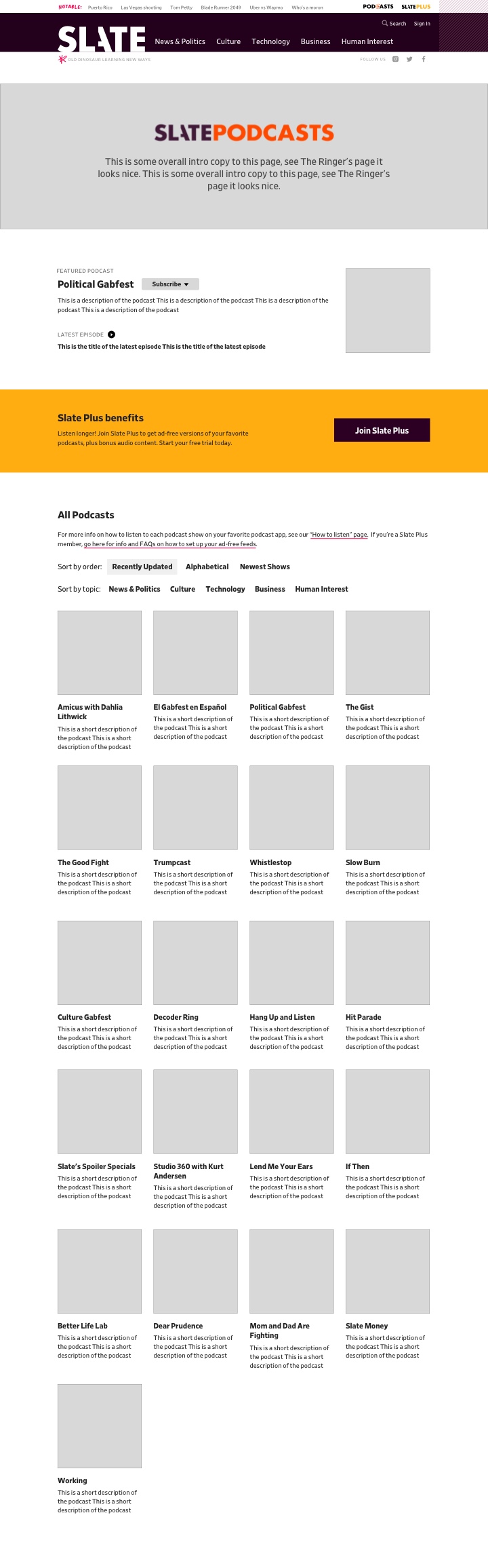
One thing I realized during this process is that in addition to the three main pages, we would need an archive page. Slate has so many shows and it didn't make sense to feature old ones that are no longer in production on the landing page.
 Link to archive page
 Archive page
User Testing
While making the mocks, I had a few questions about the experience that I wanted to user test:
- Should the shows on the landing page be structured alphabetically or by section?
- Do users understand how to use the "How to Listen" section on the show page?
For the first question, I tested a mock with all the "featured shows" listed alphabetically vs. grouped by section.
 Podcasts sorted alphabetically
 Podcasts sorted by section
I tested a group of Slate readers and a group of non-Slate readers. While users understood the alphabetical section they preferred the shows grouped by section because it is easier for a user to know what the show is about. If a user wanted to avoid all "News & Politics" shows, they could easily skip that section and move to the next.
One argument in favor of the alphabetical ordering was it is better if the user knows exactly what they're looking for. But, because the point of this page is to show the breadth of Slate's offerings, we decided to go with the section grouping.
For the second question, I tested the "How to Listen & Subscribe" section to see if users understood the "text me a link" form.
The app subscribe buttons are a very common way to link to shows in podcast applications but the "text me a link" form isn't. Because most people listen to podcasts on their phones, I thought the texting feature would be helpful but I wanted to user test this to make sure. Does the text form help or confuse the user?
 Section with both the texting form and app subscribe buttons
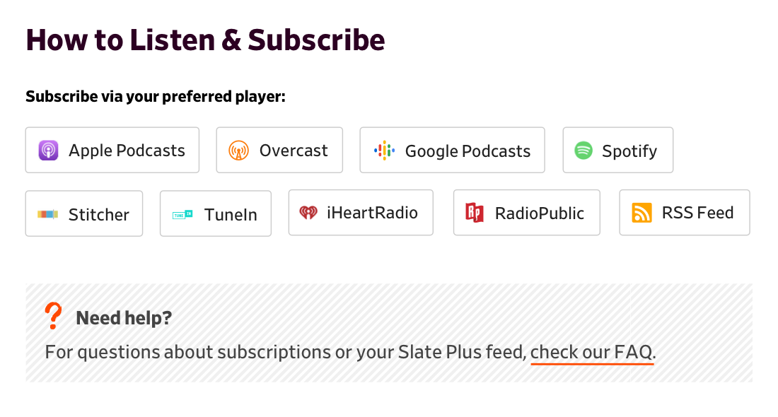 Section with just app subscribe buttons
While most users were more likely to use the app buttons to subscribe (or even just going to the app and searching for the podcast), they liked the option to text. So, we kept the version with the text form.
In the end, the texting feature was tabled so we could get the MVP out but hopefully it will be added in the near future.
Podcasts across the site
Another thing we had to consider with this project is how podcasts are displayed across the site. Podcasts are often included in article lists but we received many complaints about how there was no indication for which list items were articles and which list items were podcasts.
I tried a few different mocks but was leaning towards the designs that were the least invasive because this design needed to work in all units on the homepage as well as on list pages. I decided I would user test three slightly different variations: headphones icon before the title, "Podcast:" in front of the title and headphones icon after the title.
 Headphones icon before title
 "Podcasts:" before title
 Headphones icon after title
Users definitely preferred the headphones icon and there was a slight preference for the icon before the title. I also liked that mock most so I went with that one. The icon I used in testing was done quickly and I updated it with an icon drawn by Lisa Larson-Walker that was much more consistent with Slate's brand.
![]() Headphones icon on the homepage in the "Culture" section
Headphones icon on the homepage in the "Culture" section
![]() Headphones icon on the homepage in the "Most Recent" section
Headphones icon on the homepage in the "Most Recent" section
![]() Headphones icon in a list on the "Culture" page
Headphones icon in a list on the "Culture" page
Implementation
See this project live at slate.com/podcasts.
I worked on this project with many people. Product management was led by Chris Schieffer and design was led by Jason Santa Maria. Development work was completed by Jonathan Zuckerman, Kim Le, Chase Felker, Salomone Baquis and Greg Lavallee}. The podcast tile art featured throughout was done by Lisa Larson-Walker and the art on the landing page and in the Slate Plus component was done by Natalie Matthews-Ramo.