Paywall checkout
November 02, 2020
Brief history
Over the past year, I've been working on the Slate paywall (see other post on podcasts). One of the parts of the paywall I spent the most time on was testing the checkout process because I knew it was crucial to the paywall being successful.
Before mocking, I checked out a few other sites. All sites started with an "offer" landing page and then I was asked for my account and payment information. Some sites had the account and payment forms on the same page as the "offer" and some sites took you to a different page. I mocked up these two flows for Slate but wasn't sure which one would make for a better user experience so I decided to do a few rounds of user testing.
User testing
1. 1-page vs. 3-page experience
For the first test, I tested a 1-page checkout experience vs. a 3-page checkout experience. I screened for users that read media sites at least once per week.
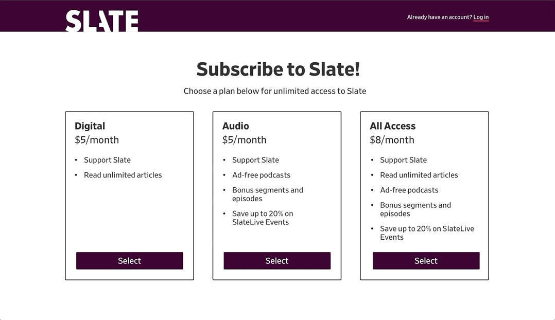
 1-page checkout
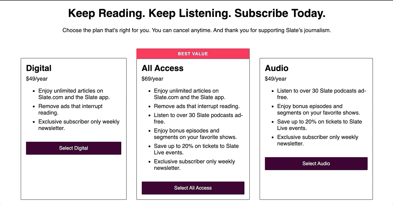
 3-page checkout
Result: Overall, users understood both processes. When I asked which experience users preferred (something I am trying to not do anymore because I don't think an experience should be dictated by preference), they preferred the 1-page experience so I decided to go with that.
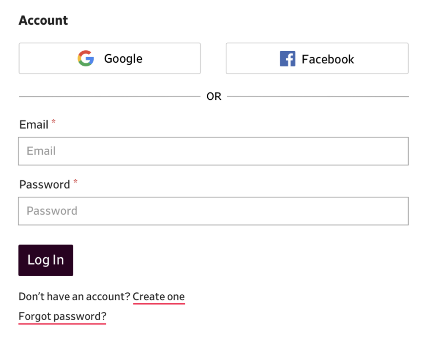
2. Forgot password experience
For the next test, I wanted to test switching from the account creation form to the log in form. Slate has a lot of active commenters with accounts so I thought this might be a future use-case they'd have to deal with.
One issue I had with this round of testing was that Invision doesn't allow smooth scrolling transitions, which is what I had envisioned for the 1-page experience, so I couldn't mimic a coded experience as well as I had hoped.
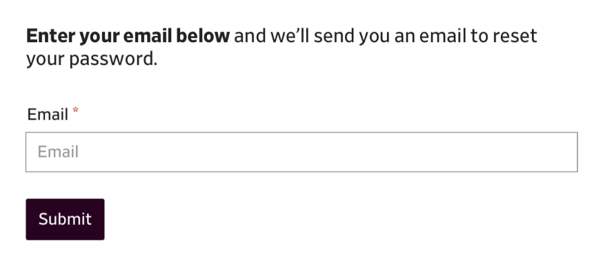
Result: I asked users to subscribe as if they already had an account but couldn't remember their password. While 2 of the 8 users couldn't find the "forgot password" link, the users who went through the whole “forgot password” flow thought it was straightforward.
3. Coded 1-page experience
Because of the limitations with Invision and smooth scrolling, I wanted to test a coded version of the 1-page experience, just to make sure. Again, I asked users to assume they already had an account so they had to switch from the account creation to login form.
For this test, I broke up users into "young" (25-45) and "old" (45-65). According to the data team, "[Slate's] median age range is 35 to 44, and 50% of Slate.com readers are between ages 35 and 54" so I wanted to see if age affected the the outcome of the test.
Result: 8 users (of 10 total), specifically older users, had difficulty with this task. Some users didn’t log in before payment (you could see the payment form grey-ed out) while some users had trouble finding the “log in” link because both the account and payment forms were on the same page.
Because of this, I wondered if I could test this same flow and set of users with a coded 3-page experience and see if I got the same results. Accounts are always difficult so I thought isolating each step might help.
4. Coded 3-page experience
For this test, I used the same screening questions and test questions as the previous test but the steps were broken up into 3 pages (like I tested in the initial test).
Result: 4 users (of 10 total) had difficulty with this task. From this, I assumed the 3-page experience was easier to understand for users trying to go from the “create account” form to the “log in” form.
Decision
Based on the user feedback, I decided to go with the 3-page checkout process with very clear links to “log in” and “create account” to toggle between the two forms. From the initial test, I remembered users understood both flows so when I considered what the data team said about Slate's age range, I thought the 3-page experience was a better fit.
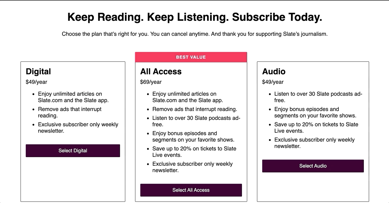
After many more rounds of wireframing and mocking, the checkout process ended up here:
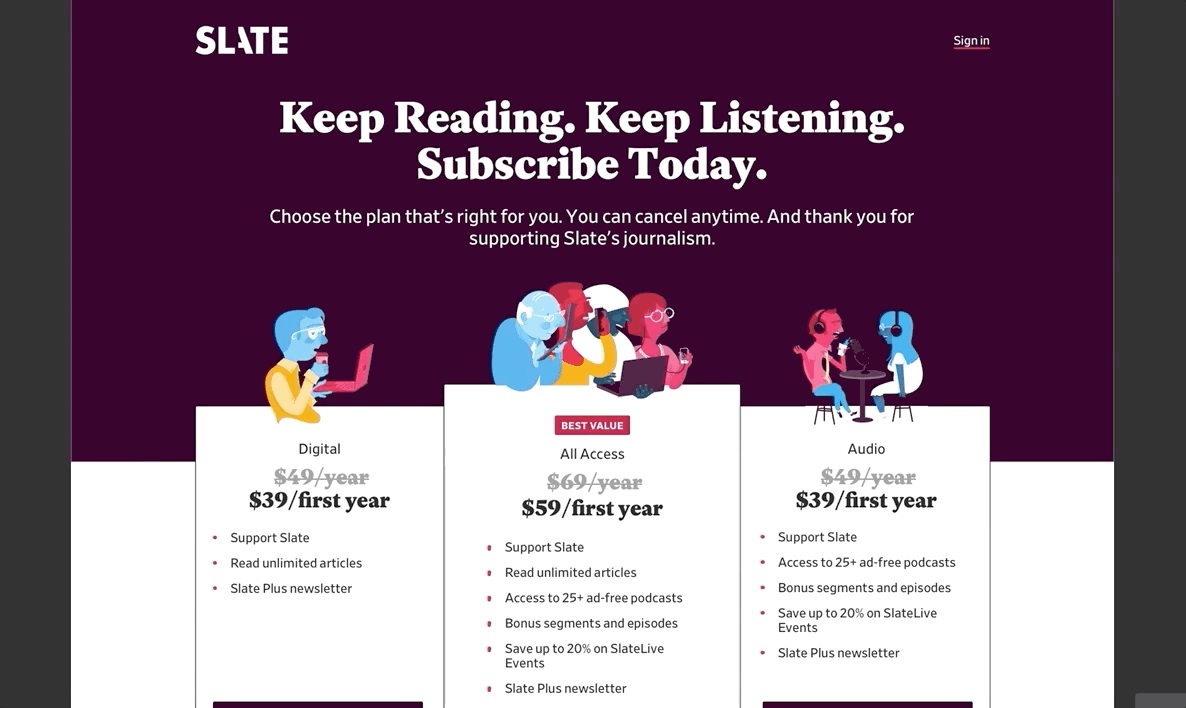 Click thru these mocks here
Thank you to product manager Heidi Strom-Moon who reviewed the many rounds of testing!