Paywall podcasts
November 02, 2020
History
Over the past year, I've been working on the Slate paywall (see other post on the checkout experience). An important part of the paywall project is redesigning the account management experience which includes member podcast feeds, one of the core benefits of Slate Plus.
The member podcast feed experience has been something I've been working on for most of my time at Slate. My first project at Slate was improving podcasts on the site and I have also contributed UX and branding work to Supporting Cast. With the paywall, I wanted to combine all the research I've done on private podcast feeds to make it a great experience for Slate Plus's members.
Slate Plus & Supporting Cast
Slate was one of the first media companies to offer private podcasts as a motivator to subscribe but the experience of loading a private feed into the player of your choice has always been manual and complicated. Users had to copy a feed link and load it into their player but each player had a different way of doing this. A common misconception about the feed link is that it is a URL so members just paste it into their browser.
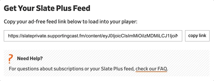 Manual feed form
Because of the success of Slate Plus, Supporting Cast was created to help other podcasters start membership services. The biggest difference between Supporting Cast and Slate Plus is that the Supporting Cast podcast feed onboarding is much more user-friendly than the copy and paste method.
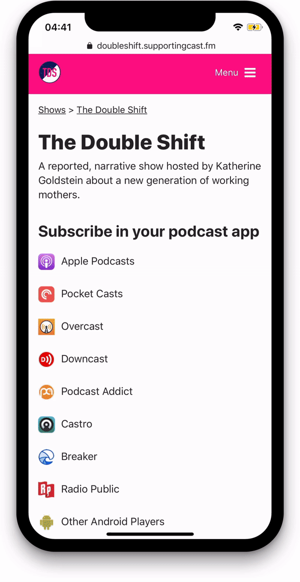 The Double Shift's podcast onboarding experience using Supporting Cast and Apple Podcasts as the player
In mid-2020 (pre-paywall), we implemented an interim version of the Supporting Cast experience on Slate.com. Because the navigation on Slate's old account management system was a bit confusing, I decided to keep all the podcasts and their feeds on one page. This also meant the UI had to be Slate's old branding so I knew all of this needed to be updated with the paywall rollout.
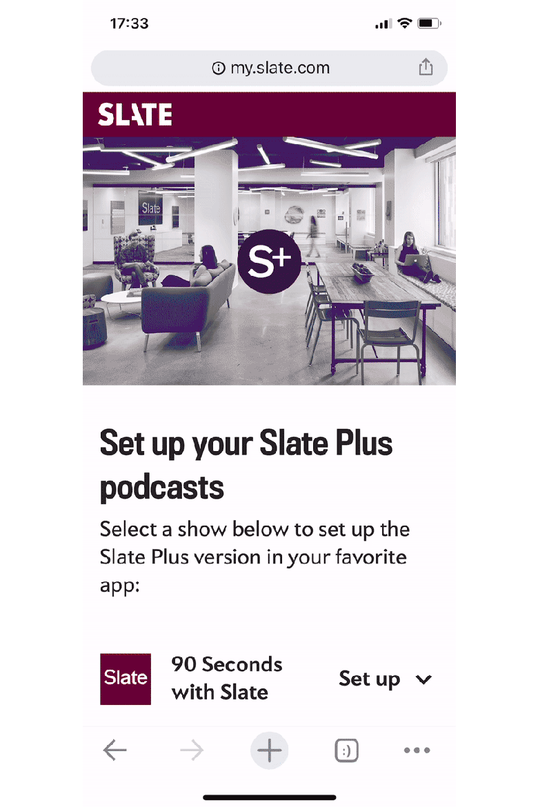 Interim Supporting Cast experience on Slate.com
With the paywall podcast project, I wanted to slightly update the UX of the Supporting Cast experience while also seamlessly incorporating it into Slate's site, both the account management and podcast pages.
User testing
I did the user testing in two groups: account management and podcast pages. I wanted the experience to be consistent for both locations so I needed to figure out what worked best for both.
Account management
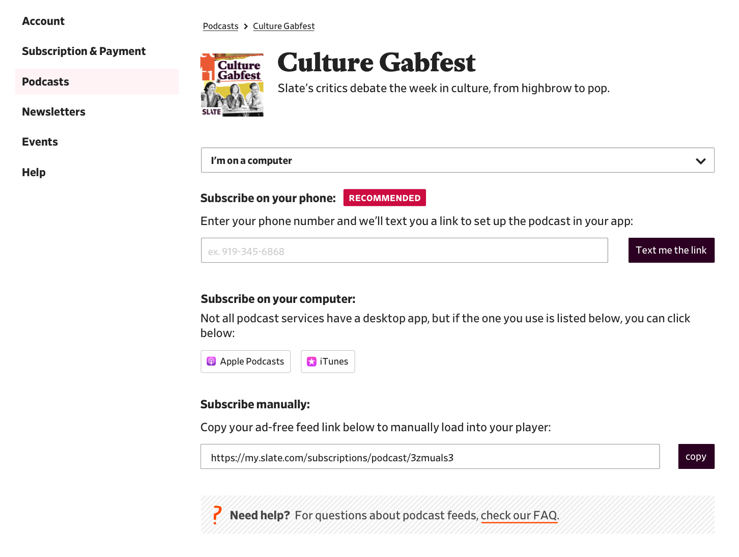
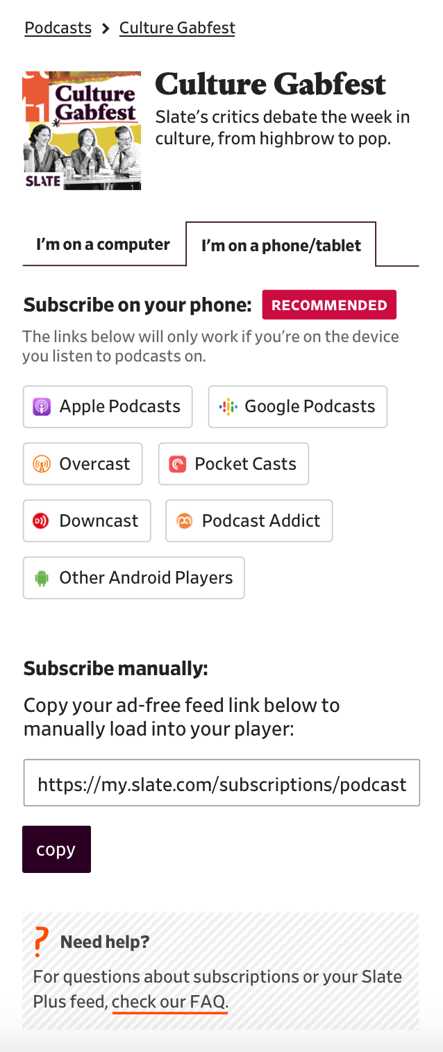
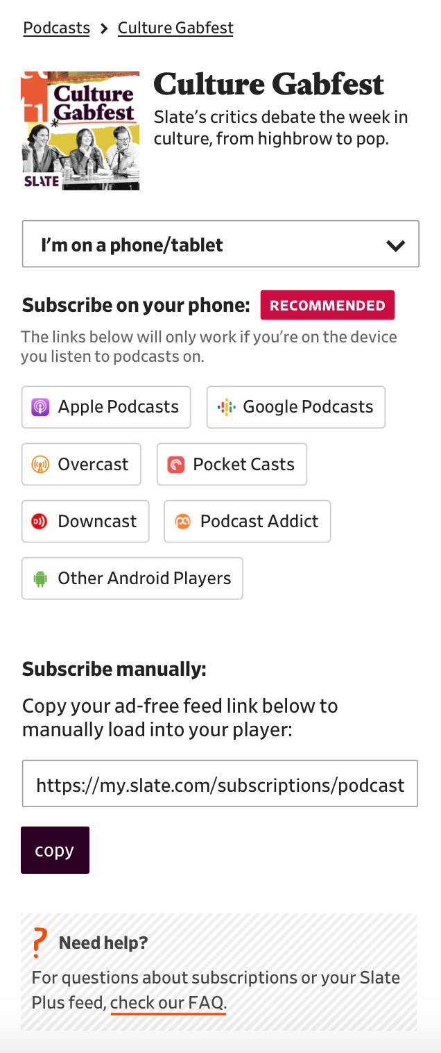
While implementing the temporary Supporting Cast experience, developer Jonathan Zuckerman was concerned that the Supporting Cast experience guessed your device (desktop vs. tablet vs. mobile) instead of letting the user choose. Although I designed the original Supporting Cast UX, I agreed.
To combat that, my first round of user testing was seeing how people responded to two different experiences where you were allowed to switch your device. I mocked up a tabs version and a dropdown version. Each experience defaulted to the correct device (desktop computers got "I'm on a computer", mobile users got "I'm on a phone/tablet") and for tablet, I tested it defaulting to desktop for some users and mobile for other users because some tablets are desktop-sized.
 Tabs on desktop
 Dropdown on desktop
 Tabs on mobile
 Dropdown on mobile
Overall, users understood both experiences and didn't have more trouble or success with one over the other. About 22% (5 out of 22) of users noted they were a bit overwhelmed with the number of options presented to them. From this information, I thought I'd try more testing and tweaking a bit of the language while also keeping in mind that the underlying issue might be the number of options.
For the next round, I decided to test the interim experience vs. the tabs experience to see if people were overwhelmed by the number of options in both experiences. Because users found both tabs and dropdowns equally usable, I chose tabs because I like to show all options available to a user, if possible.
Interim Supporting Cast experience on Slate.com
New experience with tabs
75% of users noted that they preferred the new experience over the old so I thought it was fine to see how this experience held up on podcast pages.
Podcast pages
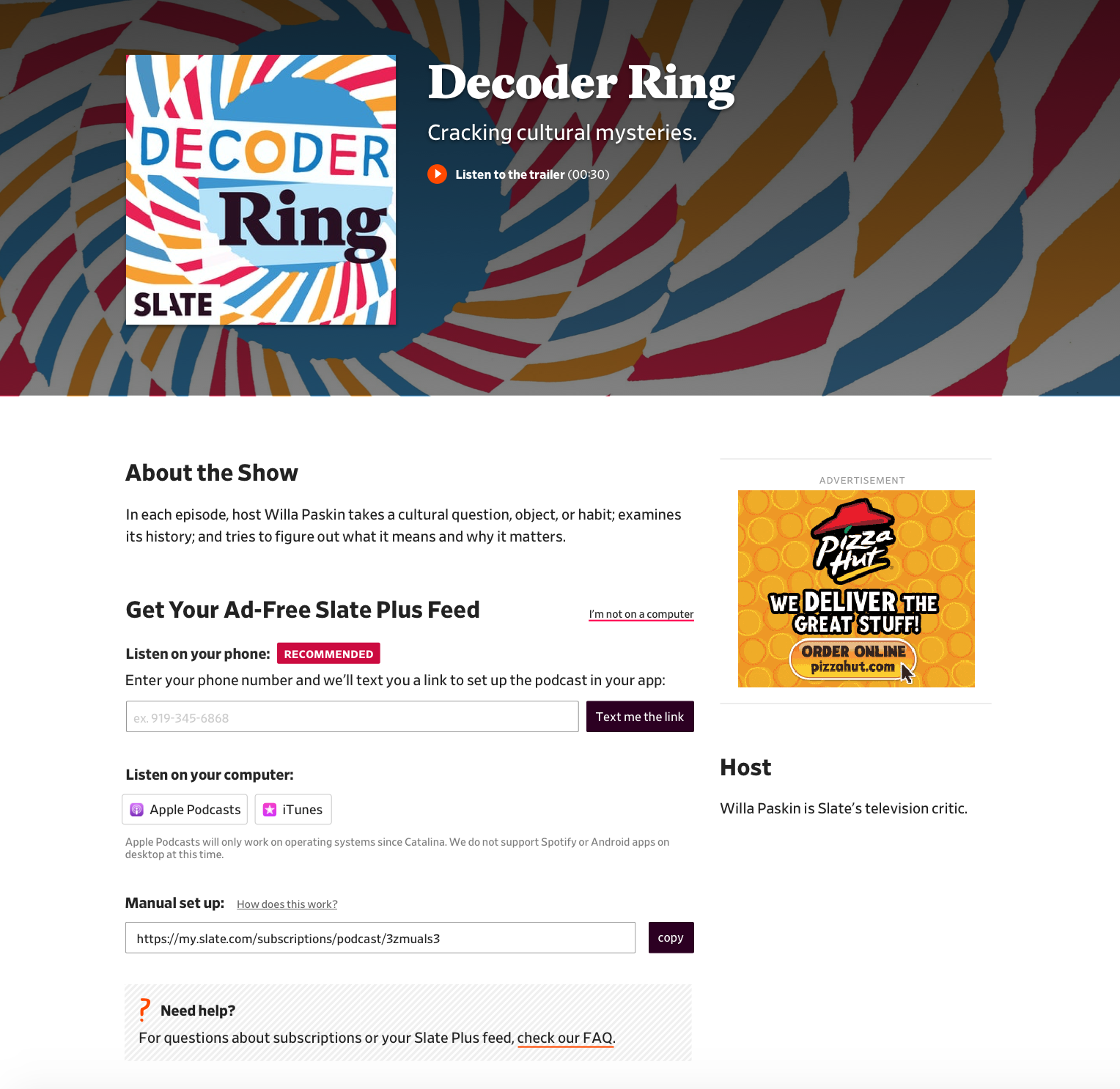
For the first test on podcast pages, I decided to just put the tabs unit from the previous tests on the podcast show page (designed here) and see what people thought about it.
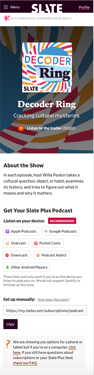
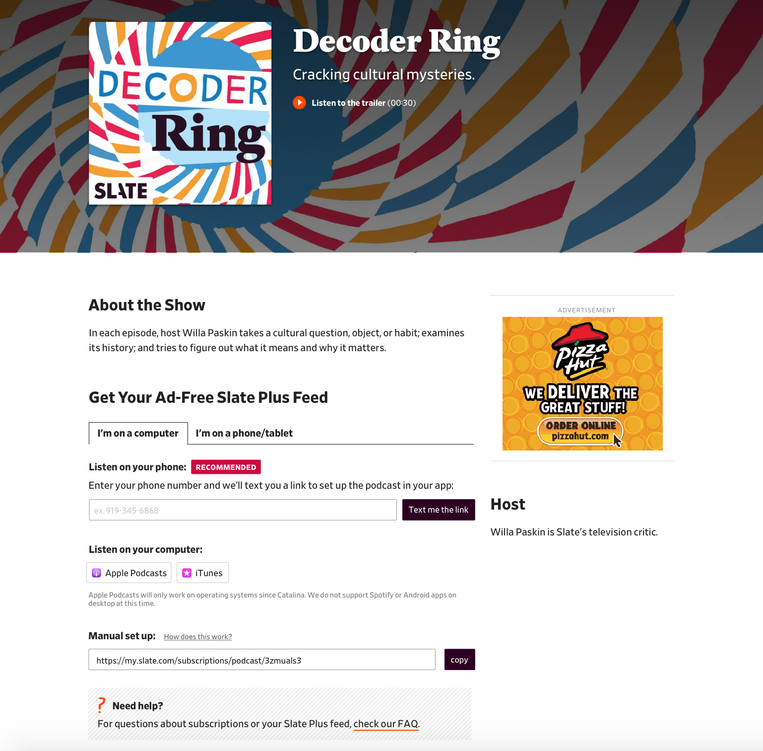 New podcast feed experience on the Decoder Ring show page
Over a third of the users stated they were confused by the number of options (both choosing their device tab and choosing how they wanted to subscribe). I thought maybe there could be a more subtle way to choose your device so the number of options weren't as overwhelming.
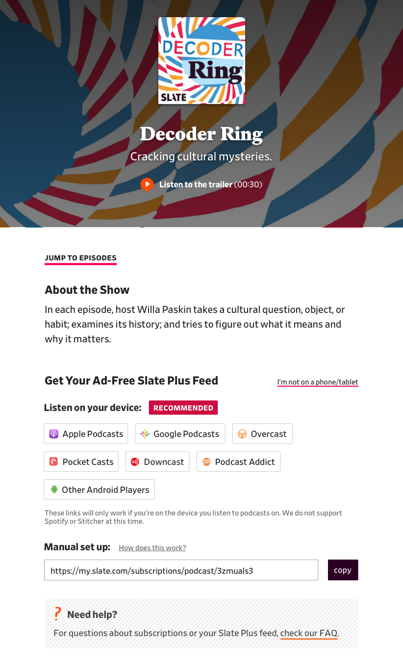
I decided to try testing a subtle link floated to the right of the page labelled with the negative version of the phrases used before: "I'm not on a computer" and "I'm not on a phone/tablet".
 Show page on desktop with "I'm not on a computer" link
 Show page on tablet with "I'm not on a phone/tablet" link
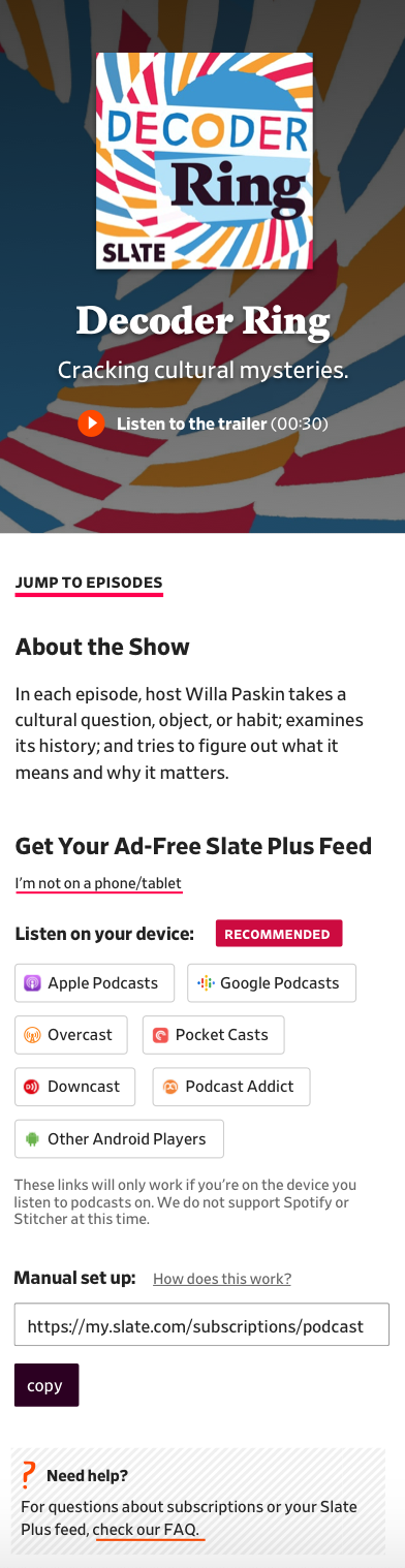 Show page on mobile with "I'm not on a phone/tablet" link
Users found this experience to be about as confusing as the previous one. I decided I could make the link even more subtle and then user test it when it was actually live to get better results. It is always hard to test something that depends on the user clicking an app link (to subscribe to the podcast) when the app buttons aren't actually linked.
Decision
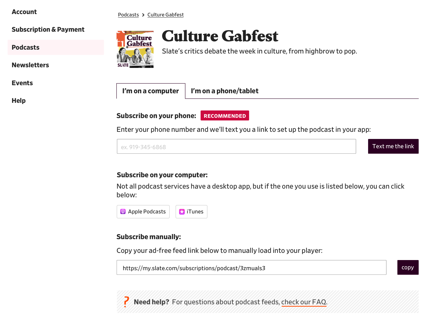
This is where the mock ended up before going to production. The link to switch to the alternate experience is grouped with the FAQ because if someone couldn't find what they were looking for, I hope they would look there.
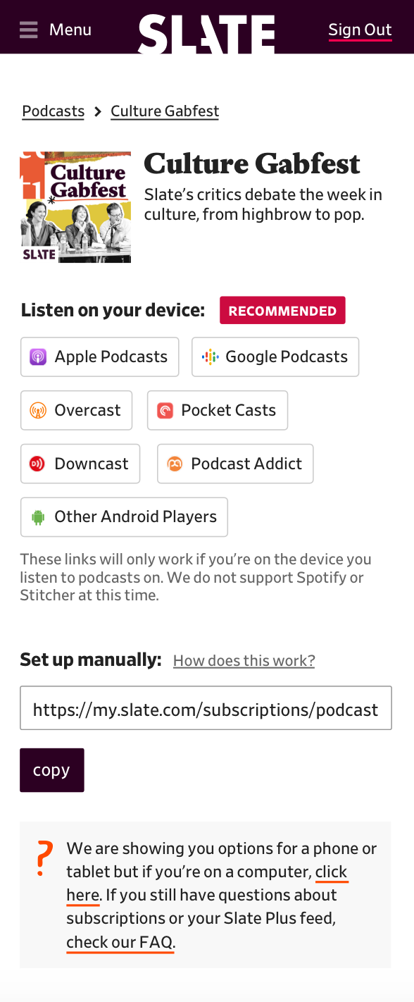 Final mock for account center podcast page
 Final mock for show page
Thank you to product managers Heidi Strom-Moon and Chris Schieffer who reviewed the many rounds of testing and to developer Jonathan Zuckerman for guidance on accessibility.