Vox iOS app
Vox app with news, podcasts and video all in one place
I worked on the MVP for a Vox app that includes access to Vox news, podcasts and video. The goal of the app was to provide a premium experience for subscribers, specifically ad-free podcasts and vertical video.
Initial Prototype
To gain leadership's sign on for the project, I did some quick wireframes (using the design system) of what the app could look like based on a few simple requirements:
- Homepage + Articles
- Podcasts
- Videos - vertical & horizontal
- Account + Saved Articles
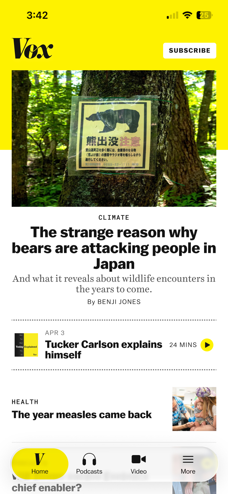
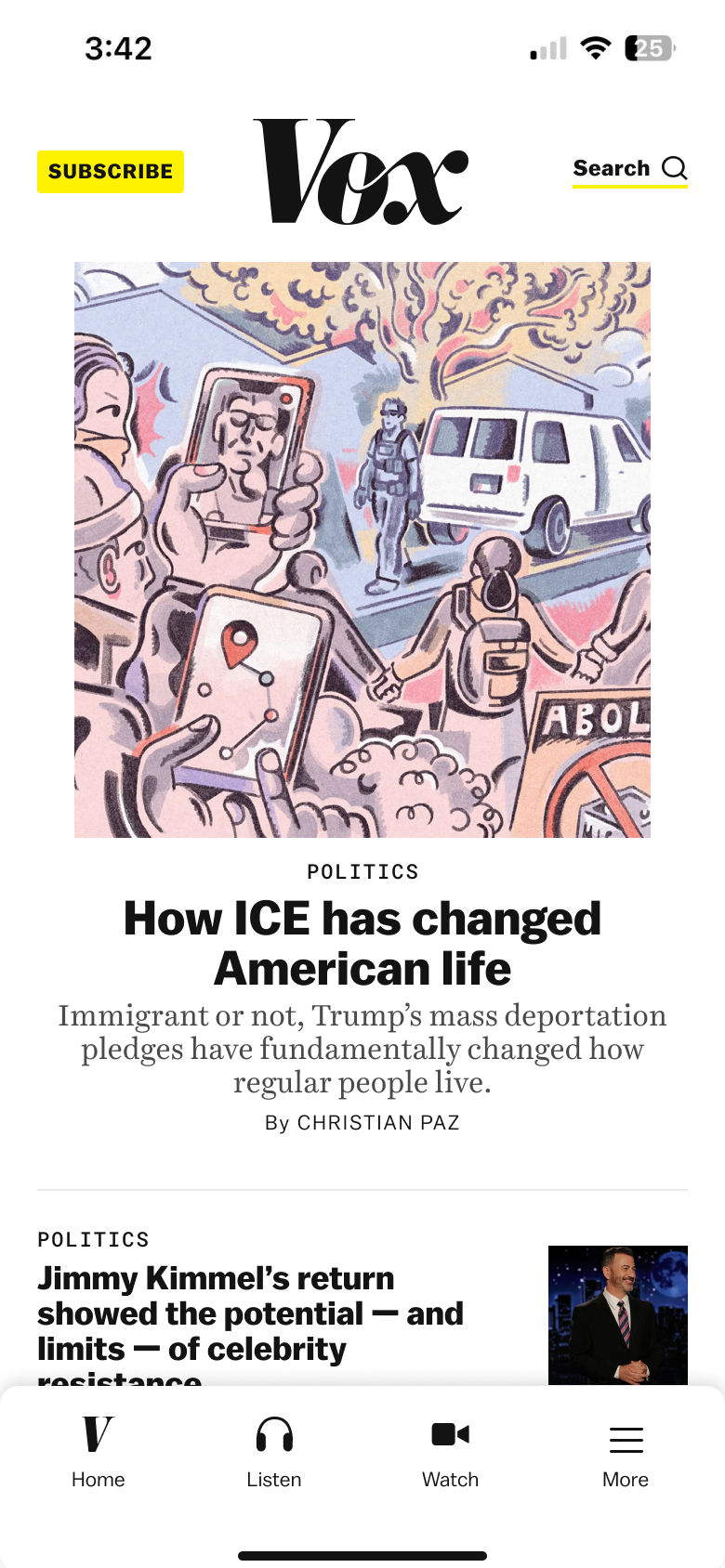 home tab
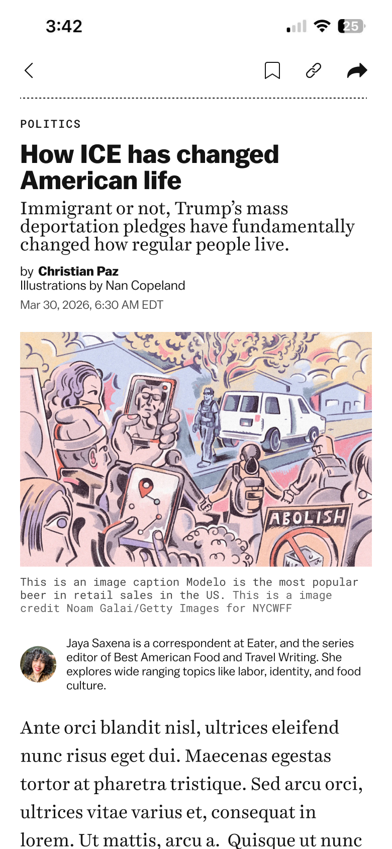 article tab
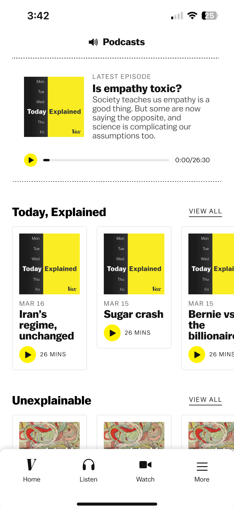 podcasts tab
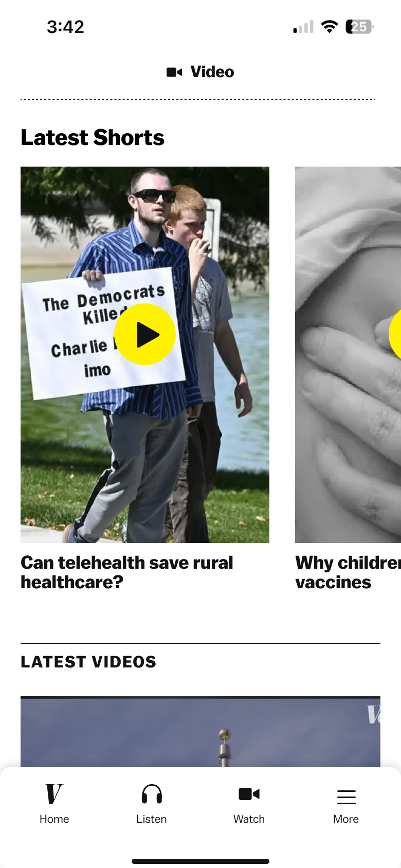 video tab
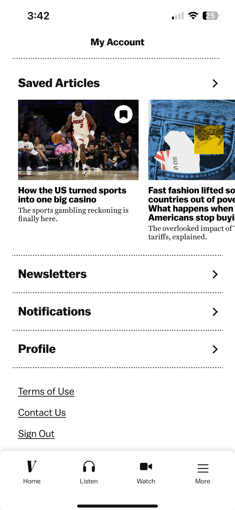 account tab
Nav & Video
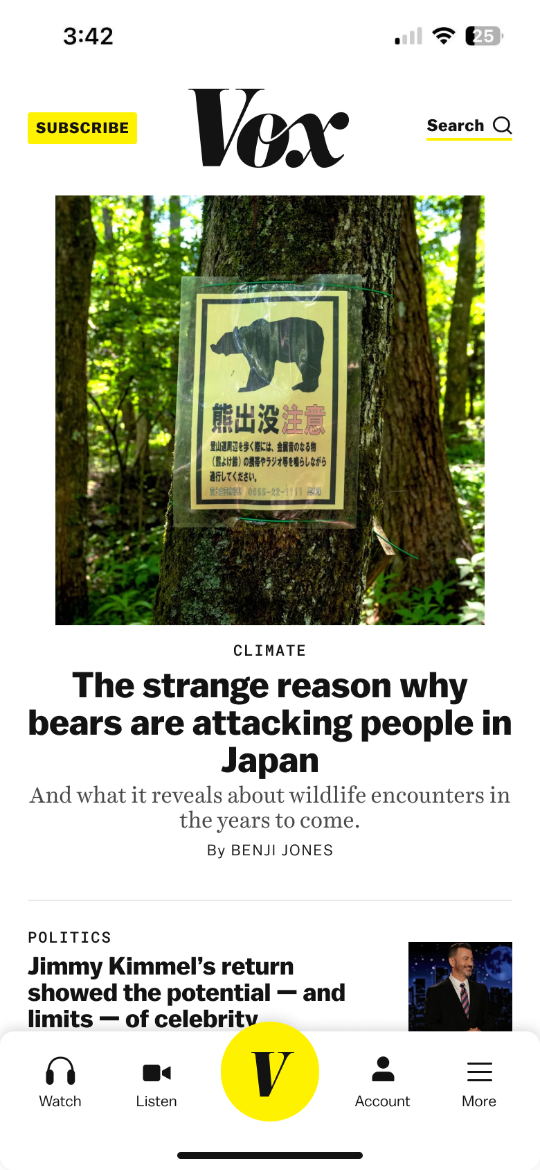
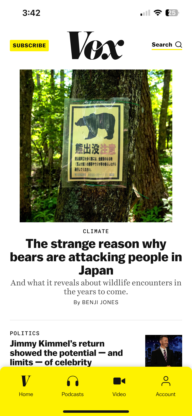
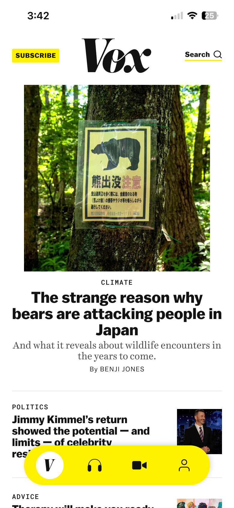
Once we got signoff to work on the app, we wanted to start building it ASAP. So, the first big decision we committed to was using the default Apple liquid glass bottom navigation. One of the app developers highly encouraged us to do this because it would be easier to maintain. At first I didn't love it because I liked the look of the more custom navs but I was eventually convinced because the native audio player (for podcasts) was very slick and the general tradeoffs seemed better for everyone involved.
 custom nav idea
 custom nav idea
 custom nav idea
 custom nav idea
 home tab + liquid glass nav
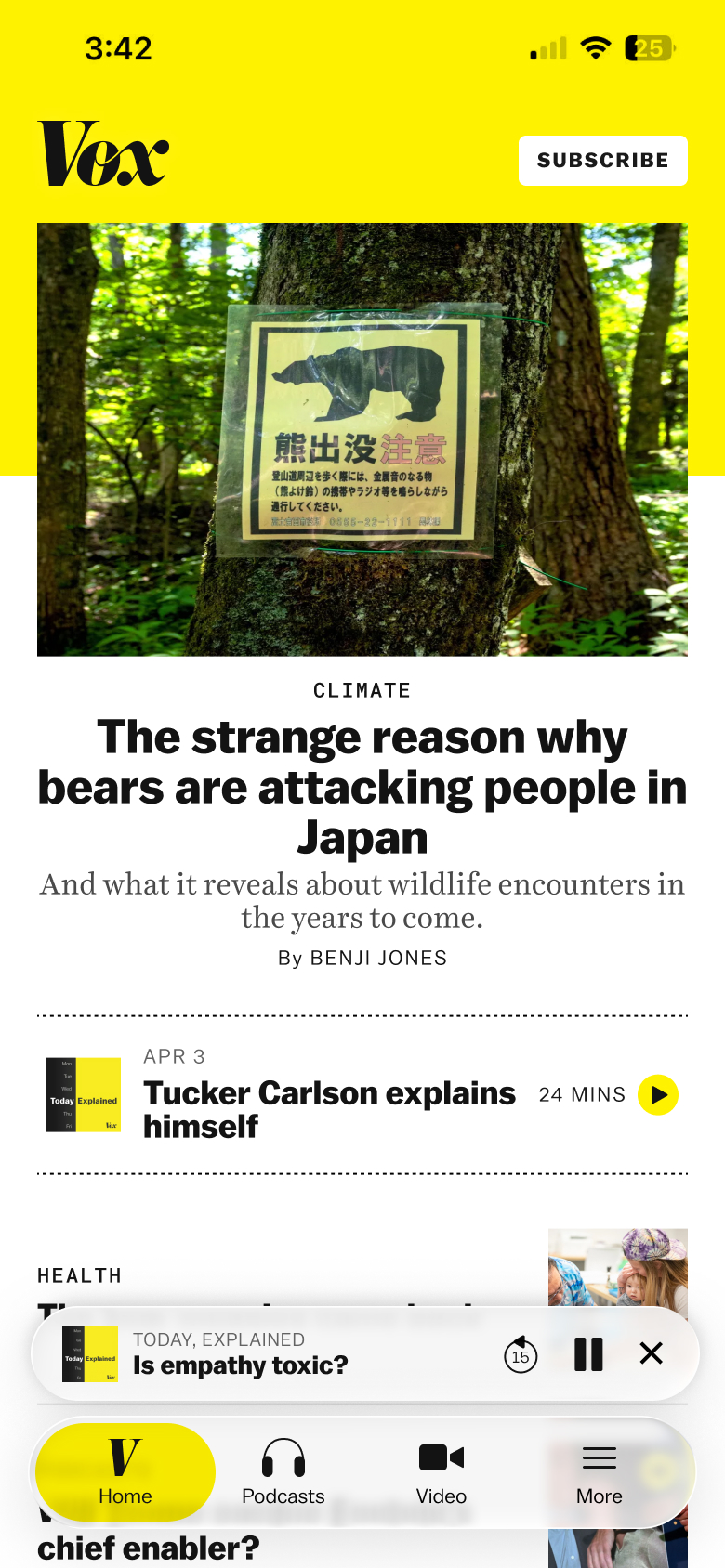 home tab + liquid glass native audio player
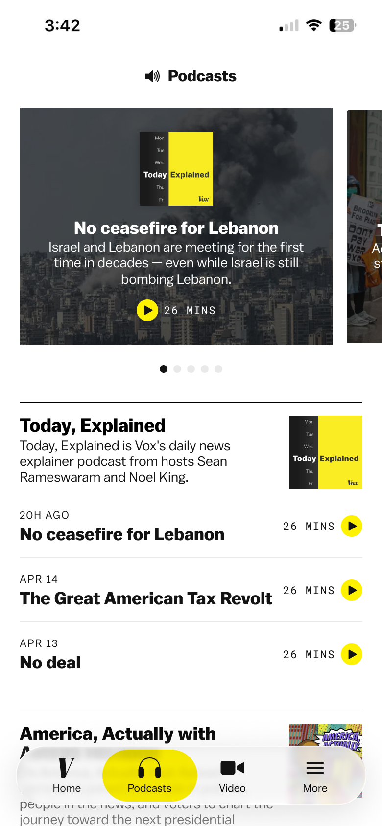 podcasts tab + liquid glass nav
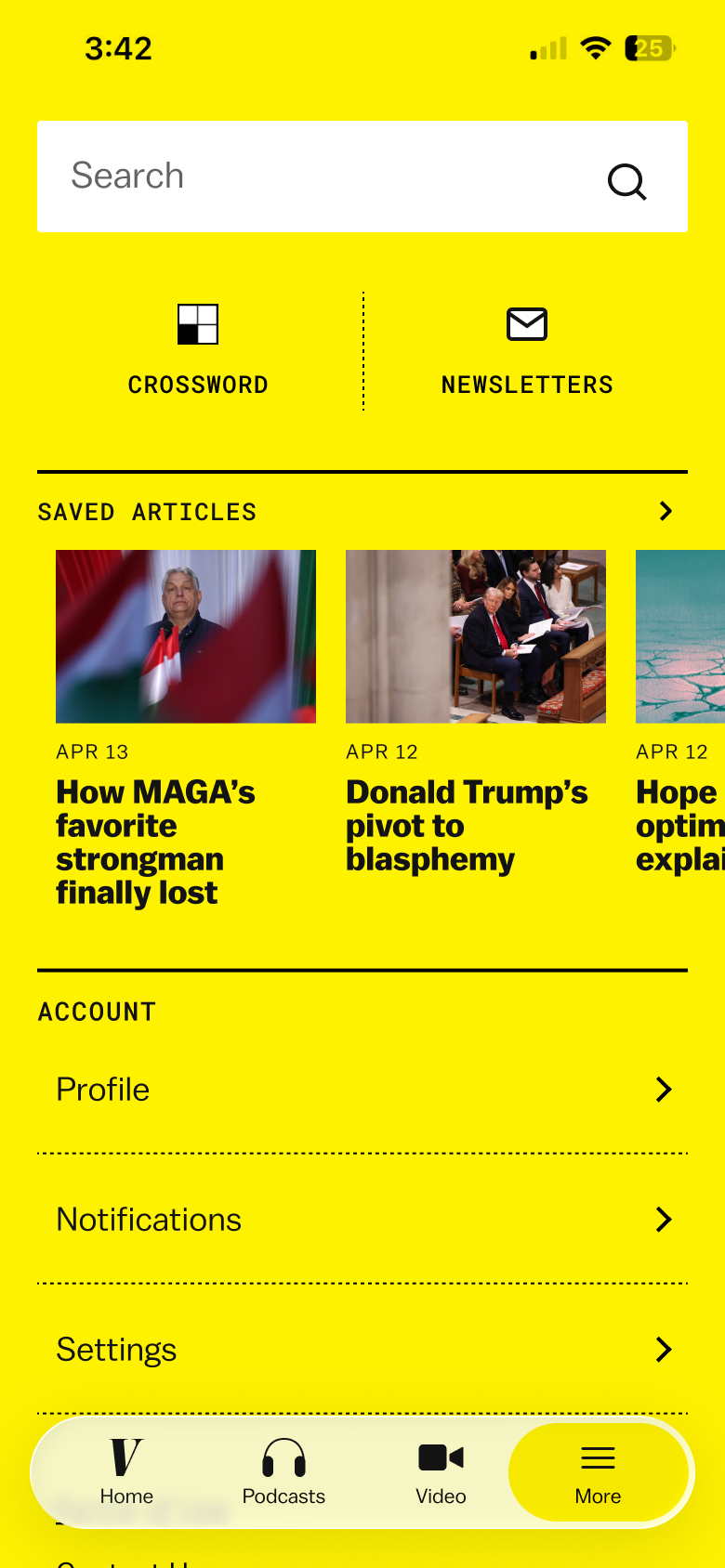 more tab + liquid glass nav
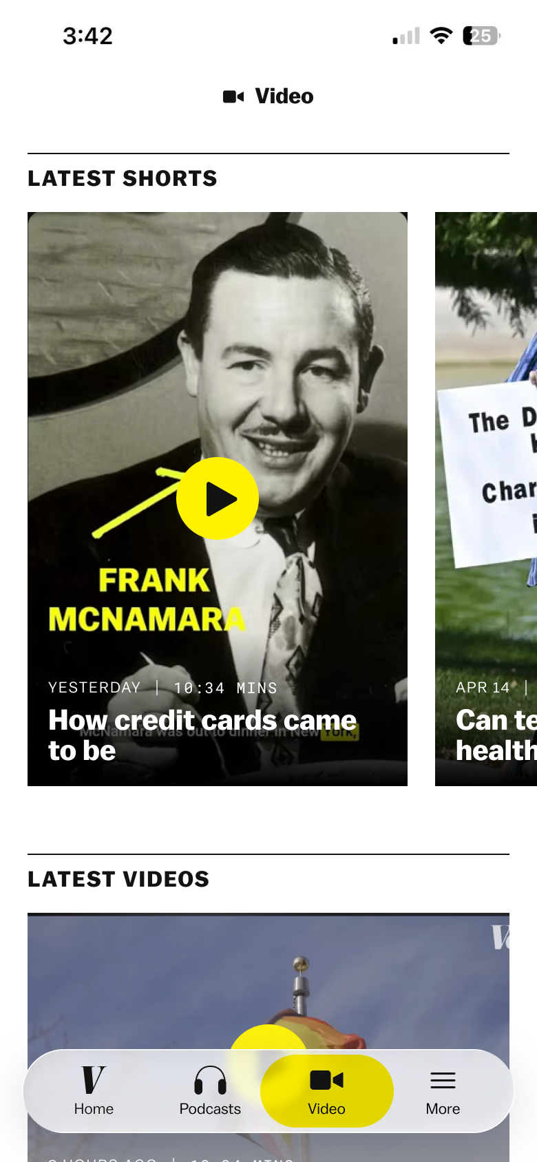
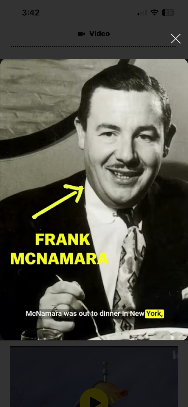
For the video tab, editorial requested an emphasis on vertical video but also wanted to feature their horizontal video content from YouTube. I initially was trying a version where both were featured on the main video tab and after you clicked on a video, you could vertically scroll thru all the videos. But, as the biggest TikTok user on the team, I thought featuring only vertical video that played automatically was a better experience. I suggested this to the team and they agreed it was more engaging and were okay to do this if we could feature horizontal video on the home tab.
 initial video tab mock
 initial video playing mock
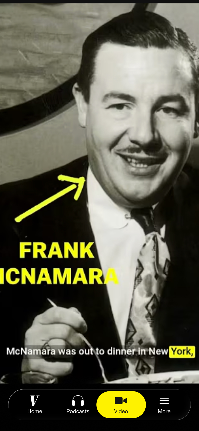 video tab with only vertical video
Podcasts
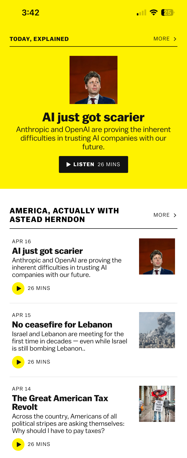
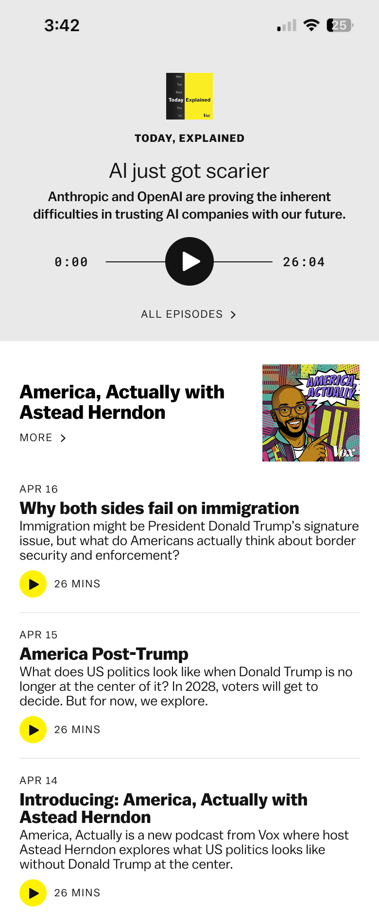
The podcasts tab was one of the most complicated parts of the app. One of the core parts of the app was being able to listen to Vox podcasts in the app (subscribers get ad-free podcasts, non-subscribers get ads) so it was important to nail the user experience. I also had to figure out the correct focus for the page. Today, Explained publishes every day and is the most popular Vox podcast but we wanted to feature all Vox podcasts.
Initially I thought a natural experience would be the latest Today, Explained episode at the top of the page followed by a few of the latest episodes for each show. When designing for podcasts, I'm always wondering if it is more important to emphasize the episode or the show that the episode is part of.
 initial option
 initial option
 initial option
 initial option
 initial option
When we showed these ideas to editorial, they didn't like the emphasis only on Today, Explained, they wanted the focus of the page to be on all podcasts. I was struggling with the initial layout so decided to try something with quick links to the shows at the top and then latest episodes below.
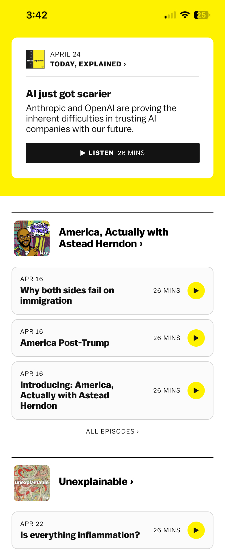
We presented these 2 options to editorial:
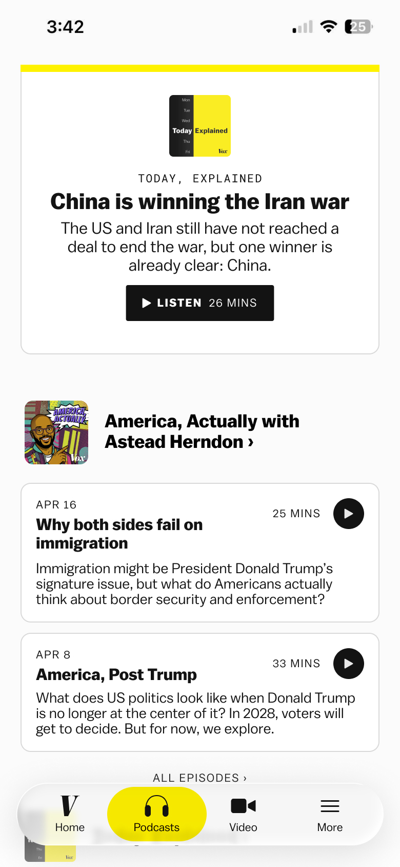
Option 1
- Latest Today, Explained episode at the top
- All shows (except Today, Explained) below w/ latest 2 episodes
- Emphasizes Today, Explained and how often there is a new episode
Option 2
- All shows in a carousel at the top
- All shows below with latest 2 episodes
- Emphasizes overview of Vox podcasts and allows user to quickly access the show they’re looking for
 option 1
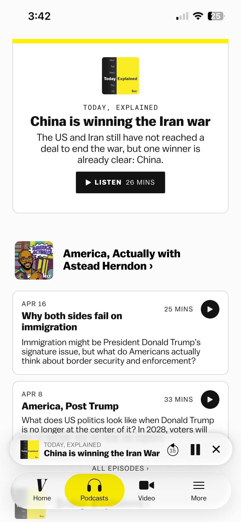 option 1 + podcast playing
 option 2
 option 2 + podcast playing
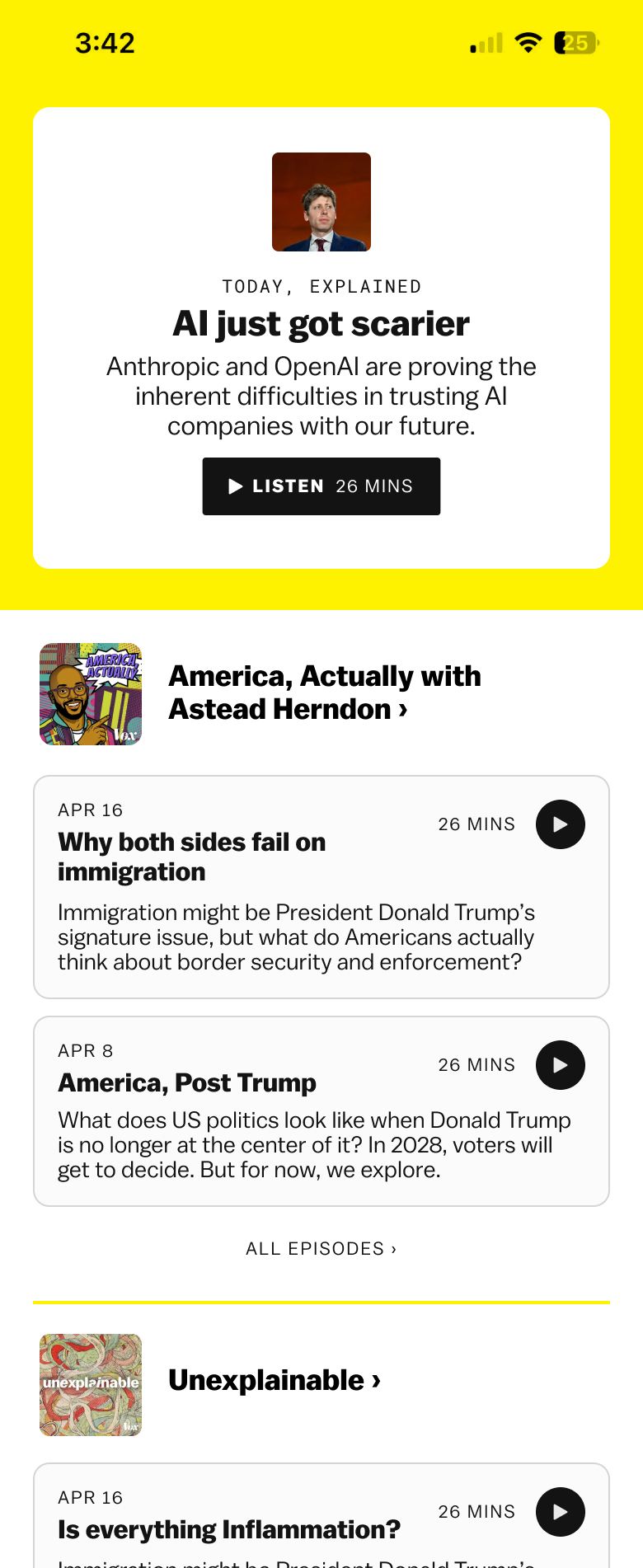
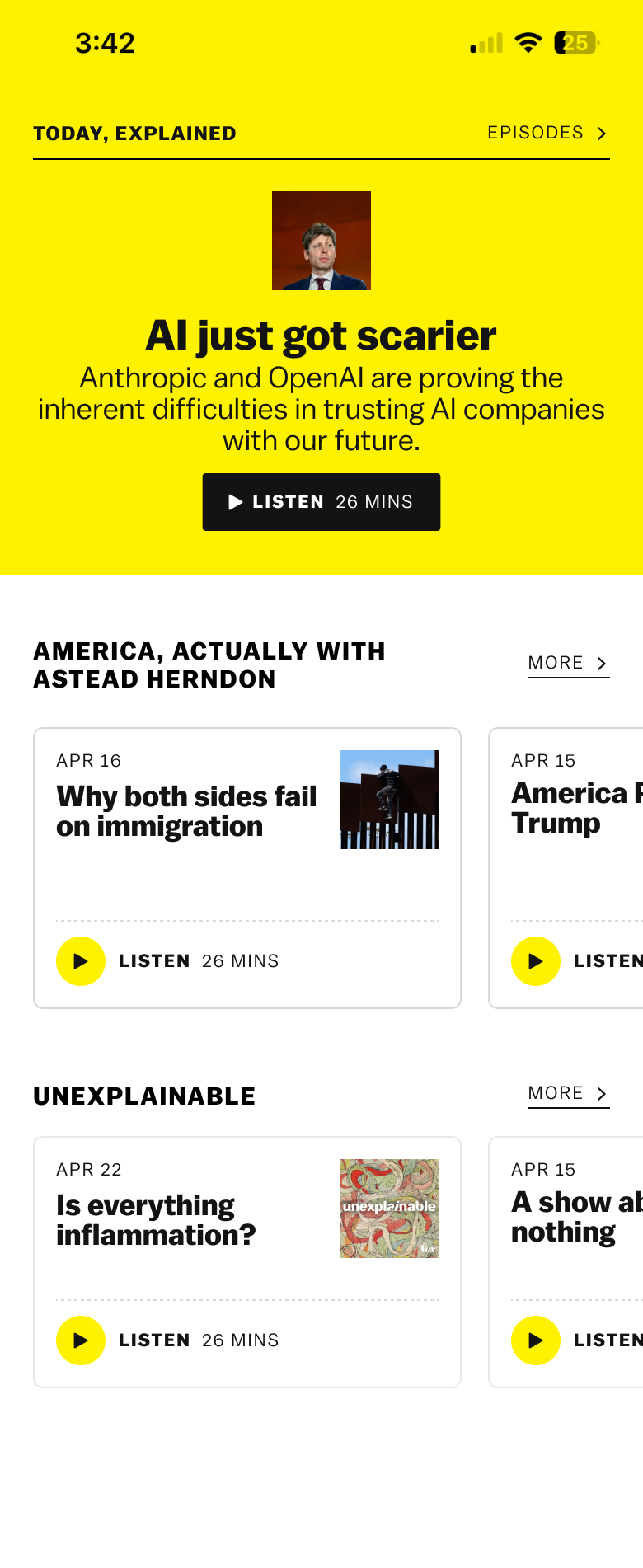
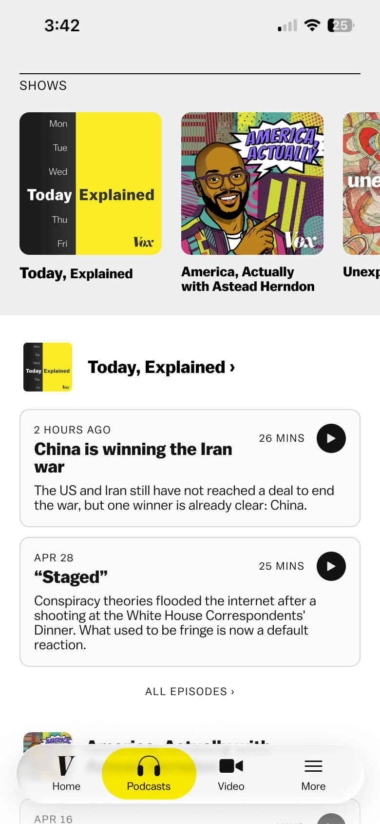
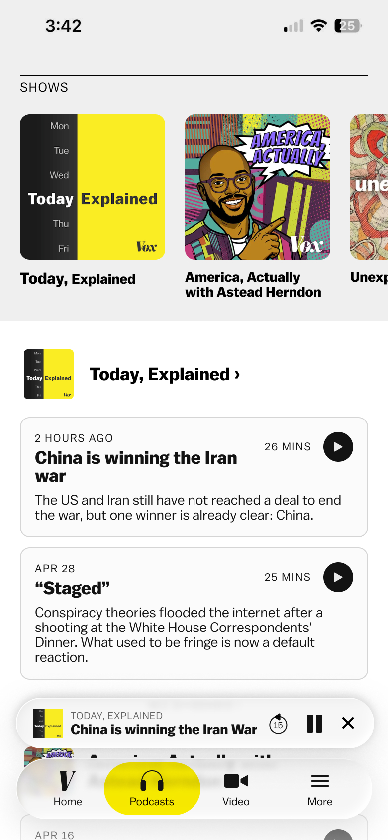
Editorial liked the new option that focused on all the shows and that option also felt like a more straightforward design so we went with that. I also added screens for show and episode pages.
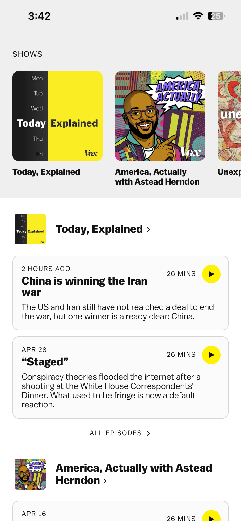 final podcast tab
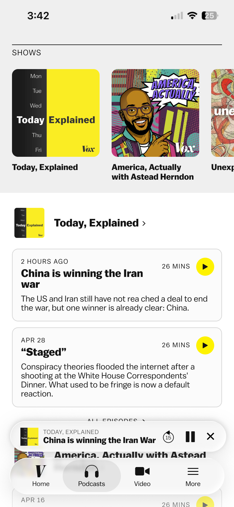 final podcast tab + podcast playing
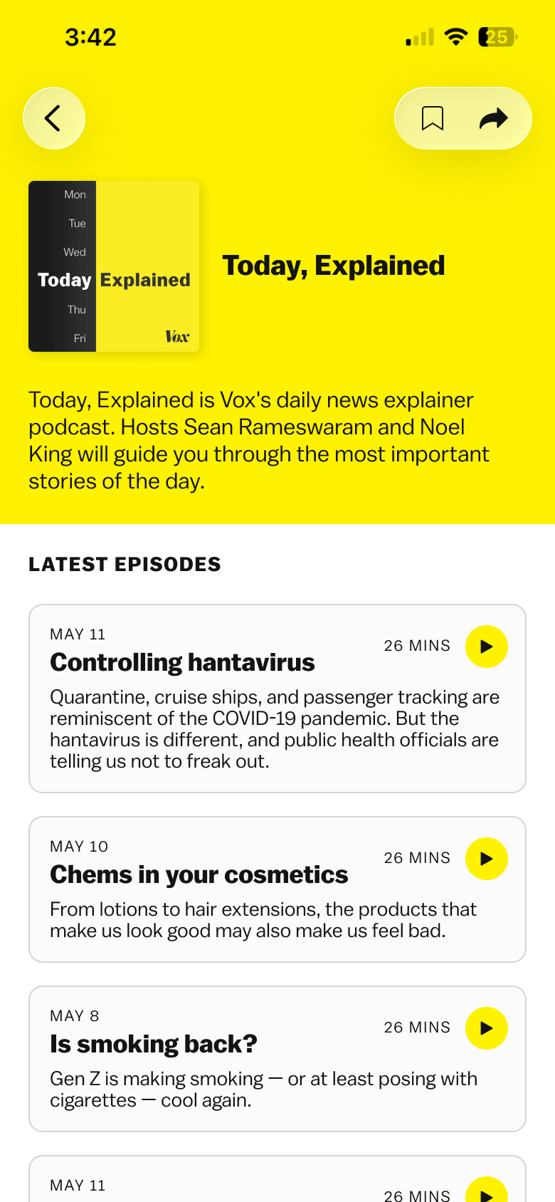 final show page
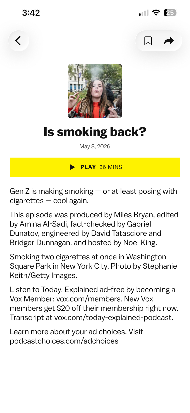 final episode page
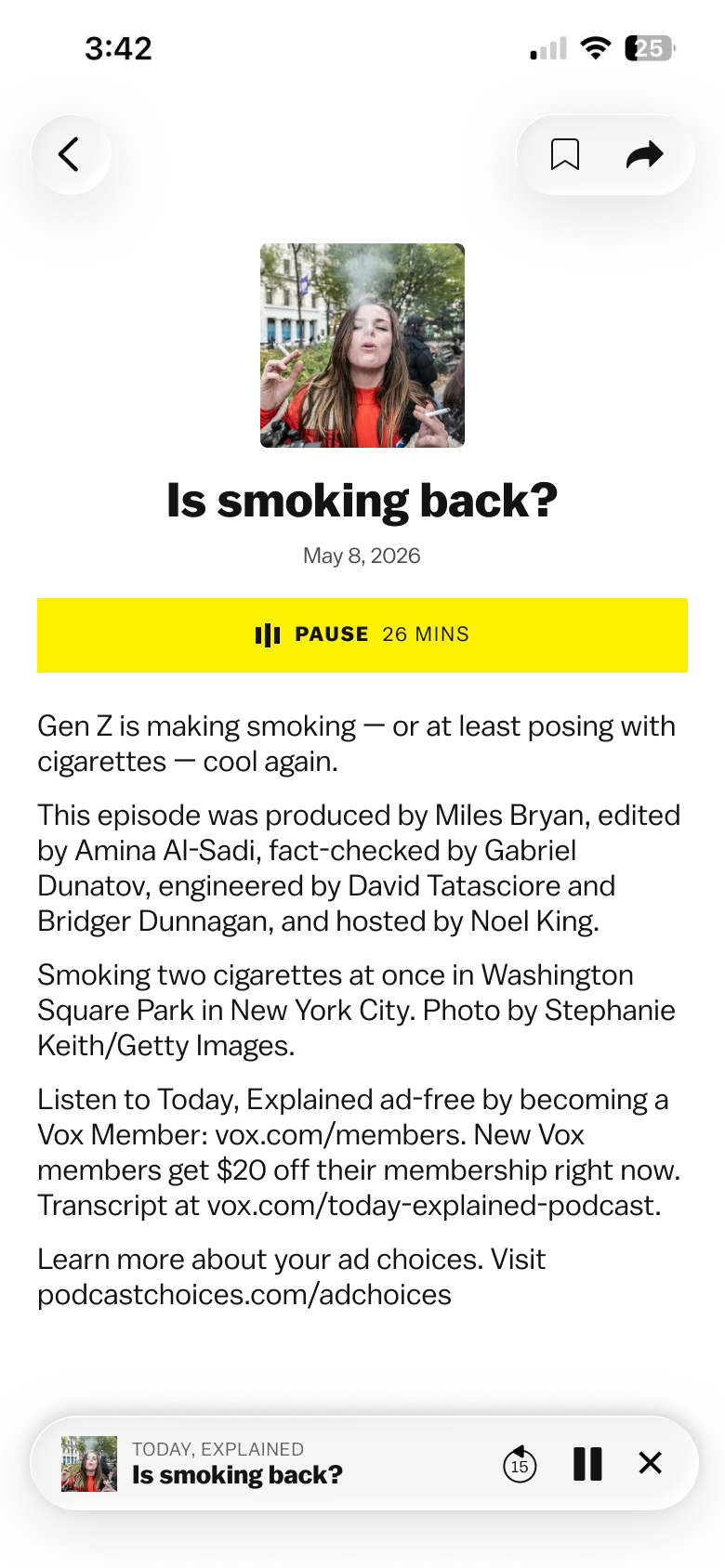 final episode page + podcast playing
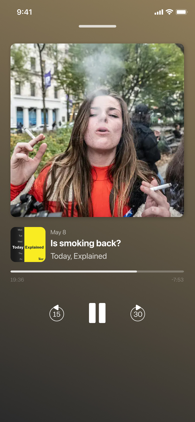 native app audio player
Home tab & onboarding coming soon...